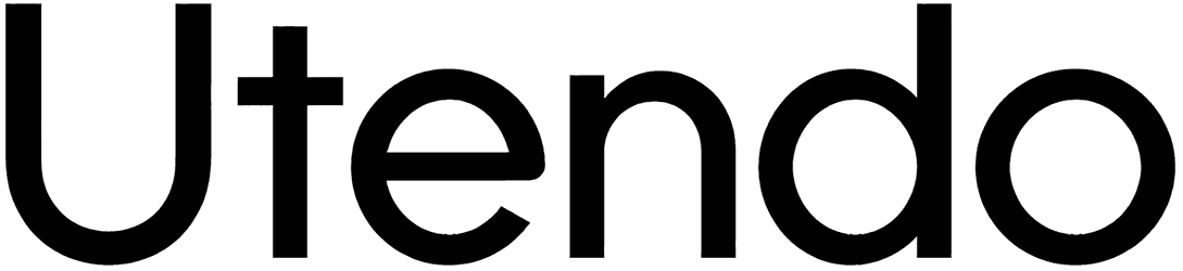
We get this. It’s cool to start from almost the verge of invisibility and slowly thicken until the tone can’t get any stronger. But is Utendo’s first version even readable? We mean half the letters are wiped out! Of course, we’re sure you’re gonna find somewhere to use that too.
Even if that’s not totally to your taste, you still have a dozen other versions of Utendo to try in your modern business cards for gyms, electronic stores, and similar projects.
Note of Designer
Based on a series of logotypes from a series of Wii U products.
This font is licensed under Creative Commons Attribution-NonCommercial-ShareAlike 4.0 (CC-BY-NC-SA 4.0). It cannot be used commercially.
9/29/2025
Cyrillics included. 7 weights were removed as Regular and Bold are the only definitive weights. Regular, particularly, is based on the “NINTENDO” part of the Nintendo Network logo. Bold is based on the rest.10/4/2025
Symbols added. To access these symbols, type:
_symbol1 for Wii U logo
_symbol2 for eShop bag 1
_symbol3 for Miiverse
_symbol4 for Nintendo Network
_symbol5 for Internet Browser
_symbol6 for My Nintendo
_symbol7 for Bezel Engine
_symbol8 for Nintendo TVii
_symbol9 for eShop bag 2
_symbol10 for eShop ‘e’