No longer worry about your magazine covers not being eye-catching enough. With loads of stylish magazine fonts waiting for you on Resource Boy, you can easily design magazines that sell like hotcakes. The first and most important step in publishing a magazine is to know what field it’s going to cover. That way, you can design a magazine title that matches the overall theme of the magazine and attracts the right crowd of people. We’re not saying that it’s a walk in the park, but with our trendy collection, it’ll definitely require less effort to properly introduce your magazine to the world. This way, you know for sure that you're going to love the final look. So let's not wait any longer and start downloading our fonts now so that you can nail all your next magazine projects one by one.
All the tricks about magazine fonts uncovered!
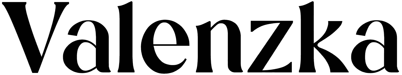
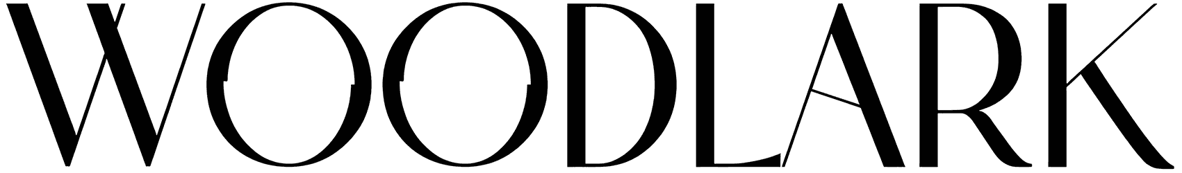
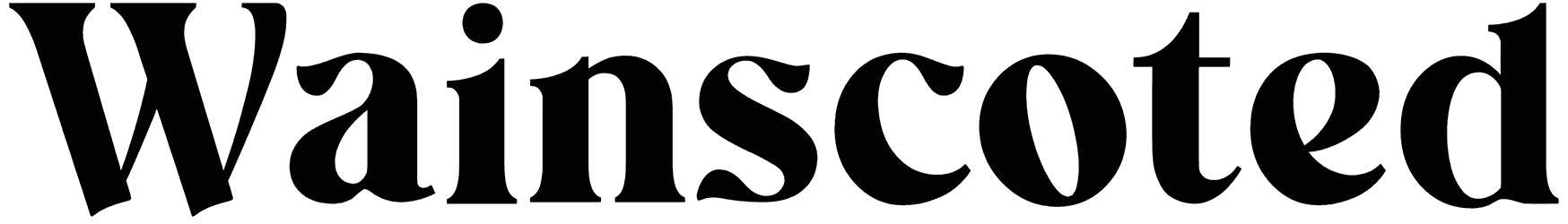
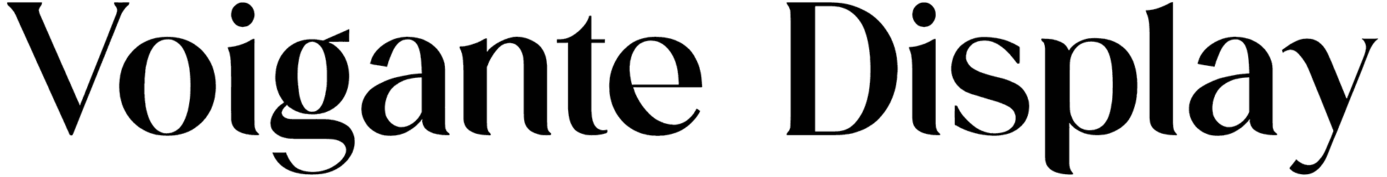
- Use the magazine letters to design not just how your words are written but how you want your ideas to be delivered to the audience. When exploring our magazine font collection, prepare yourself to see anything. It might be a bunch of collage letters with ripped edges for decorative purposes, a calligraphy style for your fancy designs, or basic characters with a minimal outline. No matter which type of magazine letters you choose, it’s the bold final writing that counts. The magazine alphabet is always kept neat to bring you legible text in the end, and your words have to be as clear as possible in order for the focus to remain solely on the text message. As a result, the refined and distinctive magazine letters and numbers should make reading a comfortable experience for everyone.
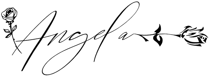
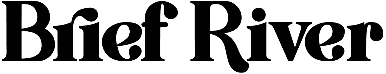
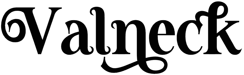
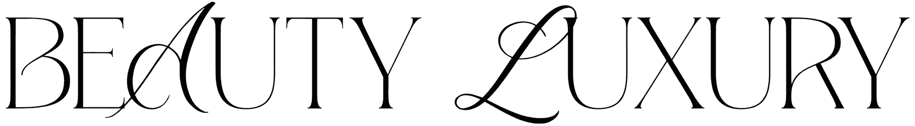
- The emotional effect of having magazine words in your lettering is uncanny. To tell for sure whether a magazine font is retro or modern depends on the mood of the font rather than having serifs or not. In fact, each of these fonts translates into a random feeling and you have to be expert enough to tell them apart. For example, a font from this set with strong feminine vibes doesn’t necessarily have to be pink for you to recognize it. Many believe that all of them have to look sophisticated but in fact, it all comes down to the subject of the magazine. You’ll definitely need a luxury font for your fashion magazines or elegant letters for celebrity magazines, but for a lifestyle magazine, the title font has to feel organic, neat, and casual instead. The playful version of these fonts, on the other hand, is designed to be more visually interesting and colorful to attract kids and youth. So it’s up to you to adjust how friendly or formal your tone should be.
- Magazine fonts, is it all really just about a magazine cover? As we’re sure you can tell yourself, the fonts in this category are so versatile that you’re going to want to use them in more projects than just a magazine title. In fact, those simple words will look cool on any printed paper, even in a nice happy birthday card layout. Sure enough, if you use any of these fonts to design a logo, the business card has to blow everyone’s mind. You’ve also got the cutout version of magazine letters which will fit the bill for your scrapbooks, bullet journals, websites, and anything else.
- Fill your design toolkit with not just the best magazine fonts, but also the best design assets of all kinds, pretty much like Resource Boy’s library itself. Resource Boy is the ultimate typography assistant that you can ask for, and that’s not only because we have so many aesthetic magazine fonts for you to download here. You’ll never truly realize how vast RB’s inventory is until you check at least a few more of our collections such as our artistic book fonts, minimalist fonts, and newspaper fonts. Guaranteed, you'll be hooked for life!