Who said you can’t make the best impression on your viewers unless your words are decorative enough? If that were to be the case all the time, anything ornamental would have lost its typography touch long ago. In fact, it’s the era when that much too showy style doesn't work effectively anymore. So it’s time to say goodbye to traditional methods and find a new one that works a lot better. Now do you see why you need Resource Boy on your side? We have all the best sans serif fonts listed for you to explore and download with a click.
It’s never too late to gain a better understanding of sans serif fonts!
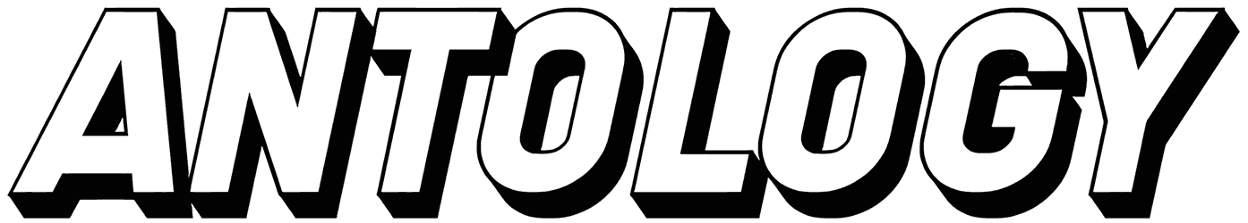
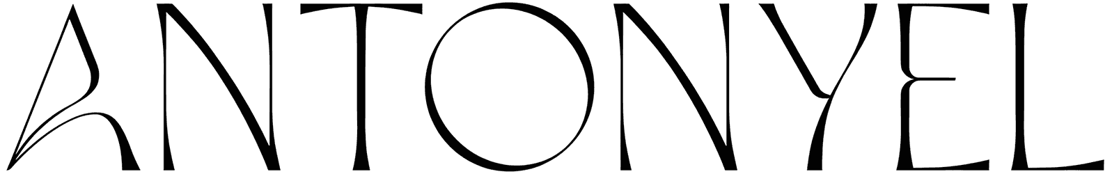
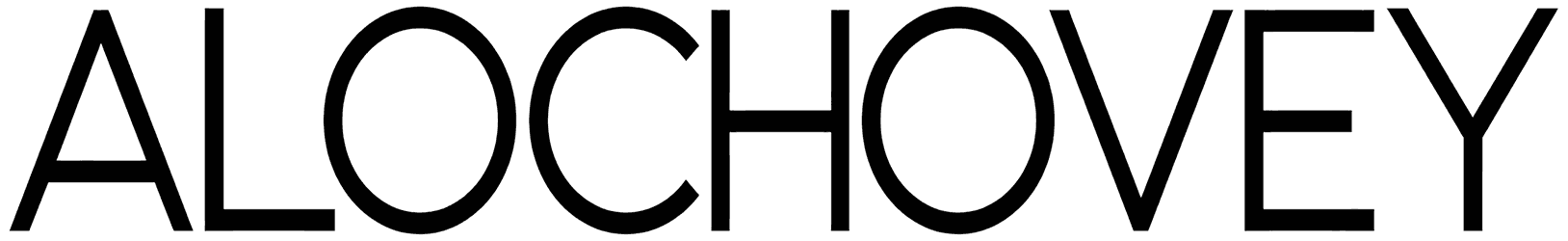
- What are the unique visible traits of the letters in this bundle? This kind of look is what happens when you write your words free of details. As a result, the message is going to be right there, easier than ever to read and respond to. So in this collection, you don’t have to worry about illegibility ever. That should be pretty much the opposite of anything that the calligraphic style offers. Here, there’s not going to be any flourishes, and the overall font style is often kept minimal instead. You’ll be surprised at how engaging these simple letters can be in a text. The reason for that is the bold final appearance of the sans serif letters, which indicates you don’t always need elaborate font designs to make your writing stick out. As long as the anatomy of the letters is shaped in its elementary form, that font belongs here in this collection. Without those extra tips at the end of the letters, you’ll get to deliver something visually clean, expressing your ideas more obviously than ever. Of course, they have their own ways of bringing enough variety to the table, despite the lack of serifs in their structure. Something like stencils, for example, can spice things up without having to alter the default version of letters. Then there are those with more extended characters as a geometric enhancement, adding more emphasis to your lettering.
- What are you going to find about their sentimental background if you dig deeper? The best thing about a sans-serif font is that there are limited decorations to get you distracted, so it can just get right to the point. Defined by the simplicity of their style, this font category doesn’t really try too hard to impress. It just comes naturally to them to be acknowledged properly. Besides that, since the least of details are used in their design, it makes them perfect for landing on all kinds of typography with any theme at all. They can be formal or informal, fancy vs. casual, thin or thick, but always aesthetic. In a nutshell, they just never stop being elegant. It’s actually more professional when you use such modern letters to be your voice. That’s what makes the sans serif alphabet such a great fit for your corporate designs.
- Where should you use these fonts for better text customization? The main application of these fonts is to turn them into stylish logos for different brands. So you must have seen a lot of them on business cards. However, this font category is way more practical than that. Here are some other examples for you to get more creative. You can use them in print media, designing newsletters, magazines, and newspapers, as well as plenty of other typography projects like license plates, gym flyers, street signs, and the best titles for everything at all, on Microsoft Word Office, Canva, or Photoshop.
- Are you ready to be blown away by even more of these fantastic resources from RB? The great news is that our collections of basic fonts and Bauhaus fonts are just as popular. So if you want your next designs to be more advanced, you should check them out ASAP.