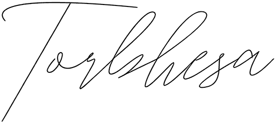
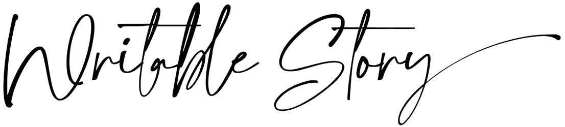
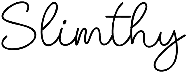
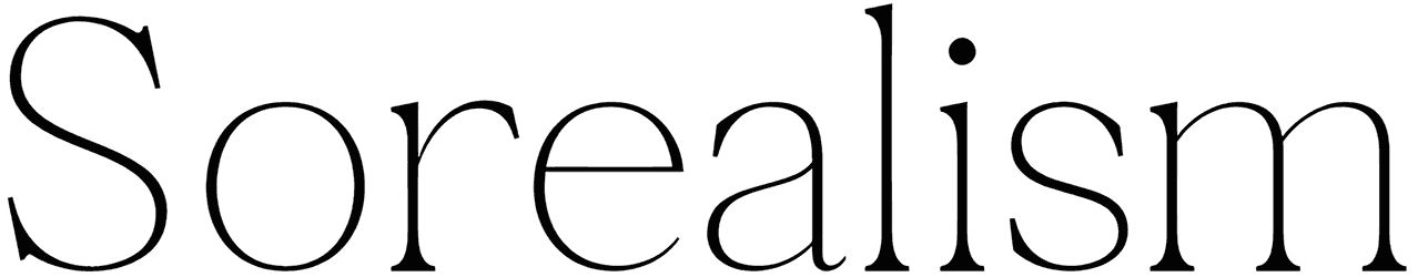
Everyone thinks that thick fonts have an advantage over slim texts when it comes to conveying a message. That doesn’t at all seem to be the case though. There must be thousands of brands with their logos made only of thin letters. Nothing could stop them from becoming universal, right? In fact, these fine words are much more tasteful than big bulky letters. Just customize a design of yours with these minimal elements and you’ll see how fancier it gets. Then, if you want your next project to turn out just as handsome, this whole pack of thin fonts is yours to explore.
A dive into the world of thin fonts with Resource Boy on your side:
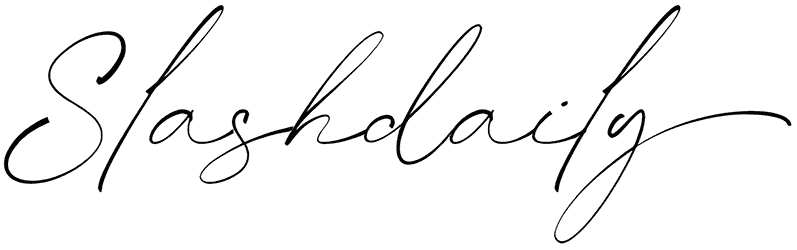
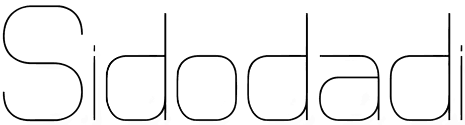
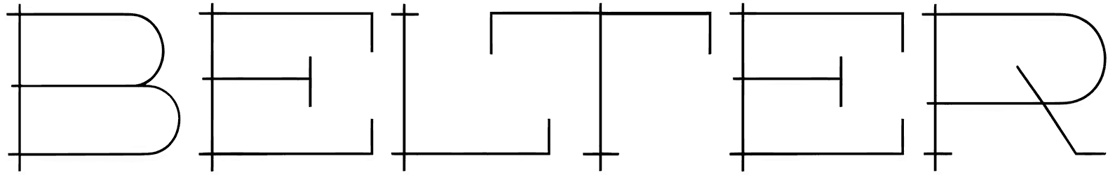
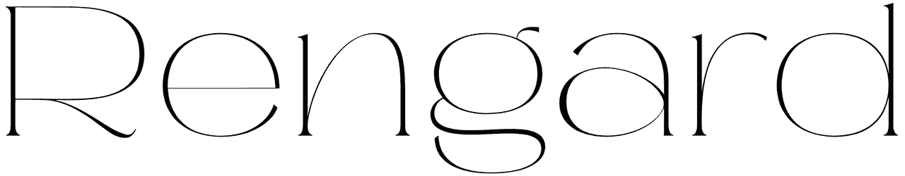
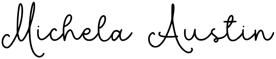
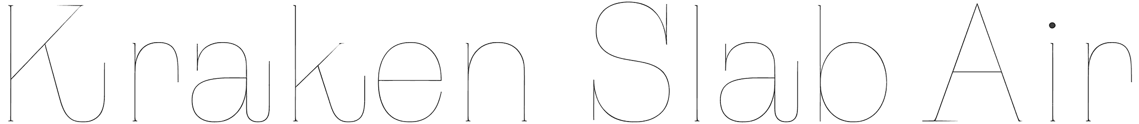
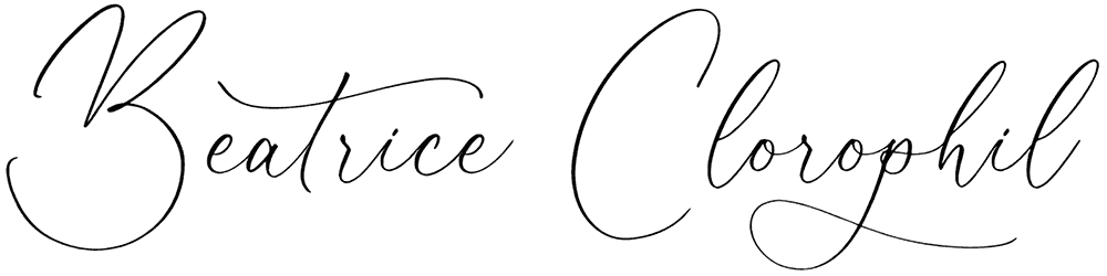
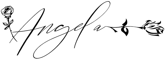
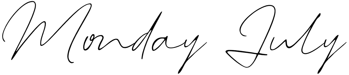
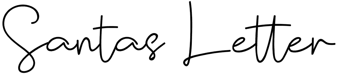
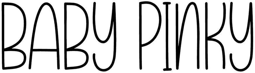
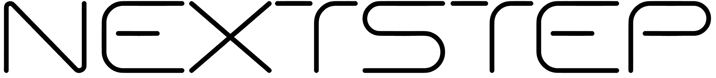
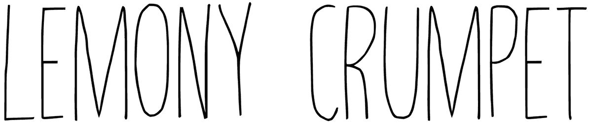
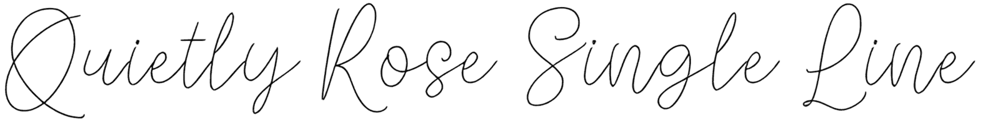
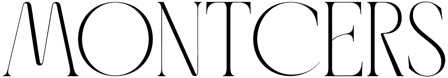
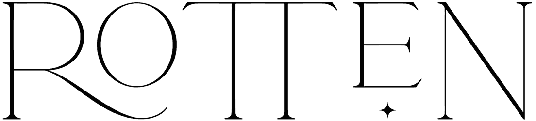
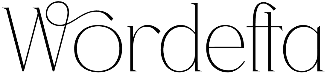
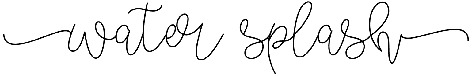
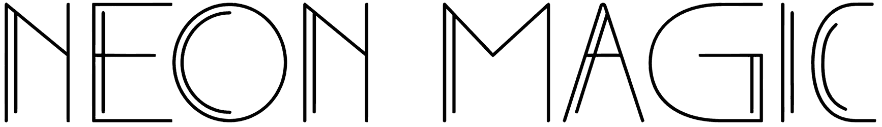
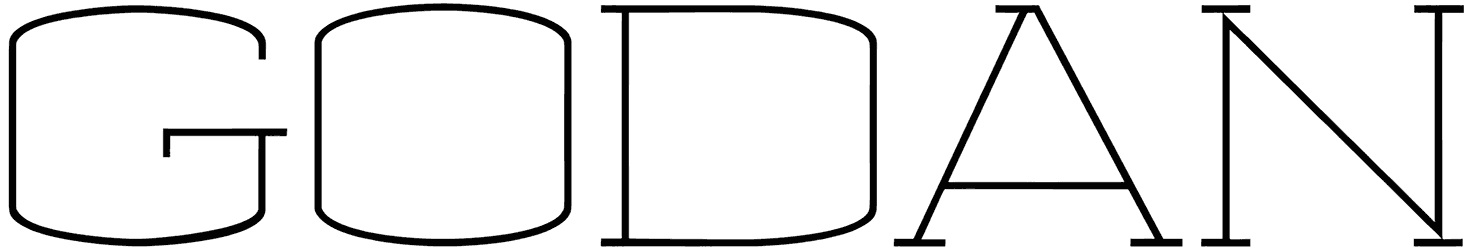
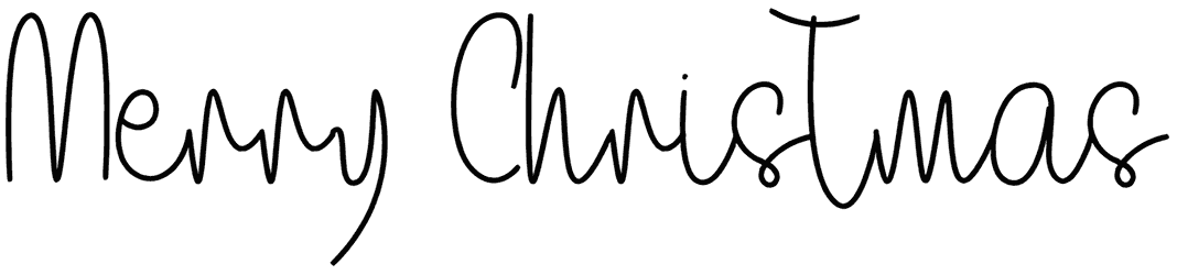
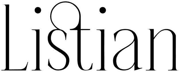
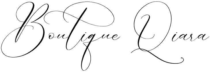
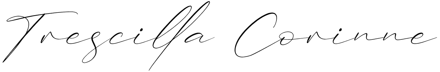
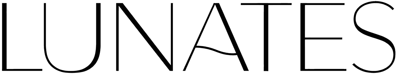
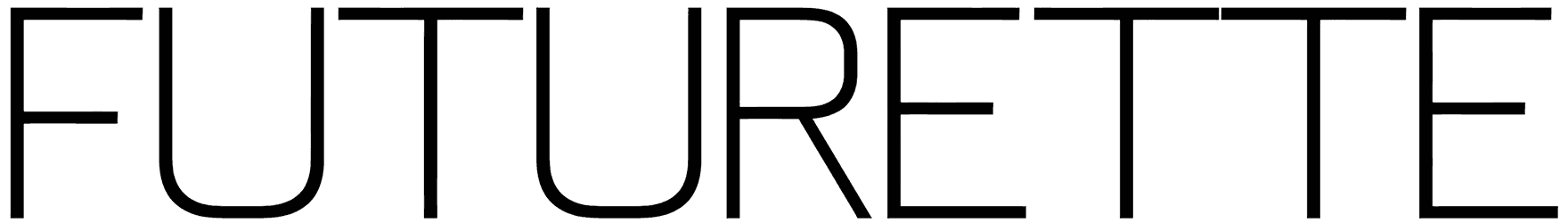
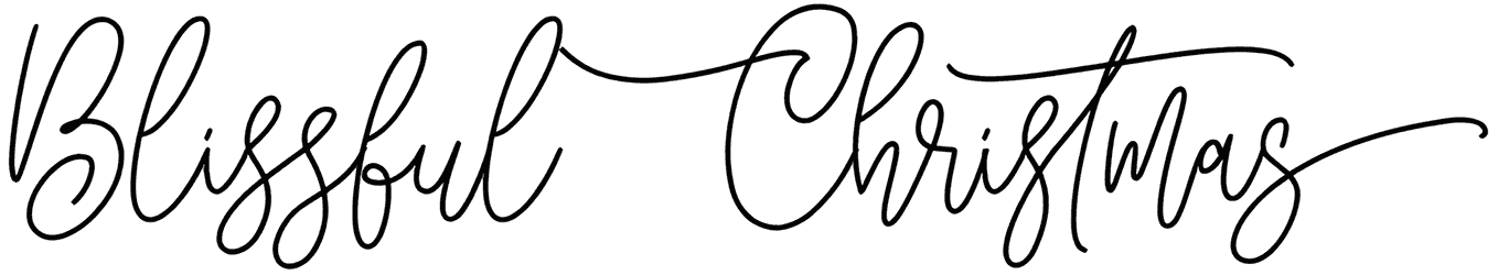
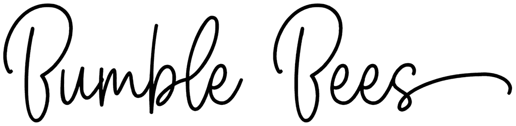
- What are thin fonts often shaped like? You’re going to recognize these fonts based on their delicate figures. Everything about them is exactly the opposite of bold, but that’s not going to stop them from being eye-catching. Case in point, calligraphy fonts are never anything but thin and they still work like magic, right? So never underestimate how effective they can be. Here, every typography will end up neat and classy, especially with one of those gorgeous sans-serif versions. In fact, they can be styled as crisp and sharp, or sometimes as round and cute, each perfect for two different kinds of application accordingly. These thin letters are usually designed to be tall to make up for the lack of thickness in their font style and be easy enough to read. However, their overall structure is rather simple, because there’s no room for elaborate textures on their bodies. For one thing, you’re not even going to notice if they feature a grunge look or not. Still, you shouldn’t completely dismiss their decorative touch. Think about it. With a cursive form, they will look a lot like a real piece of handwritten text, won’t they? That comes in handy on several occasions.
- What do thin fonts add to the general mood of your writing? Judging by their stylish look, it completely makes sense to think these fonts belong to the futuristic genre. That’s just because there are so many of them used in modern designs all the time. The truth is that the thin alphabet can be just as great in vintage themes too. This change of era doesn’t make them any less appealing though. They make you feel comfortable, just as they did back then. Once you use them to personalize your lettering, it’ll just begin to feel light and cozy like nothing else. They can be tender and subtle, but that’s exactly how thin fonts get you hooked with their nice feminine quality. Every last detail about them points out their gentle approach and it won’t ever stop being charming. In fact, thanks to that obvious elegance and cutting-edge spark, everything here will be such a great match for anything regarding fashion design or some kind of technology project.
- Where should you apply thin fonts to get better results? It’s not that often to see a poster designed with a thin font, but that can also happen. Who knows maybe it was even better than using heavy letters, especially if you want something close to hand-drawn letters. Other than that, they’re useful when you want to put your brand’s name on a store sign or business card, for an art gallery, spa, jewelry store, or maybe even selling clocks. Also attractive enough to elevate your marketing material, these fonts totally qualify for your social media posts.
- What else will you find in this vast inventory of Resource Boy? As you can see, all the world’s best thin fonts are right in front of you. However, if you keep looking, you’ll discover a whole new world of resources here, including our cool collection of minimalist fonts and tons of other stuff.