When it’s absolutely essential to make your text noticed, we don’t recommend the minimal lettering that is so trendy nowadays. In fact, you should take the exact opposite approach to stick out. The boss letters of our thick fonts should be able to produce a piece of typography that conflicts with the conventionally simple texts you see everywhere. These fonts can appear in just about any form and flavor that you require, making sure that your communication with the audience is powerful enough. Those fat letters can get straight to the point, keeping distractions at a minimum. Given the usefulness of this font category, you need as many of them as you can get. Good thing you’ve got Resource Boy for that. With so many cool thick fonts for you to download, you’ll always get to make your point in any design rather effortlessly.
Pro tips about thick fonts and how remarkable they are
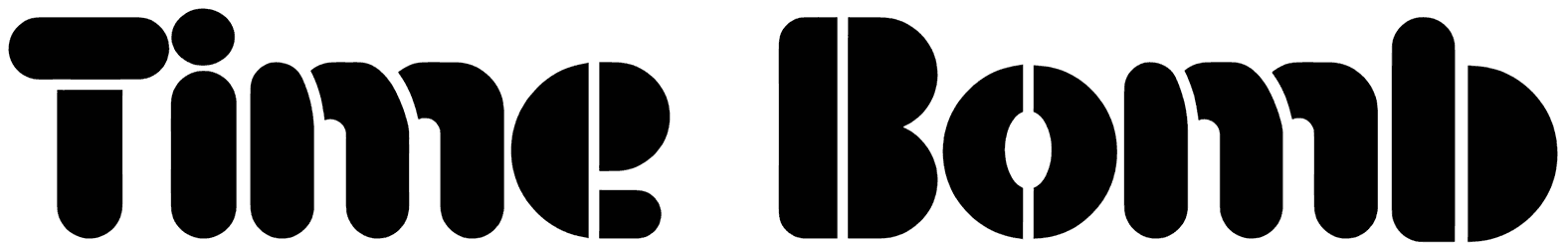
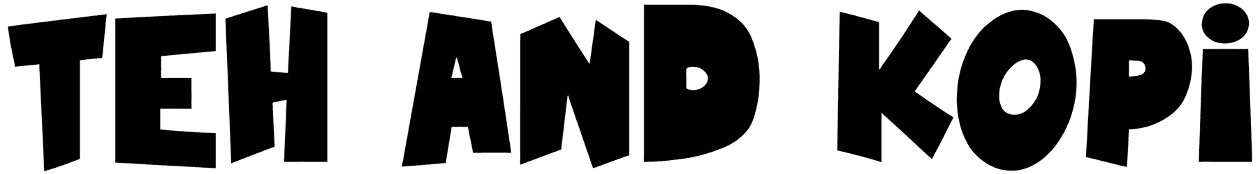
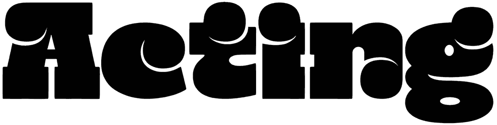
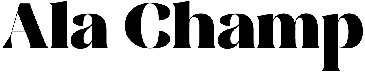
- What is so special about thick letters and their style? When you try to think of a thick font, it’s probably a sans serif font with heavy bodies that comes to mind first. The truth is that these fonts can actually be designed in a variety of styles, but it’s their well-expressed appearance that sets them apart. So you don’t have to go with all-capital texts every time you want to emphasize your words anymore. These chunky uppercase and lower characters may be inspired by calligraphy, outline style, graffiti, script, brush strokes, shadow, or hand drawn elements. This way, you don’t just get to produce something highly legible, but playful too. So they’re all supposed to be dense and big, but they can also come across as cute or elegant. Plus, their concrete design is straightforward enough that even as cursive, they will avoid any misleading.
- What does it mean in emotional terms when a text is written in thick letters? The prominent letters of these fonts successfully associate your words with a recognizable character that is reliable and determined. Designed to be sturdy, the thick alphabet gives your writing strength and a sense of authority. Your texts get highlighted with an extra dose of importance through these bold characters and you get to feel how they express stability in your tone. Some people believe that these solid fonts come with a masculine quality, but that’s not always the case. Thick letters can look stylish too. Considered to be loud and grabby, these fonts are great for implementing modern vibes in your writing, and not just in English, but in other languages too.
- What designs are usually a better match for using these thick letters? There’s no particular rule saying that you shouldn’t apply these thick fonts to a certain typography design. Although you may want to steer clear of using them in your body content. They’re clearly more of a title material. Next time you’re asked to design a crowd-puller logo for a gym, you can see how extremely effective these fonts are. You may even have a spicy sign to make for a motorcycle store or some other shop, and that project will also be out of your hair shortly once you decide on the thick font you want to use. As it appears the collection is also suitable for your sports designs, like promoting a wrestling event or a boxing match poster. Captivating enough to turn into tattoos too, these fonts seem to be quite unrivaled in a variety of situations.
- Don’t you wonder what else is stored in the other sections of our awesome graphic design library? We’re proud to announce that our rich bundle of thick fonts has made it to the top of the list of sources for downloading these fonts on the internet. We can bet good money that finding the other types of fonts is not exactly a walk in the park either. So why don’t you check out our striking block fonts, these aesthetic bold fonts, and the list of creative fat fonts right here on Resource Boy and save yourself the trouble of looking around?