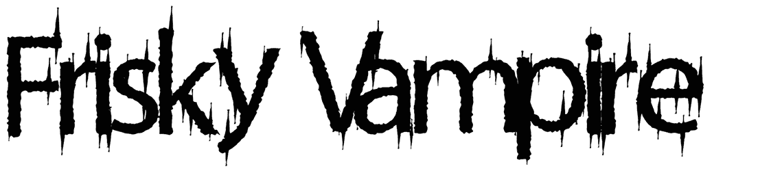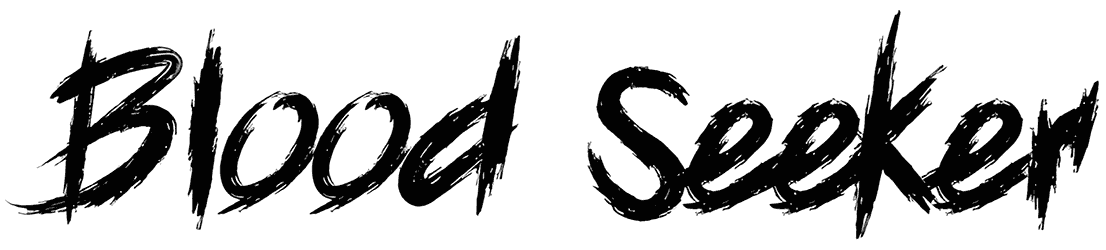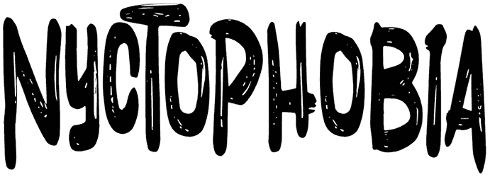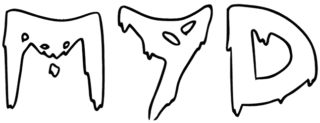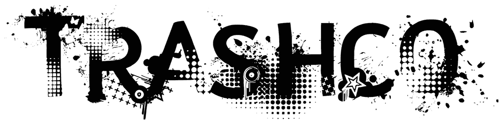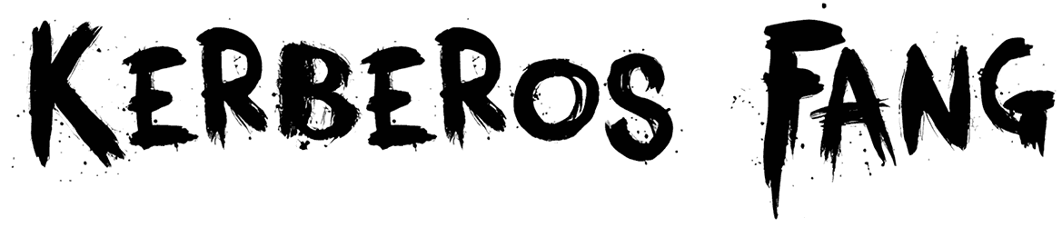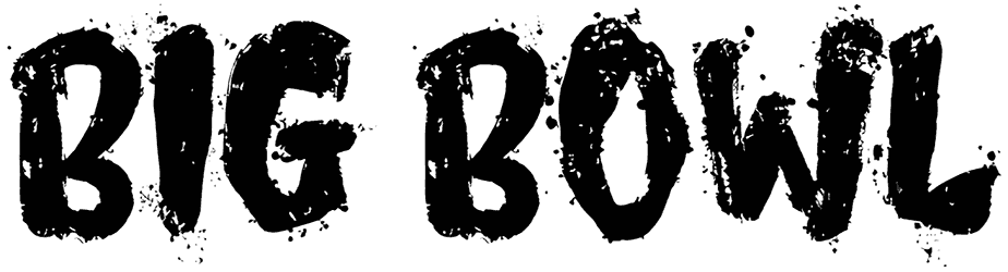

Blood 4 the People looks ripped, scratched, and painted in a rush. Heavy black strokes break into jagged edges, dry-brush gaps, and irregular spikes, giving the alphabet a violent handmade texture rather than a polished horror effect. Compact counters keep the forms dense, while the uneven silhouettes make every word feel restless and unpredictable.
Use Blood 4 the People font for horror posters, punk flyers, metal artwork, Halloween graphics, distressed packaging, or underground apparel. Push this blood font large against stark backgrounds and let the damaged texture stay exposed; black, dirty white, crimson, or acidic accents fit naturally, especially alongside clean supporting type that sharpens the contrast.
Note of Designer
Blood 4 the People.
WOODCUTTER
MMXXII
Free For Personal Use OnlyDonation link:
https://www.paypal.me/woodcuttermanerocommercial licenses available:
contact: [email protected]http://www.woodcutter.es
Social:
http://www.facebook.com/woodcutterilustration
http://www.instagram.com/woodcuttermanero