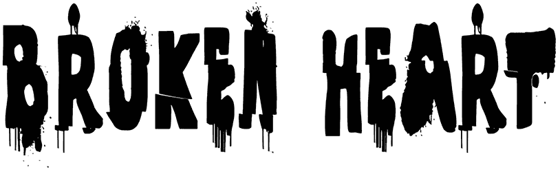
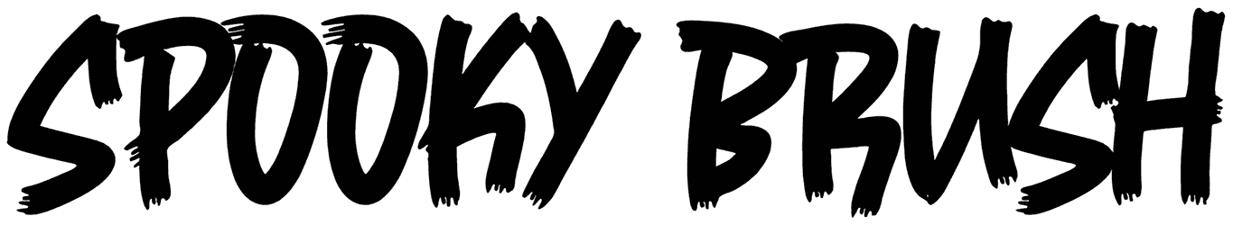
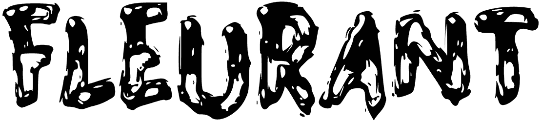
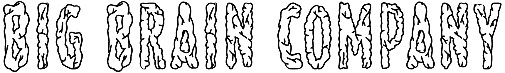
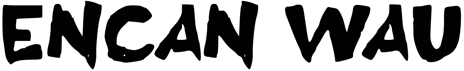
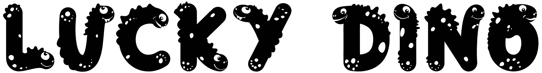
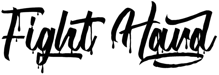
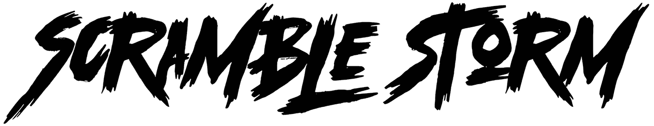
Boo your viewers with the cartoonish crooked letters of spooky fonts and catch them off guard! You don’t always have to wait for Halloween night in October to get a kick out of RB’s stunning creepy fonts collection. Leaving no stones unturned, Resource Boy has successfully conjured the coolest most expansive bundle of spooky fronts on Google from all around the world. Yes, they are all creepy but not in that alarming way you’d expect to scare everyone off. Quite the opposite, their spookiness is somehow so inviting that you just can’t help being impressed. The plan is to give you the chills and in doing so, stick to your mind eternally! So you better download as many of them as you can. It’s always fun to feel your heartbeat rise while working with a spooky font.
A quick but thorough introduction to creepy and spooky fonts. What others don’t explicitly tell you, we will:
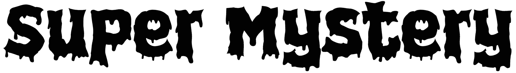
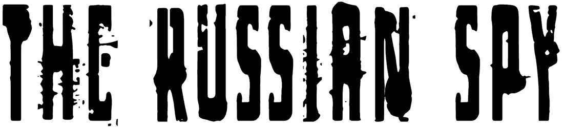
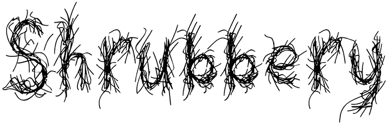
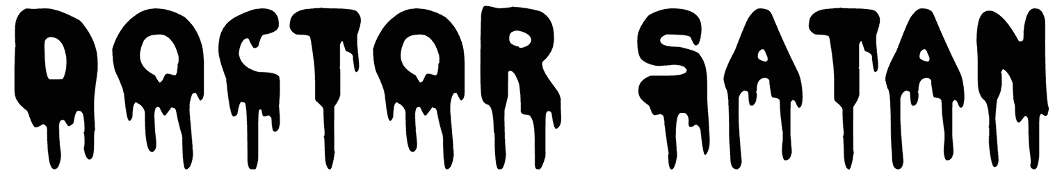
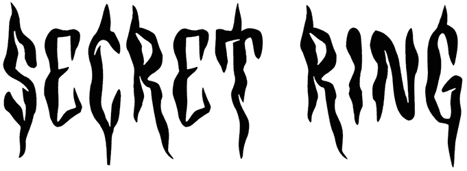
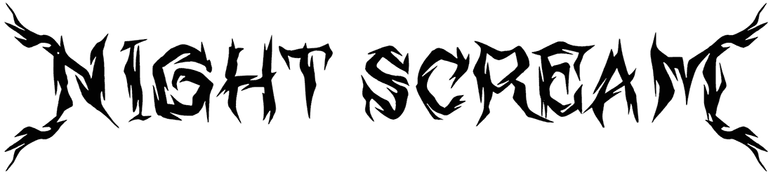
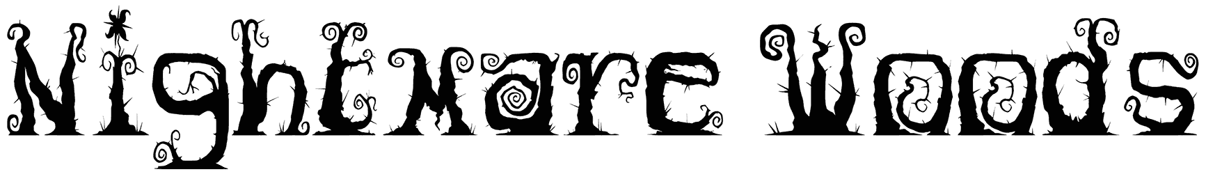
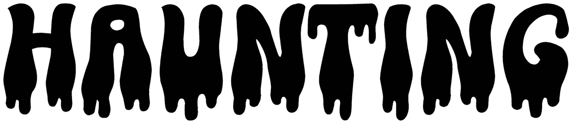
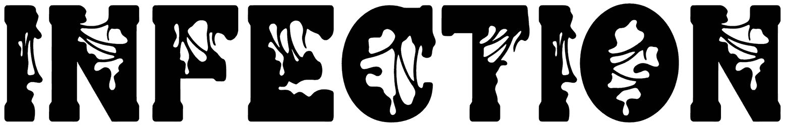
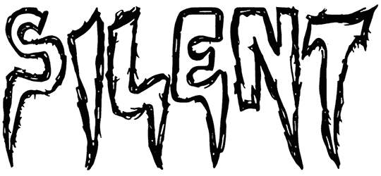
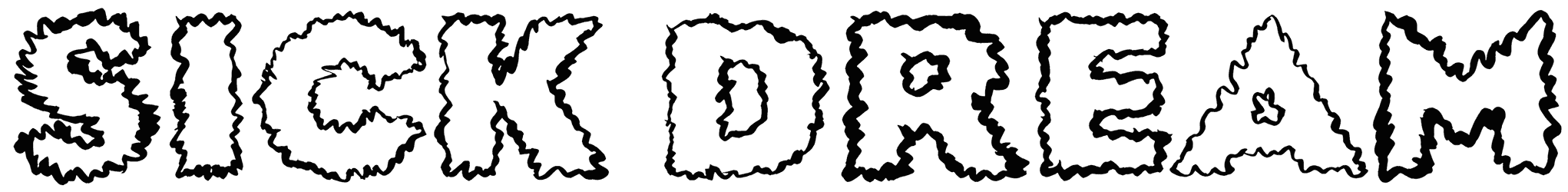
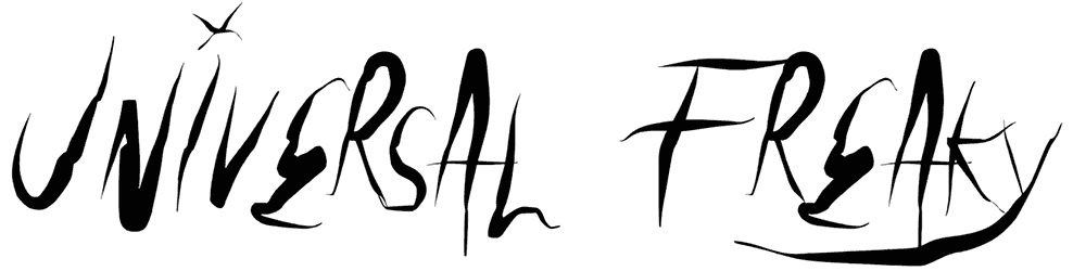
- First, there’s the obvious creepy style and how it’s captured through design details in each character: Despite looking as distorted and crude as it does, the creepy alphabet still counts as one of the cutest options for your typography. Even as handwriting, it’ll look more like some witch’s potion recipe than anything else! So there’s no way we would expect neat calligraphy from it if we were you. Even the cursive style that is often supposed to give your text an elegant edge, here opts for inducing an unsettling sense of unsafety instead. The result? Definitely something you wouldn’t want to see at 3 AM! Not even when they look like bubble letters which are known to be a lot less creepy. Since spooky texts are abundantly seen as bold and sharp, you can imagine that red suits them better than all other colors, especially if they’re drippy with blood.
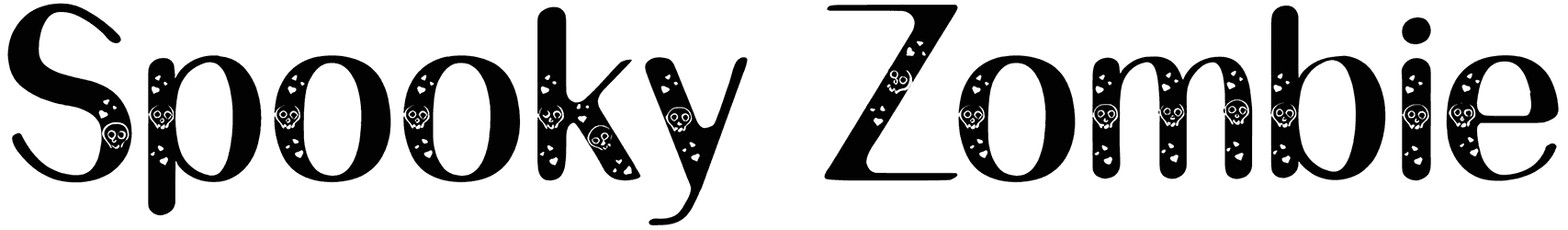
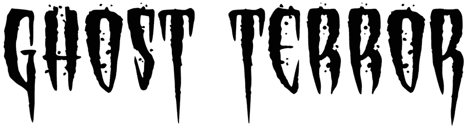
- Second comes the spooky vibes. Impossible to miss even if the text is in an unfamiliar language: When you apply a creepy font to your writing, expect nothing intimidating or terrifying. At most, it may just be a little weird and awkward to make things fun, but that’s it. Their rough words are surprisingly good at being playful so don’t ever use them to depict a sinister context or for anything that you want to be perceived as genuinely intimidating. The most they can do is come across as mischievous or adventurous, even mysterious sometimes, but never sole-crushingly frightening. That’s because the creepy alphabet is more lovely than it should be to pull off a scary mood.
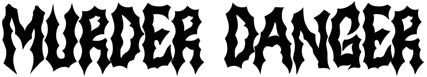
- Third, we’re also going to give you some ideas about where to use these spooky and creepy fonts: Once you see the magic of creepy letters and numbers first-hand, you’ll be looking for any chance to pick them for your lettering. A lot of artistic tattoos, creative graffiti, gorgeous happy birthday cards, and gaming logos couldn’t have been designed and presented to the world if it weren’t for creepy fonts and their unique influence. Needled to say, any Halloween flyer you see on the street that sparks your interest immediately, chances are you’re looking at a happy Halloween written in one of our creepy fonts. Their fancy spooky letters always find their way into your artwork and make it ten times more interesting. So make sure you don’t use one of these spooky fonts unless you want the final work of art to be easy on the eyes.