You can never be sure of the final unique look of your text, but with a distressed font, you’ll have nothing to worry about. It may not exactly seem neat or new, but it takes the exact opposite approach to clash with the usual expectations and stick out. In fact, that grunge appearance can do you a great favor. We’re so used to seeing intact designs these days that it has become easier to turn heads if you just defy the conventions instead of going with it. So to make the world notice you, find your own set of distressed fonts from this list of RB and let things get a little crazy once in a while.
Everything about distressed fonts and their undeniable intrigue:
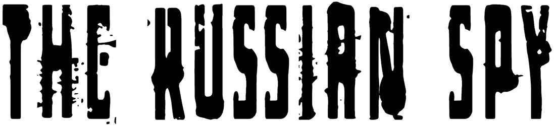
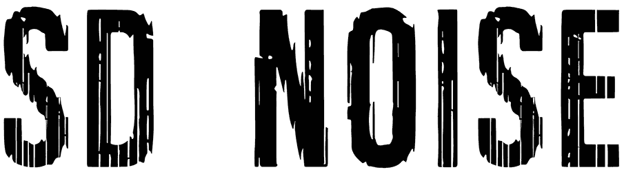
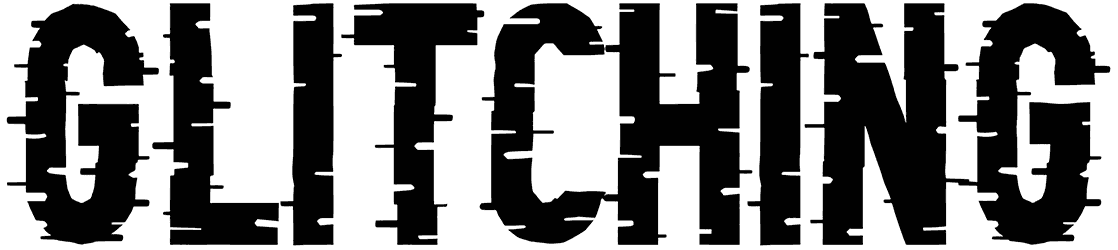
- Where does that visual appeal come from anyway? There’s no way you could mistake the letters of distressed fonts because they’re all literally marked. Some are scratched, some others are stenciled, and a lot of them are simply worn away. So to sum it up, they all manage to reach a rough appearance one way or another. To put it in simple words, these weathered characters are supposed to be as far from perfection as possible. But who needs a perfect style anyway when you can instead do so many cool things with a harsh look like this? Whatever you wish to achieve, these distorted characters can get you there in no time. If you don’t mind the messy look, they will be one of your top go-to fonts whenever you want to make a memorable impact on your audience. Plus, this kind of textured design can also highlight more details about your lettering, like whether it’s stamped, or written in spray paint or with a brush. That’s right, these fonts can totally be handwritten too, unlike what people may commonly believe. It may even be more charming. On another note, since these fonts already promise a strong aesthetic look by default, they can deliver enough decorations even without serifs. Nevertheless, if you prefer to take things further, we can totally set you up with serif versions from our collection.
- How does your mind interpret splatter letters emotionally? This eroded style can have plenty of different meanings, based on what you’re trying to convey through your lettering. For example, it can be suggestive of an aggressive approach, while other times it’s just there to make things a little more playful in your typography. In fact, when you include hand-drawn characters or round letters in your writing, it tends to adjust your tone and make it less intense. So there’s no need to worry about being too harsh. In other scenarios, that faded style is used to point out how aged your words are. Besides, how great would it be to design your rustic works of art with something as realistic as the distressed alphabet? The way they create such bold text is uncanny. Actually, it can make any design of yours work more effectively.
- Where are distressed fonts applicable? Countless projects can use such creative letters to transfer the message. Imagine you have a sign to design for a woodshop or an antique store. Wouldn’t it be just awesome to put a distressed font in charge? Or let’s say, you want a one-of-a-kind tattoo for a client of yours. Then this list will give you a wonderful opportunity to take care of it perfectly. Also, you’ll find these fonts here a great choice for labeling your products artistically or creating a music cover for your rock song.
- What are the closest things to this collection on Resource Boy? The next best things we can offer you are our terrific selections of destroyed fonts and dirty fonts. Just keep digging into our inventory if you want to be blown out of your mind.