You’ll forget all about a nice attitude for your typography once you see the strong effect of horror fonts on the viewers. Just click to apply their terrorizing letters to your typography and boo! Their attention is all yours. Let them fall victim to the irresistible charm of your design and finish them off on the spot. However, what’s even scarier than these fonts is when you can’t seem to find your ideal one after searching different websites. So we offer you to bookmark Resource Boy now because it’s the only collection with so many fonts. It’s easy to find the perfect fearsome font when you have countless options in front of you.
Find out the answer to all your questions about horror fonts at once
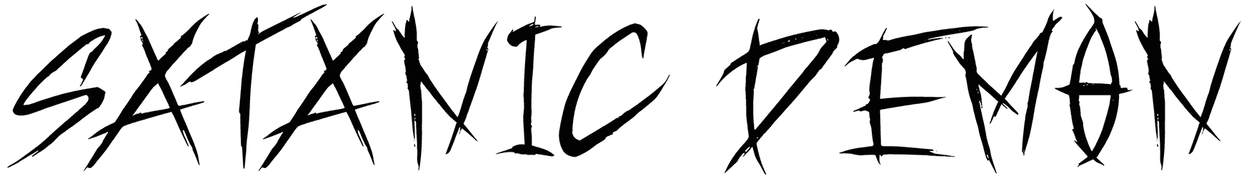
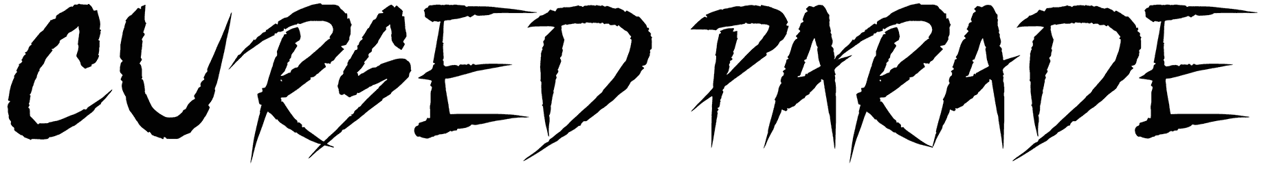
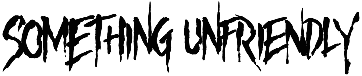
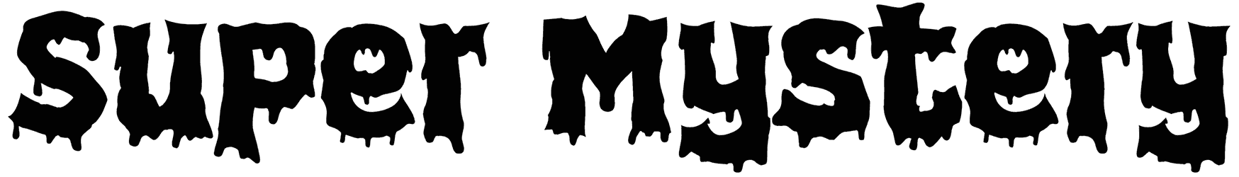
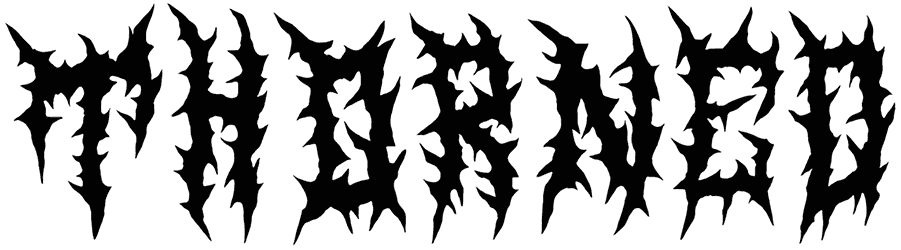
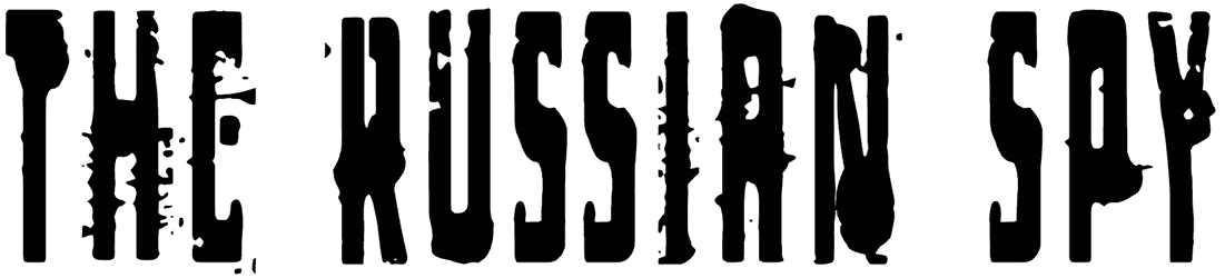
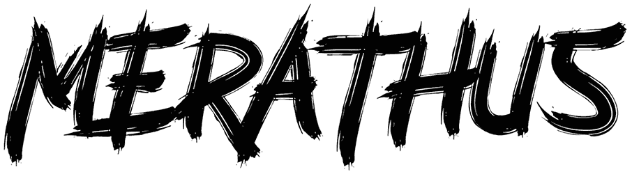
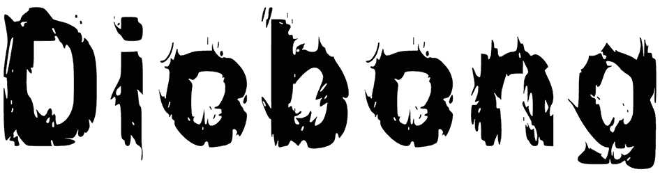
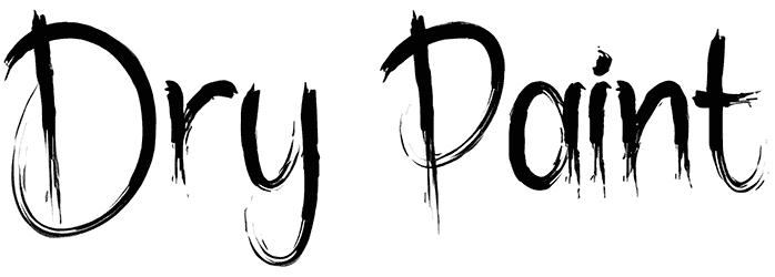
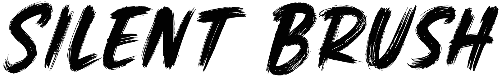
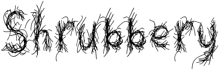
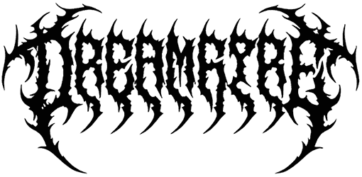
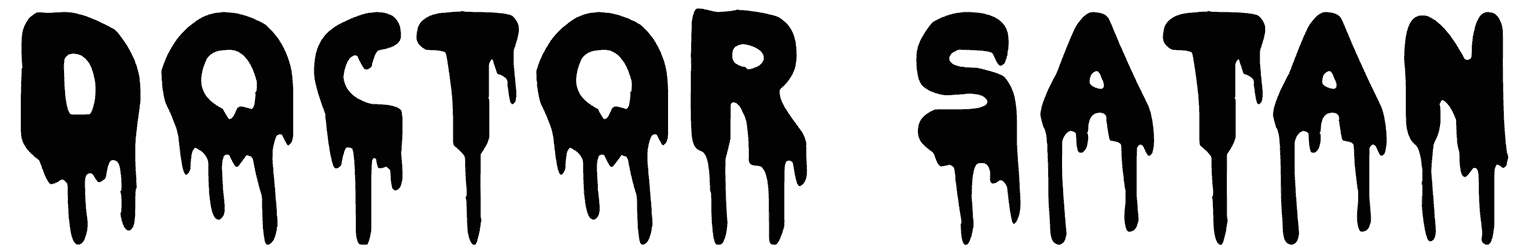
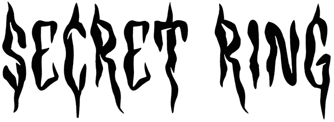
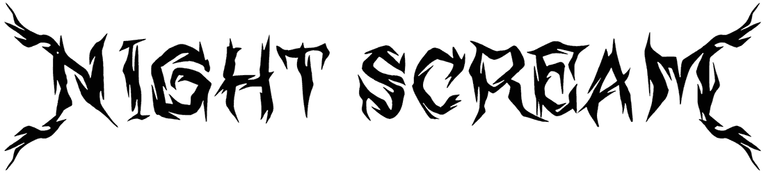
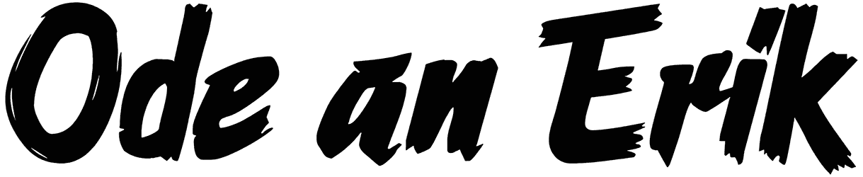
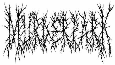
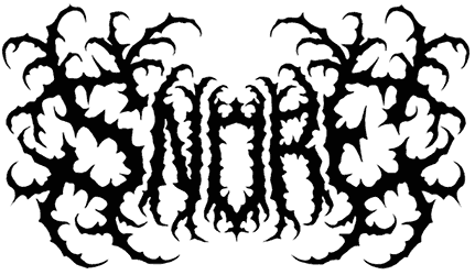
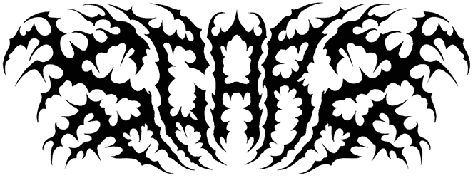
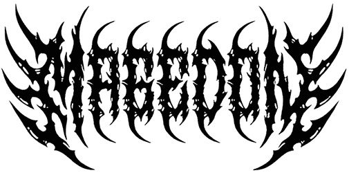
- How should you know you’re dealing with a horror font and not something else? It’s highly impossible that you will ever have any doubt about recognizing these fonts. Their terrifying design is so obvious that no combination of different styles can quite conceal it. Even a calligraphy style can’t make things right. For all we know, any attempt to add a fancy touch to these letters would only make it sound more dreadful. Likewise, their cursive versions are rather confusing and spine-chilling instead of elegant and stylish. Even the fun bubble letters tend to look nasty, or else they wouldn’t have ended up in this collection. They’re so good at creating a rough look for your words through metal characters, sharp letters with scratch marks, and a dirty effect, making your text appear harsh. Even the graffiti fonts will no longer be playful once they combine with this super distressed font style. The horror alphabet may appear as drippy blood fonts, letters shaped like splatters, or skull fonts with bones and everything that will all make a crude face for your art.
- How does the audience usually respond to reading something written in these fonts? Turns out these fonts can do a lot more than just creep you out. They can pick an aggressive approach to convey a message, represent a hardcore personality, warn the audience about a danger, or symbolize evil. And as if it’s not enough that they show satanic vibes sometimes, their dark concept can be associated with death too. Some of them rely on a crazy look to scare the hell out of you, so if you ever wanted to come off wild in your lettering, count on their intimidating letters. Like our spooky fonts, they will destroy the innocence of your plain words and replace them with an alarming aura. The edgy horror letters and numbers also signal a fighting mood. All in all, this scary approach is supposed to favor your writing with a daunting tone. Think about it. Doesn’t it feel much more exciting with Happy Halloween written in blood?
- What is a good time and place to use these fonts to scare the life out of your audience? Using these fonts as your Halloween fonts, you’ll always be prepared for October. They’re also fit for cool artwork like the cover design of your death metal albums and tattoos. If you want to have a simple job designing bold awe-inspiring logos, make sure to download these fonts. They will fill your artwork with fear whether it’s a themed happy birthday card, or movies and games with zombies and ghosts. Plus, you can always make more people panic if you customize them in red.
- What other types of graphic design tools are assembled in the library of Resource Boy? Other than offering you these awesome frightening fonts at such a great variety, we can also tell you what goes well with them. Download these free barbed wire textures and spider web textures from RB and they sure make things look more horrifying next to these fonts.