Polished and clean letters are not always the answer you’re looking for. Sometimes, you have to go the exact opposite direction and customize your typography with letters as gruesome as slime to get results. There’s nothing wrong with attracting more attention, and if looking slimy is what it takes, then why the hell not? Of course, the real challenge begins when you decide to use slime words in your design. It’s not like the best of them are lying around, making it easy for you to find them. You should have a reliable source for downloading these fonts; and as the collection with the highest number of included slime fonts, Resource Boy’s bundle is the only website for designers with high standards. You’ll just know you’re not missing any options. Plus, you get to make the best choice. So, let’s see what we’ve got for you here.
You can’t say you’re good with slime fonts if you don’t know these details about them
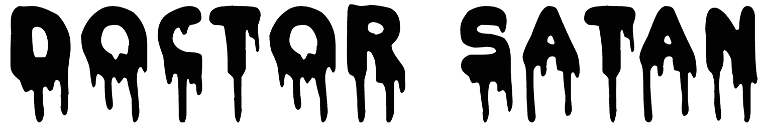
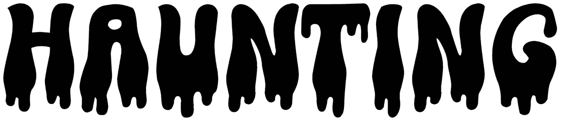
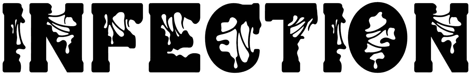
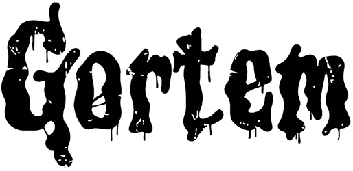
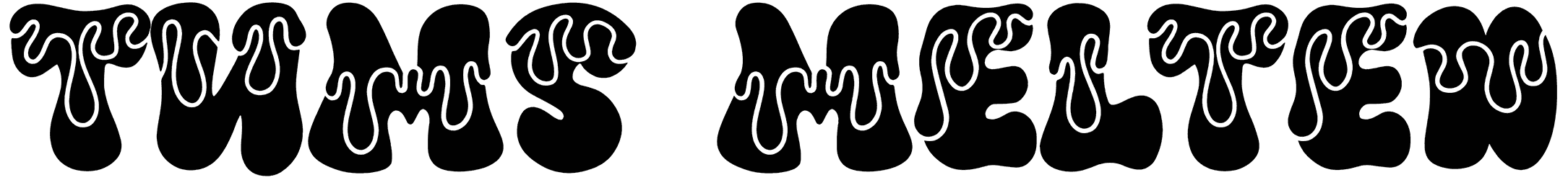
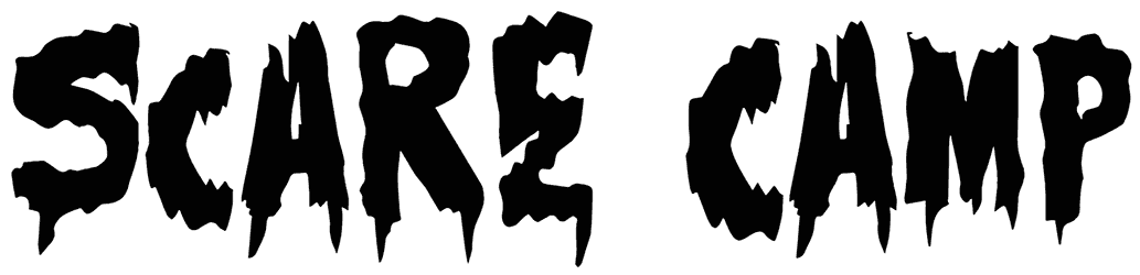
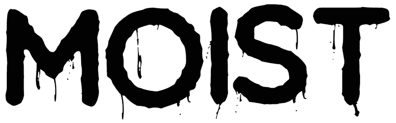
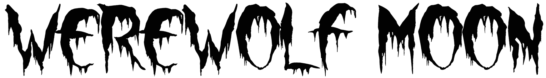
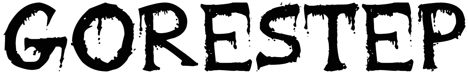
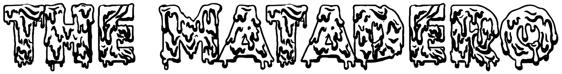
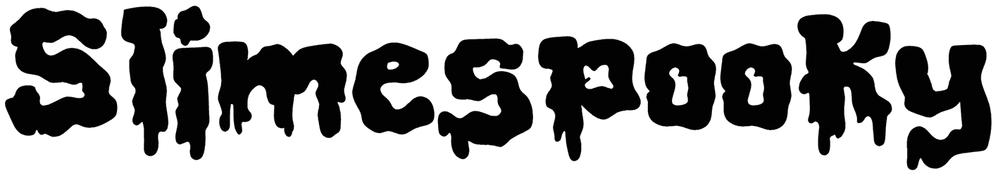
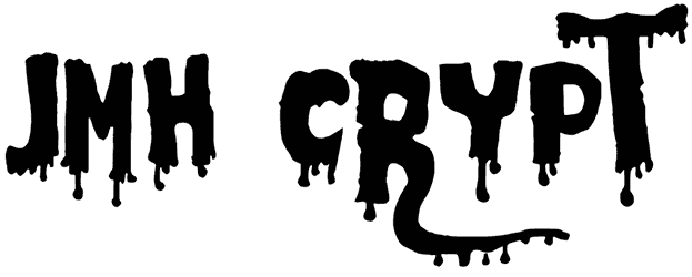
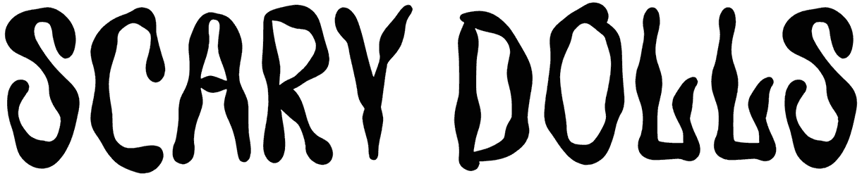
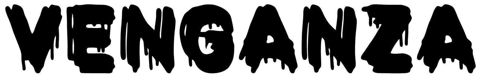
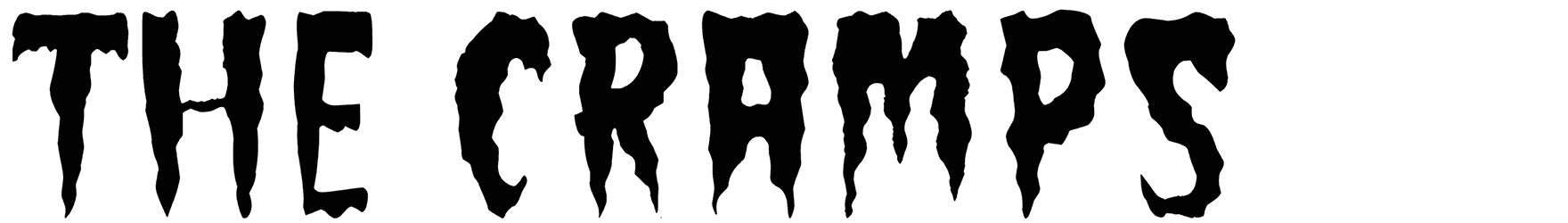
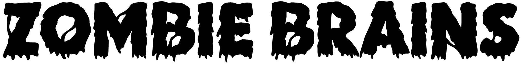
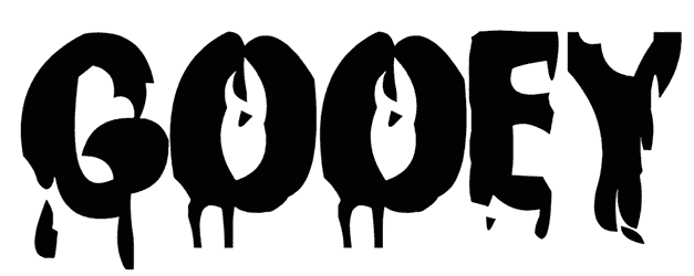
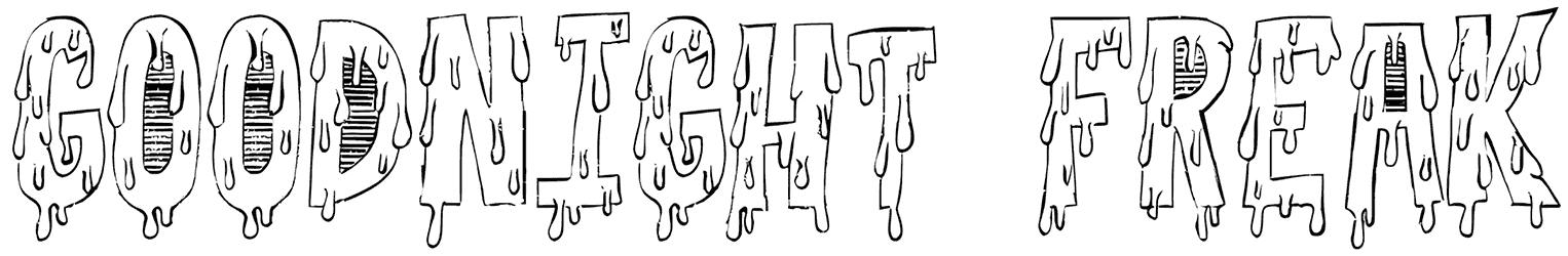
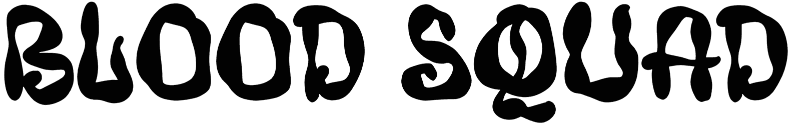
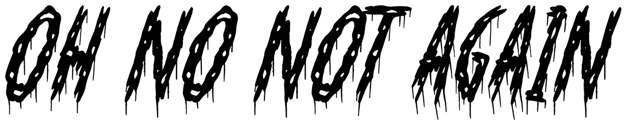
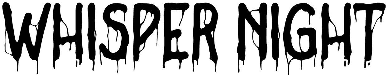
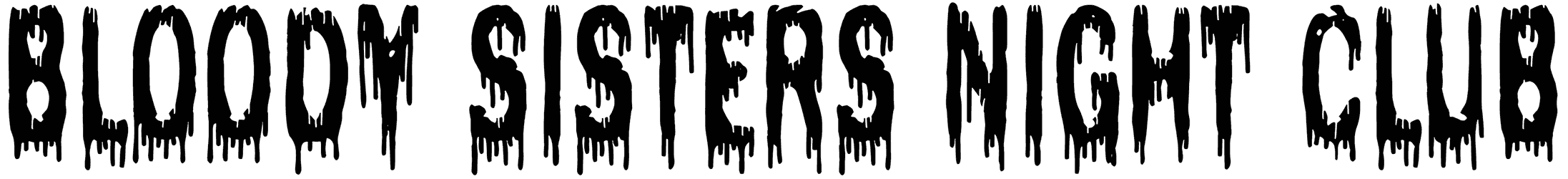
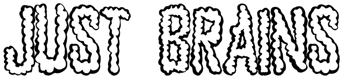
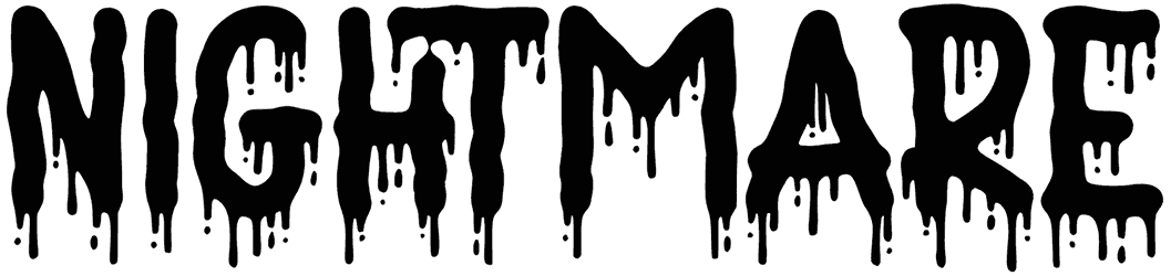
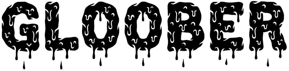
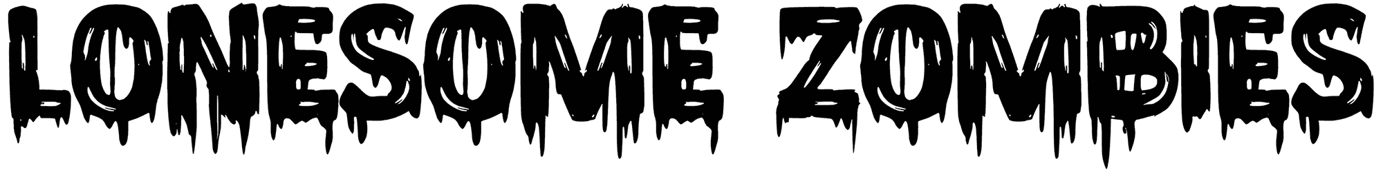
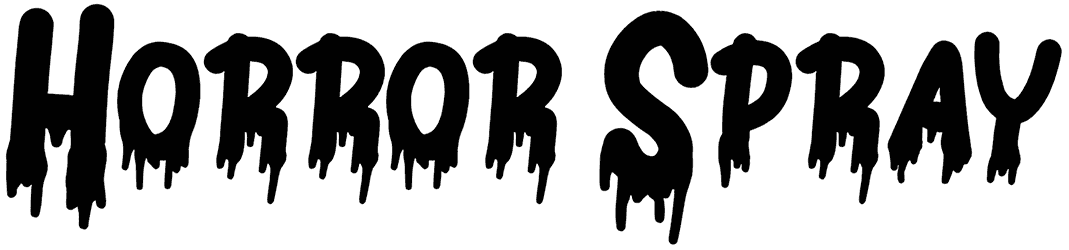
- Our slime fonts are proof that it’s not a clean look that’ll always get noticed. Slimy fonts count as one of those font families that pick an unconventional approach to make a lasting impression. Before you accuse them of having nasty bodies, let’s not forget that it’s their sticky design that makes your words stick in minds too. Thanks to their melting material, slimy fonts have a natural gift for turning into cursive texts. Plus, those soft edges don’t exactly allow you to call them monsters, just because they are irregularly shaped. The often-green slime alphabet doesn’t need neat characters to display a bold personality. Even though their eccentric style can’t be denied, you can dial down their grotesque look by involving features from other styles like bubble, Y2K, blood, cartoon, or graffiti. What remains is sure still surrounded by gooey qualities, but at least it sounds a lot more fun.
- Let us guess, our slime fonts make you feel a bit disgusted sometimes! No one said this was going to be a nice and clean job to work with slimes. If it has to get ugly to be remembered as special, then let it. However, if you know the first thing about slime letters, you should know that they are more cute than icky. As the slime alphabet drips all over the place, creativity also drips with it. So you can’t complain about their imperfect design or how smelly they seem, when the truth is, slime letters are not even repulsive enough to scare off children. Sometimes you have to make your lettering look toxic on purpose, and that’s when you’ll acknowledge our lethal-looking slime letters. The whole purpose of the gross slime outline fonts is to ooze creepiness in different doses. They are often balanced out by playful characteristics though to avoid an unpleasant result.
- You’re going to find our slime fonts more useful than you think. The more projects you do with our slimy fonts, the more enjoyable you find them. If they weren’t good at all, then why are there so many logos out there made with slime letters? They might not exactly do things in an elegant fashion, but that’s what sets them apart from other fonts. So try not to sleep on the slime numbers and letters. You don’t know how cool they can look once you turn them into tattoos or happy birthday cards. They’re probably more popular as Halloween posters, but you’re also going to love these slime words in your games, or some other design that revolves around kids.
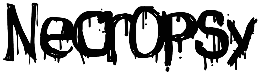
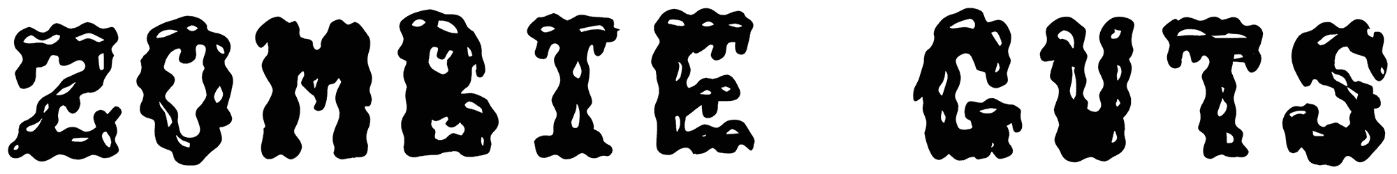
- There are just so many more design assets to show you on Resource Boy, besides our awesome slime fonts. Gathering all the premium and free slime fonts from different sources was certainly not a walk in the park for our team, but we did our best anyway, and we all agree that we crushed it. Pretty much like any other design tool we have to offer you! So we're not going to let you leave before we recommend you some more design gems. For the most similar results to this current font collection, visit our terrific melting fonts, zombie fonts, and dripping fonts and download them in the best quality.