Customize your design with the striking letters of skateboard fonts and all the attention will be yours just like that. Once you see the liveliness added to your lettering by these fonts, you can’t go back anymore to how uninspired your text sounded at first. Some of them may look a bit old school but even those will surprise you by how they let things work out toward an engaging output. Anyone who discovers the electrifying touch of this font category is going to become obsessed. Good thing we have already assembled this bundle to supply you with an unlimited source of skate fonts. Together, let's check them out now!
Before using a skateboard font, you should know what you’re getting yourself into
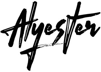
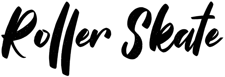
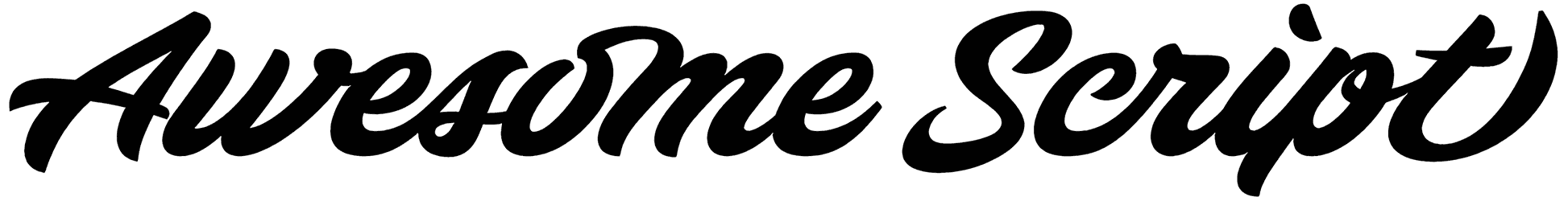
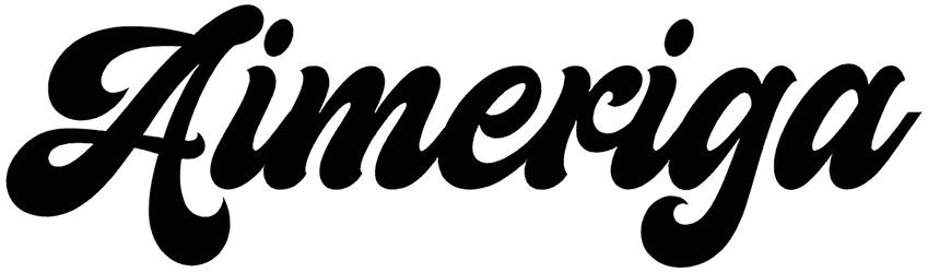
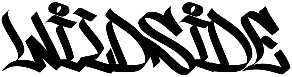
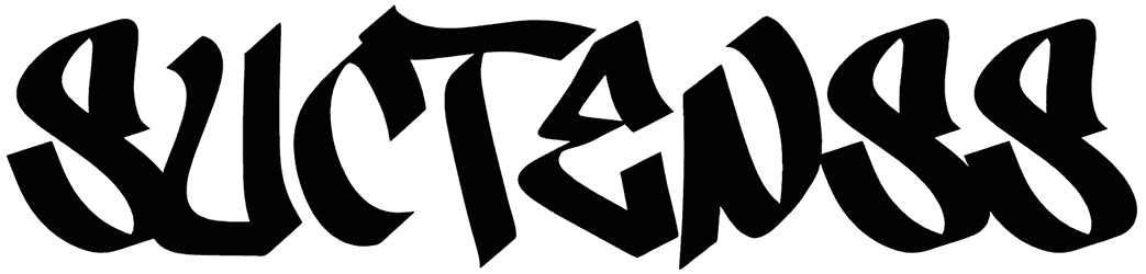
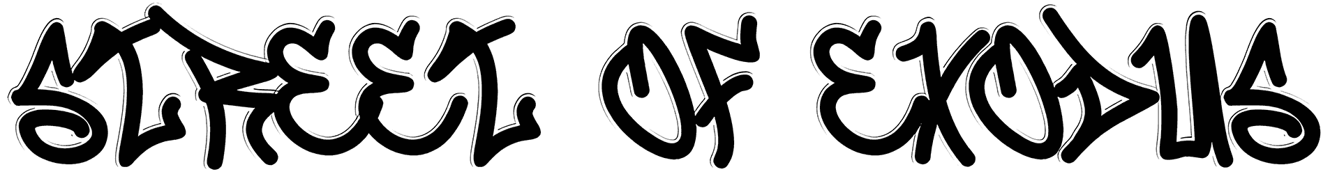
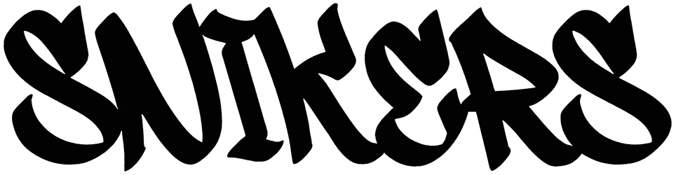
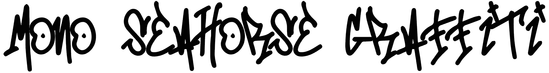
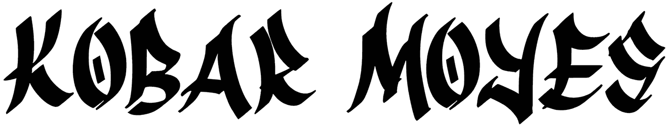
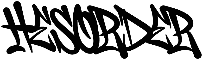
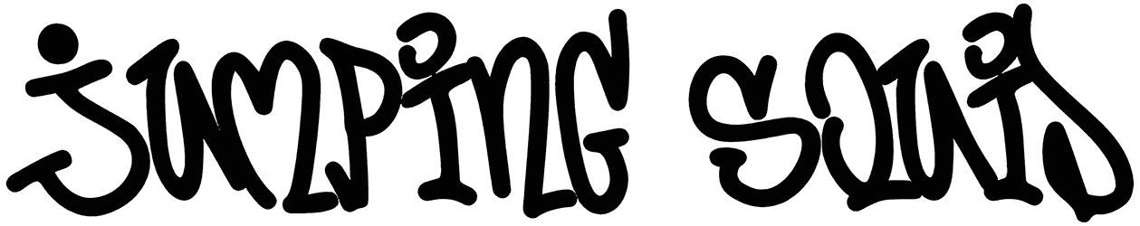
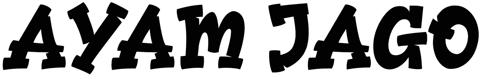
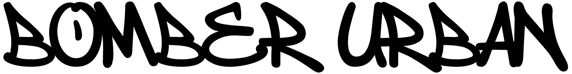
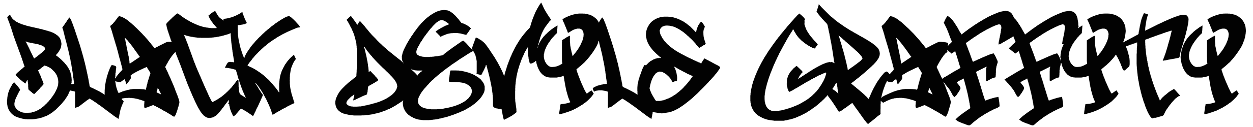
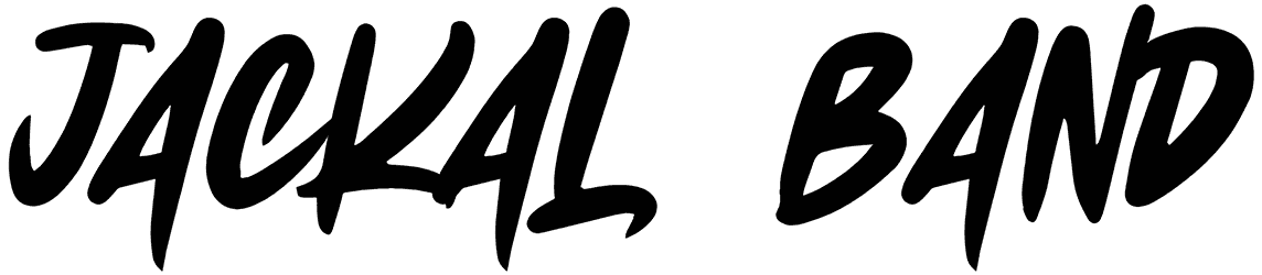
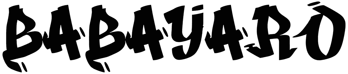
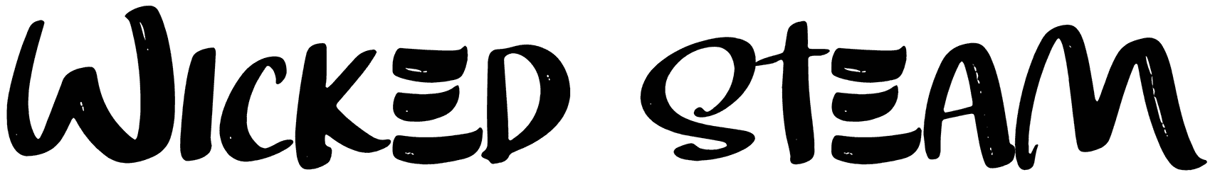
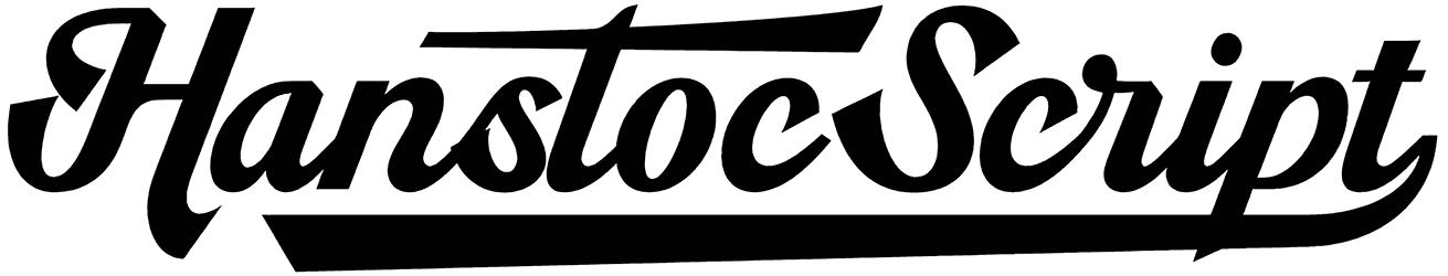
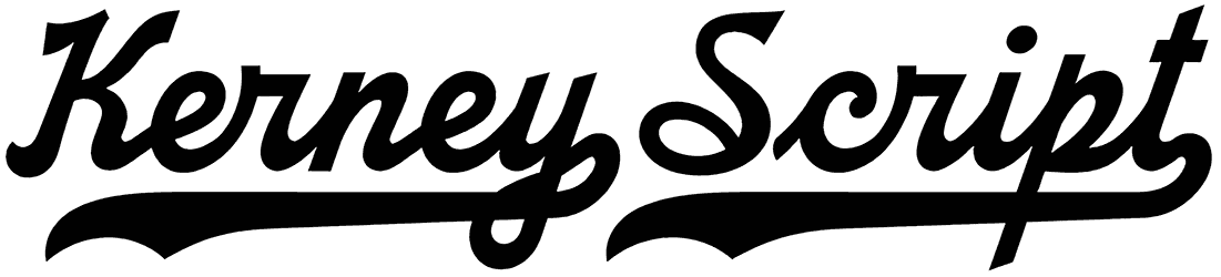
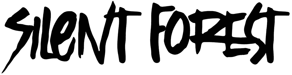
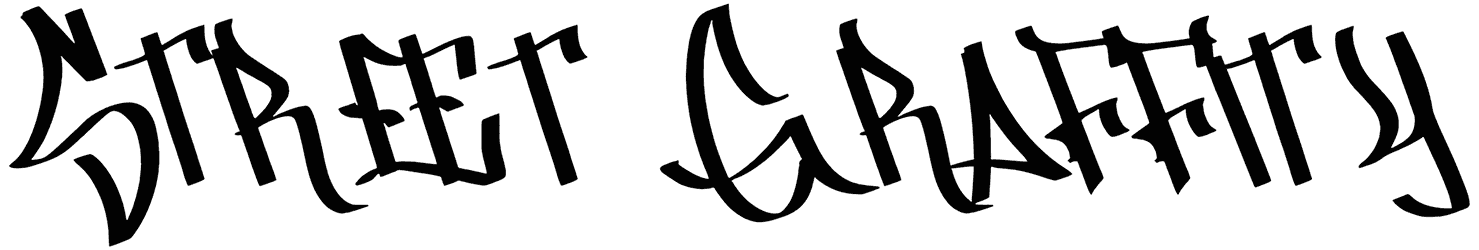
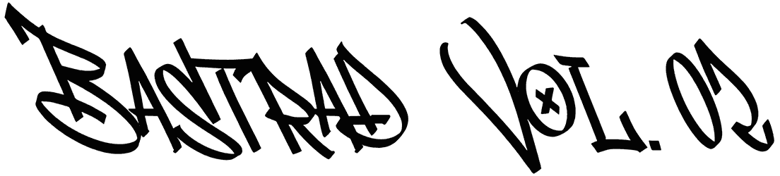
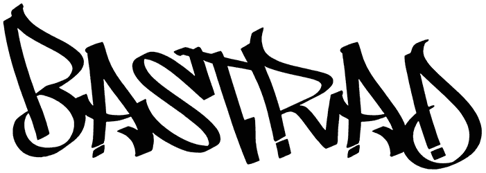
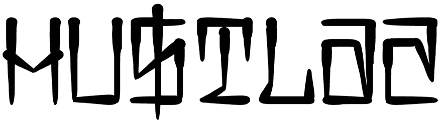
- What is the conventional look for the fonts in this collection? To tell you the truth, the telltale signs for recognizing skateboard fonts are not very specific. Nonetheless, we can give you a few hints to look for in the font style. The reason is probably because of the fact that they are usually made of irregular shapes, so it’s going to be a bit tricky to pin them down. If you know the graffiti fonts well enough, you should be able to see the resemblance between the wild letters of these two font categories. There’s also a subtle retro charm radiating from the skateboard alphabet, that can only make them more pleasant. Often designed with sharp edges, skateboard fonts deliver a pretty expressive message. A dynamic style is also part of their character to make them more influential. That’s why you can see different spray paint letters, or elements like fire, lightning, and motion lines, as well as occasional swashes beneath the word in this category, spicing things up.
- What’s the typical mood associated with skateboard fonts? You’re probably going to find yourself in favor of this collection from the very start. This appeal is caused by a variety of emotions generated by these fonts. The most obvious feature of them is that nice street feel produced by their crazy letters. That plus their sweet vintage flair makes them come off a lot like our urban fonts. So it’s likely to confuse the two with one another. The skateboard letters are designed to portray a skater, his identity, and characteristics. So you should be able to notice their rebellious attitude as well as their energetic tone. Since these fonts are often associated with youth, they also bring along a thirst for adventure and implement an exciting theme in your text. This all lends a delightful sense of passion to your writing, thus setting it apart from everything else out there.
- When are you going to find skateboard fonts useful for a design of yours? Thanks to the variety of interesting visual elements used in their design, these count as one of the best display fonts you can use to make your words seem more unique. For instance, they will be great as logos, but not just for representing skateboard brands. Any company could use those bold letters to create its own strong identity in the market. Also playful enough to make any of your typography projects seem cool, the fonts in this bundle are what you need for your posters, and banners for social media and websites.
- Here on Resource Boy, you’ll have the chance to access a great variety of other graphic design tools as well. This is the only collection across the internet where you get the chance to browse through countless skateboard fonts until you find the perfect match for your design. If you want to benefit from more awesome assets from RB, your next step should be to check out our fast fonts as well as our unrivaled 300 free graffiti backgrounds. Download them now and they can help you produce the same iconic vibes as this current bundle.