There are several ways to make your text stick out, but nothing does it as simply and elegantly as an inline font. So next time you want your title to receive immediate attention, you’ll have this wonderful selection of Resource Boy to count on. Nothing says how professional you are in lettering more than a bunch of neatly shaped numbers and letters with mild linear decoration. Seems like you don’t even need to look any further for the best of these fonts on the net. They’re all here already. View the list and download your favorites so that the fun part can begin right away.
A practical intro to inline fonts and why they’re so popular?
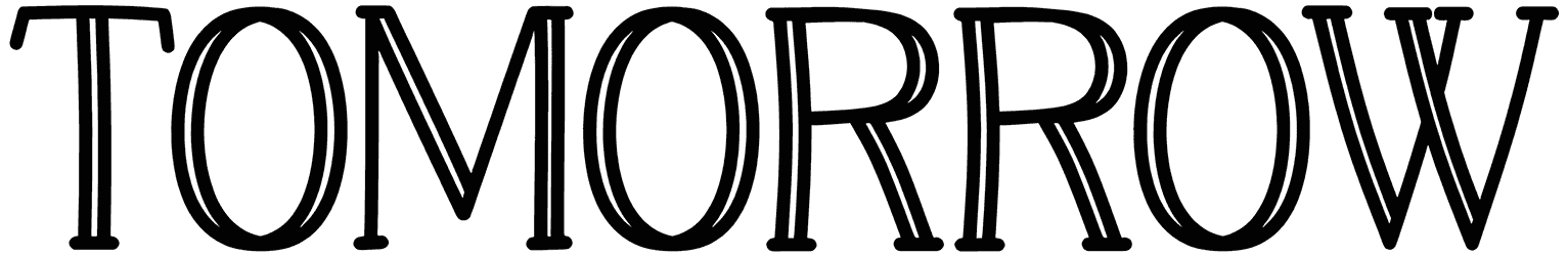
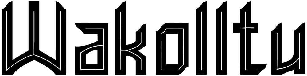
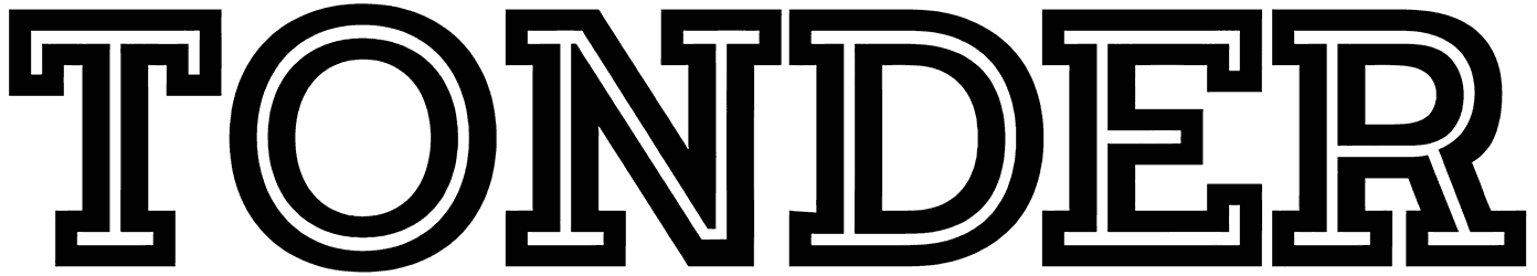
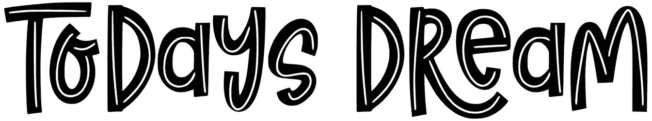
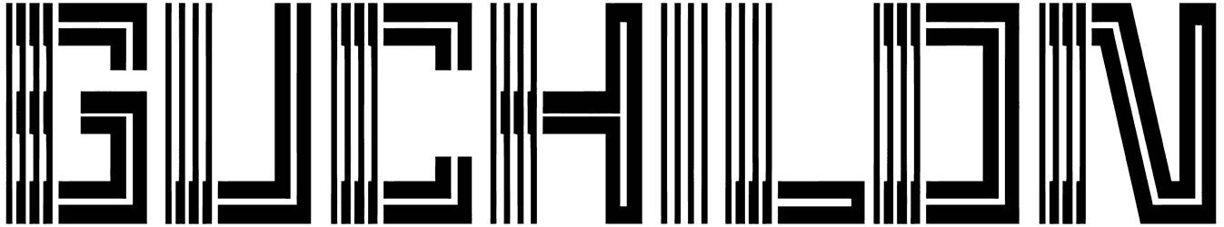
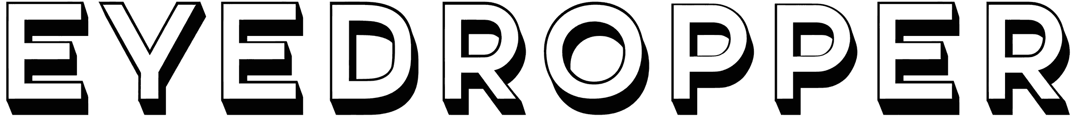
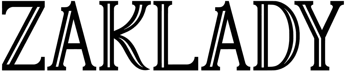
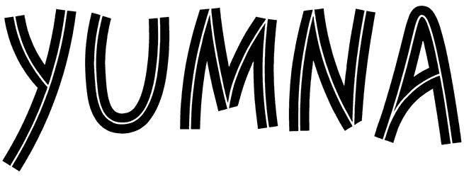
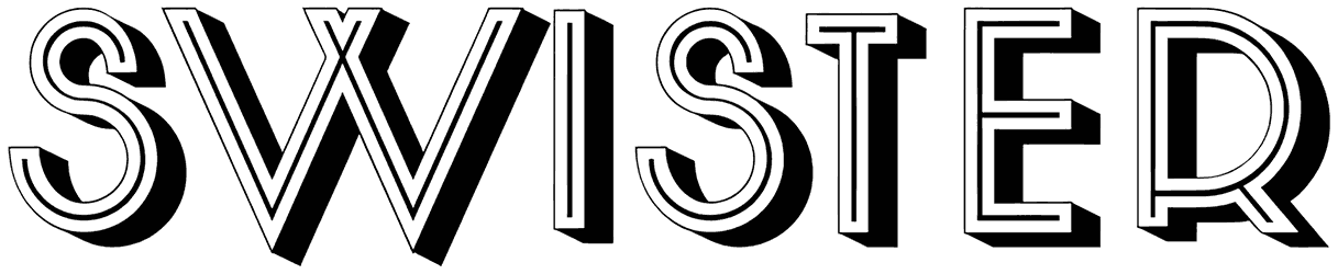
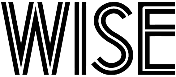
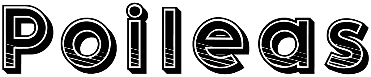
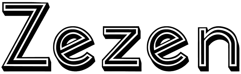
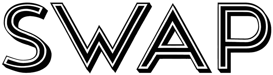
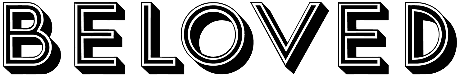
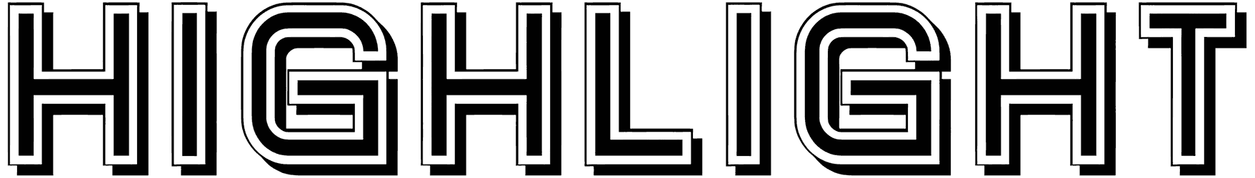
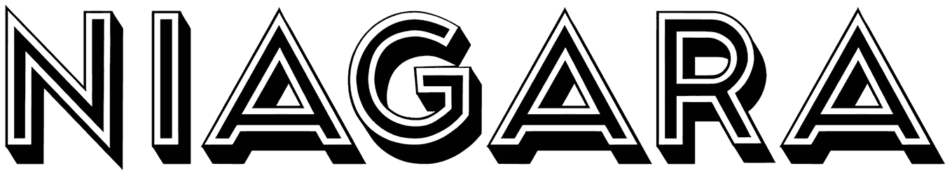
- How tastefully they highlight your words with their unique font style: There’s always something stylish about the way these fonts deliver a message. Those double-lined characters are particularly designed to make your writing look clean and sharp. There’s actually no difference between their serif and sans serif fonts in how eye-pleasing they are, maybe only in their contemporary quality. Usually, the inline letters seem to be based on a geometric design, which is only more obvious when they’re shaped like squares or surrounded with a rounded edge all over. However, that’s not always the case, as they can also let go of their neat arrangement and trade it with the soft and smooth touch of script style. That’s when it becomes impossible to resist their charm in a cursive form. On a separate note, these fonts are already good at emphasizing your words, but if you want to take things further, you can always find something more condensed or with shadow overlay to get a perfect job done.
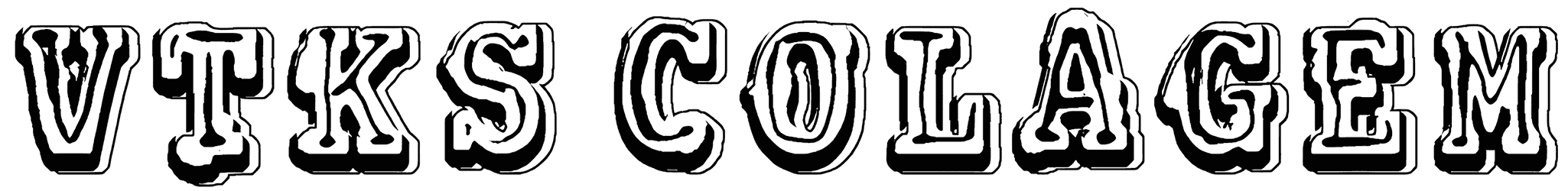
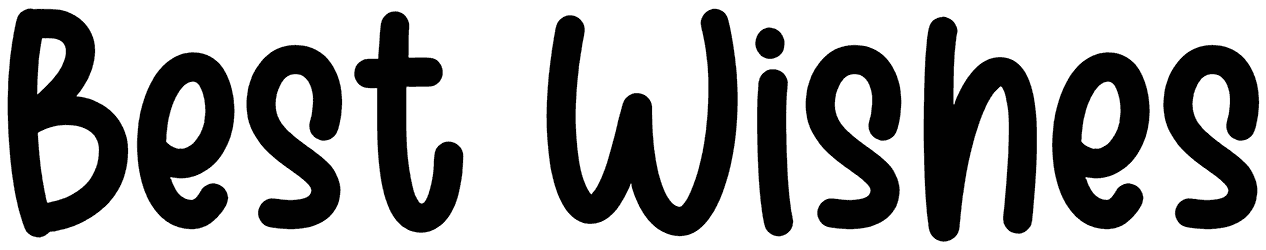
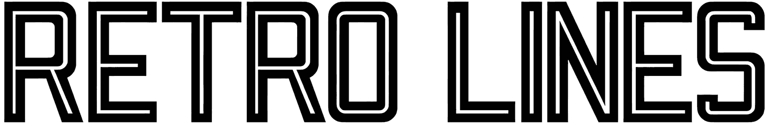
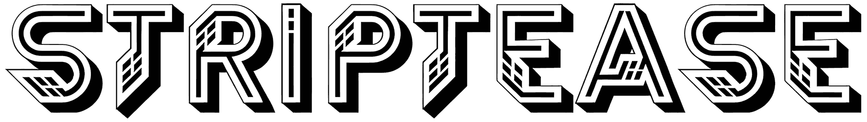
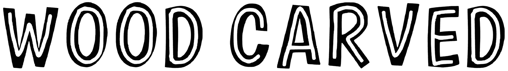
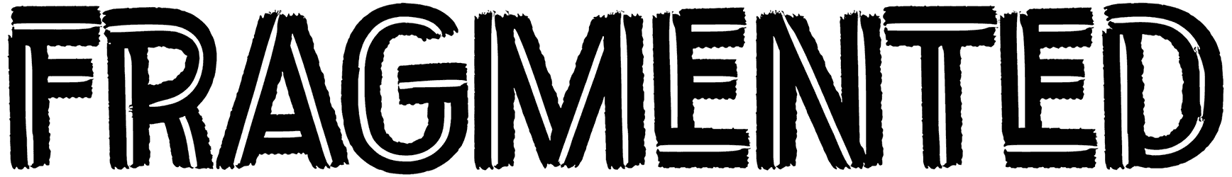
- All the special feelings they let your text convey to make a good impression: There is more than one way these fonts can set your writing apart. Their best feature is probably about how they hit the perfect middle ground between formal and casual approaches. Just keep in mind that it’s going to feel much more friendly in handwritten letters, so you can tip the scale in whichever direction you desire more. Nothing is going to change how cool and sophisticated they come off at the same time, so you may as well add some other flavors to your design to set the right mood. For instance, the inline alphabet does not always have to be used in modern contexts. If you choose the right font for it, they will also be perfectly capable of exuding a retro charm. Also, they have no problem drawing even more attention to your art with a playful distressed look.
- How useful they are in the field of graphic design: You don’t have to be an expert in typography to realize what an ideal logo they can all create. These fonts are not just good at representing your corporate identity, like an architecture firm, but for less intense businesses too, such as bakeries, apparel, stationery items, or ice cream stores. Depending on how you want to be introduced to the public, this font category can portray you as bold, entertaining, or kind.
- All the other exciting offers like this waiting for you on Resource Boy: There’s no reason for you to seek another selection of inline fonts when you can find them all right here. It’s already at a volume that no one else has ever supplied. Plus, you can always find more of these unique assets to outperform yourself and others all the time. Case in point, you’re going to love our collection of Art Deco fonts for sure. Check them out now and all the other amazing items in our library to be blown out of your mind.