It’s been over a century since Art Deco fonts changed the whole dynamic of visual representation in lettering artworks and since then they have never stopped being popular in the community of designers. So believe us when we say you can never have enough Art Deco typography in your personal font collection. You'll never know the next time that the sophistication of Art Deco letters will come in handy in your designs. So to prepare you for any upscale project that someday you’ll be in charge of, here is the widest variety of Art Deco fonts anyone has ever seen. This whole collection is yours to explore and download if you start right now.
Get acquainted with Art Deco fonts once, and you’re not going to stop using them!
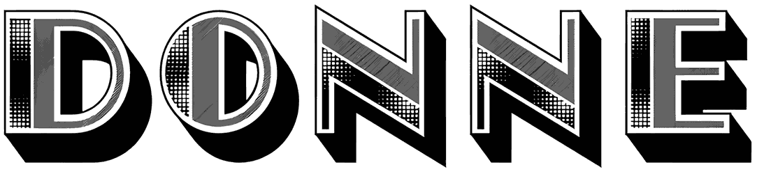
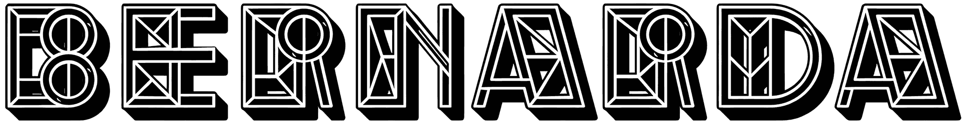
- Let’s review some of their visual signs and details. As a category, they are associated with elegance in style, and it gets far more impressive once you see how they achieve that without relying on calligraphy letters as often as you’d expect. They are rarely seen as script alphabet and are hardly ever cursive. Instead, both thin and thick geometric shapes of Art Deco letters demonstrate the concept of symmetry in their design in the coolest way possible. For most people, Art Deco fonts are the definition of minimal style with their clean lines, sharp curves, vertically or horizontally elongated letters, and occasional zig zag patterns. But they are not always that simple. That’s why on Resource Boy, you can always find Art Deco fonts with decorative borders, neon effects, and cross stitch textures.
- Aren’t you curious to know what Art Deco fonts symbolize in the field of typography? Art Deco as a general style can not be described by modern traits alone, nor does it fit retro contexts entirely. Actually, it’s a pleasant combination of both that makes these fonts so unique and unforgettable. Where the future and the past meet, the Art Deco alphabet shines brighter than ever. That’s the reason why there’s no difference between the Art Deco lowercase and uppercase in French or any other language in terms of being authentic. Thanks to their flashy exterior that represents a rich concept, they will always be fancy. So even though gold is a good look on them, they don’t always need that to come off as luxurious. There are tons of other elaborate displays of art that make them as bold as they are known to be.
- The more Art Deco fonts you download now, the more projects you’re going to nail in the future. There’s one thing for sure, their classy letters always present you with the opportunity to gain more recognition as a designer, no matter what kind of design you’re working on. Art Deco numbers and letters can always surprise you. For instance, you probably don’t see them suited for happy birthday themes, while in fact, they are great at that too. Just throw them on your Microsoft Word documents or Photoshop PSDs, and after that, it’s you who should decide whether to turn them into something formal like monograms or something fun like bakery shop signs!
- When it comes to satisfying your design needs, we become unstoppable, and it’s not just about our Art Deco fonts. The best fonts were never this easy to find before Resource Boy introduced this curated list and changed the game forever. You’ve seen us outperform other websites the way we have collected all these fonts on Google in one place, so it was no big deal for us to do the same for our Nouveau font, 1920s font, and 1930s font collections too, and make them universally peerless. So if you’re looking for a second font to use alongside our Art Deco letters, you'll find tons of suitable fonts if you follow the hyperlinks now.