Creativity can be a really wild card, almost an unstoppable force, especially when you don’t want to go back to how something is usually done. That’s how Art Nouveau was created. Meant to take everything ahead and make an actual difference, Art Nouveau fonts performed their role as “new art” in the field of typography as well. Now looking back to that era from decades later, we can see how successfully they made their contribution to the world of graphic design. There are lots of bold designs out there that we owe only to the Art Nouveau fonts. So you better not let your toolbox miss any of it.
Art Nouveau fonts and everything about their artistic significance:
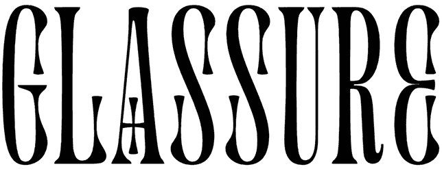
- Which type of letters belong to the Art Nouveau fonts category? When you take a quick look at this collection, all you find here is something unconventional as far as it goes. Something that defies the standard shape of letters, usually by overdoing the embellishments. Everything is supposed to be exaggerated here, building a whole new definition of lettering that would change the perspective of the graphic design community for good. Even when you manage to keep things simple, it will still be obvious enough. The serifs alone are enough to give them away, as they are rarely ever so flourishing and fancy. Even without being entirely cursive, Art Nouveau fonts manage to bring their own version of calligraphy into your text. Those extensive curves lead to something ornate like nothing else. In fact, their curvilinear structure is inspired by natural forms like flowers, vines, and waves, floral and plant motifs. That’s why you can fill your writing with all the intricate details you want and it’ll still feel natural. The decorative touch can get excessive but it’ll never be too much. Despite those whiplash curves and hand-drawn elements, the Art Nouveau alphabet doesn’t really count as a script, at least not the kind we usually know. That’s exactly what sets them apart, their own unique aesthetics. So they may belong to the late 19th and the early 20th, but they will somehow still make their way into your contemporary designs and just nail it!
- How about their theme and how they can make you feel? It’s been ages since the first emergence of Art Nouveau fonts and during this time, they have never really stopped being popular. Even in other languages like French and Japanese, they still hold on to their exquisite charm. You’re just going to be surprised at how well they lend themselves to your modern projects, as long as you keep things neat and just enough elegant. In fact, they can work wonders when you want your words to feel genuinely original as well. That’s just how sophisticated the Art Nouveau letters can be. Besides that, they’re also incredibly fit at concepts related to romanticism, and they mix perfectly with a gothic flair just as well. That’s how a font reaches timeless appeal, right?
- Why and when will you probably need an Art Nouveau font anyway? It’s so fun and fulfilling to use one of Art Nouveau's fonts that you better not lose any chance to go for it. This notable trend has been so rich that it has left its mark not just on the graphic design industry but on all other sorts of art too. Just open your Adobe Photoshop, or Canva, and get down to creating the wildest tattoo or coolest logo of your entire career. With all these fonts at hand, it’s going to be easy to impress people with a beautiful piece of art.
- You can’t possibly think that this is all we could do for you! Resource Boy has a lot more to offer you than the best Art Nouveau fonts from around the world. After this, try downloading some of our Art Deco fonts and Victorian fonts and you’ll know what we’re talking about.