You would think no one misses the “Dirty Thirties”, but here we are witnessing the 1930s fonts still holding on to their glory and not letting go. And they’re not just a superstar in the designs related to films, but any other artwork requiring a unique lettering font. You can’t expect the work of such a significant era to lose all meaning just like that. We’re here to make our own contribution to this timeless trend by having all the 1930 fonts in the world assembled here. Download and pour them into your different projects to make sure this beloved tradition never has to die.
Facts about the 1930s fonts that will set you apart from your competition:
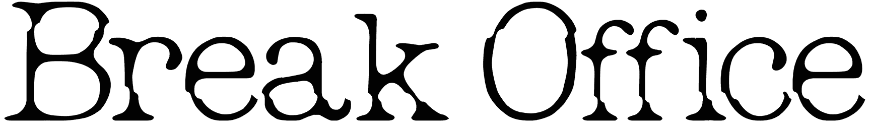
- What happens to your text’s visuals after applying one of the 30s fonts? It may have been decades since the emergence of this font category, but thanks to their sans serif style, it doesn’t exactly strike you as retro. Instead, it’s mostly the elegance in their design that makes sure they're instantly etched into memory. That’s what you get for hitting the perfect middle ground between the future and the past, an undying version of aesthetics that stays forever popular. There’s actually no wonder why they’re considered to be in a class by themselves. Those sleek characters and their geometric figures exude a lot more charm than you can disregard. It’s as if those rounded and circular letterforms are perfectly streamlined to get maximum attention in the least encounter. You have to admit that ornate look is like nothing else and that’s not something you can get used to either, after all, they have survived long enough. Plus, once you take that nice manmade quality into account as well, you can see clearly why this type of writing doesn’t belong to this generation at all. Didn’t you want to stand out? Then here’s your chance!
- What type of mood are 30s fonts used for? They come from such a rich background that it’s only natural to feel drawn to this font category now and then. It’s not just centered around their vintage touch, but the sophistication they bring to the table as well. In fact, their close association with music, cinema, and literature makes them such a perfect choice for elevating your art with cultural appeal. It’s also about the historical significance, as they have been around for about a century. They have defied the fading effect of time enough to make their mark on the field of typography, and subsequently your designs. Just leave it to their classic aura and simply acknowledge the neat output in the end. There’s really no need to point out just how well they land on luxury design. However, the 1930s font is not particularly good at happy scenarios, especially if you know about the great depression. Then it shouldn’t be that hard to learn about their dark side, and how it makes things more interesting.
- When is it the right choice to go with a 1930s font for your lettering? So far, these fonts have proven themselves as movie fonts several times. Other than movie posters, their strong tone will come in handy as title fonts for your fashion magazines or packaging ideas. Customize any text of yours that’s missing a bold design with these stylish 1930s letters, and let your words get everyone hooked right away.
- What else is going on in the Resource Boy library that you should know about? So far, we’ve brought you the best 1930s fonts ever found on the internet, but sure enough, there’s still a lot of ground to cover. Take for instance our collections of Art Deco fonts and Bauhaus fonts. How can you knowingly miss such fun treats from RB?