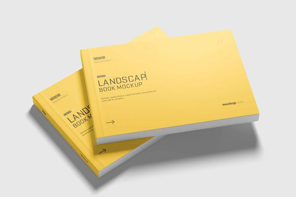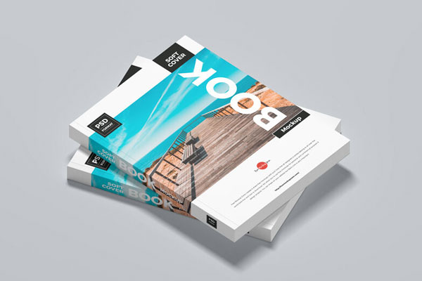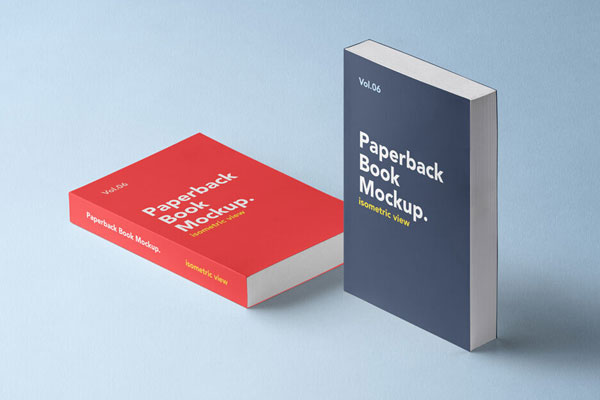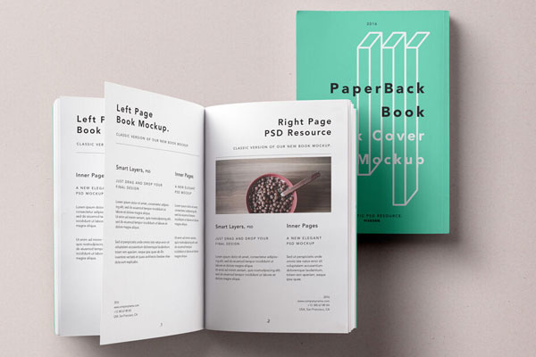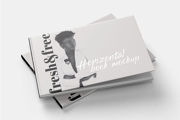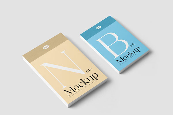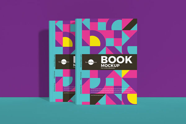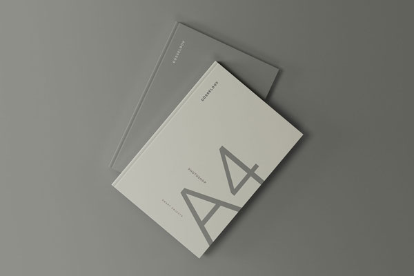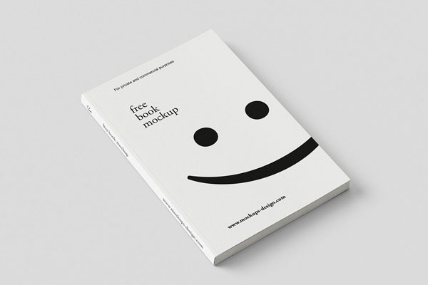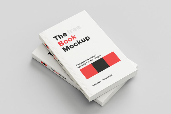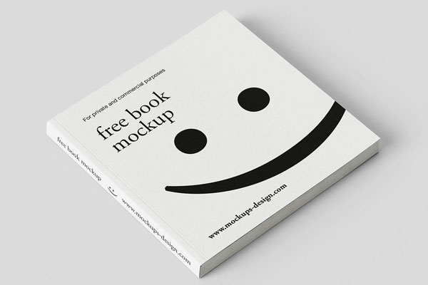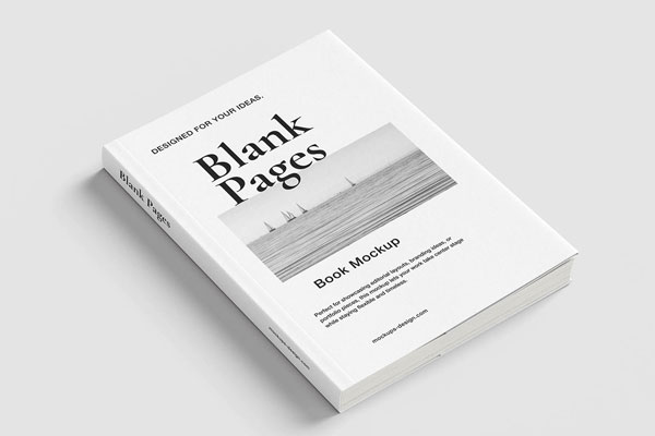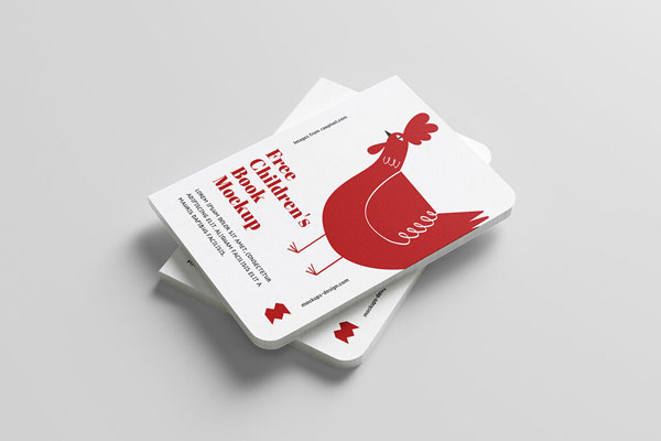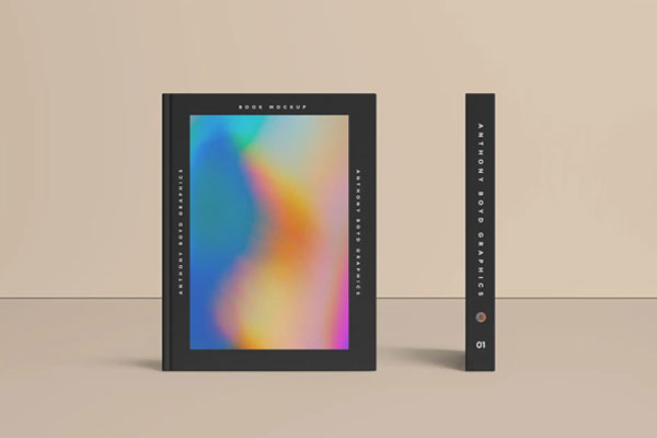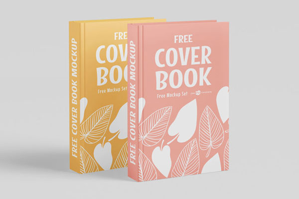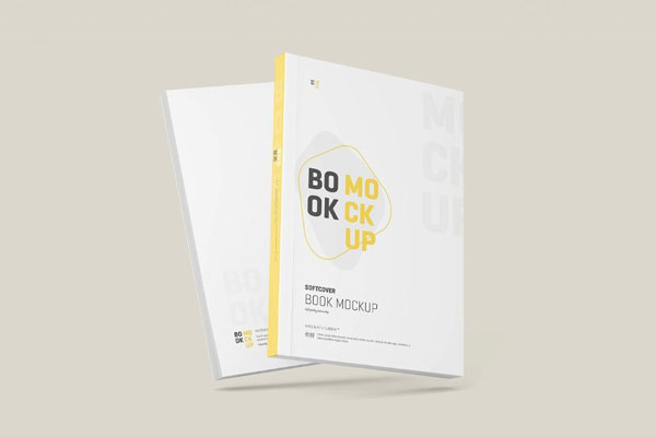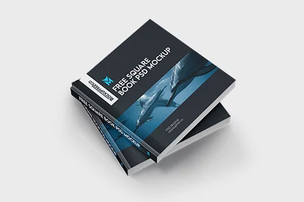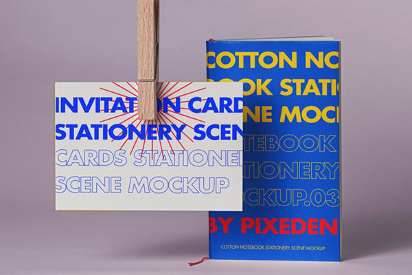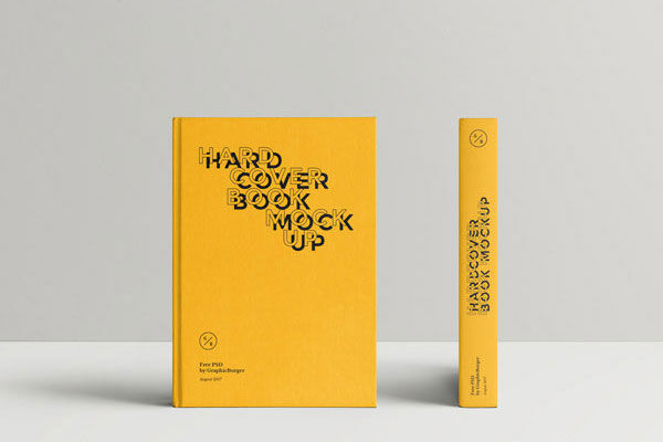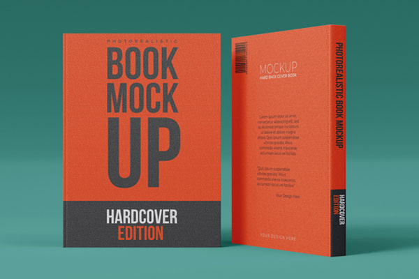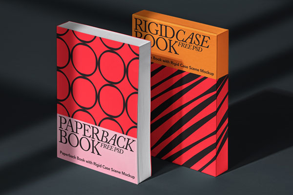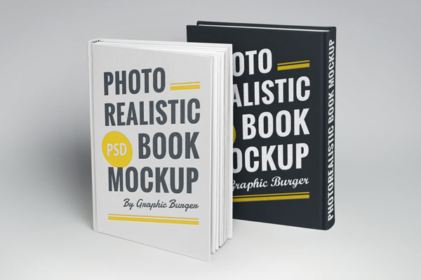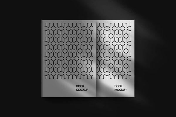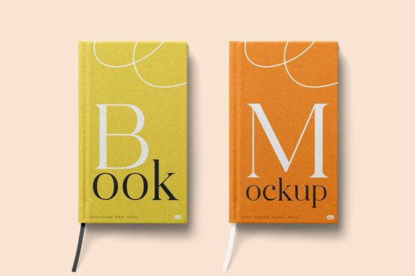
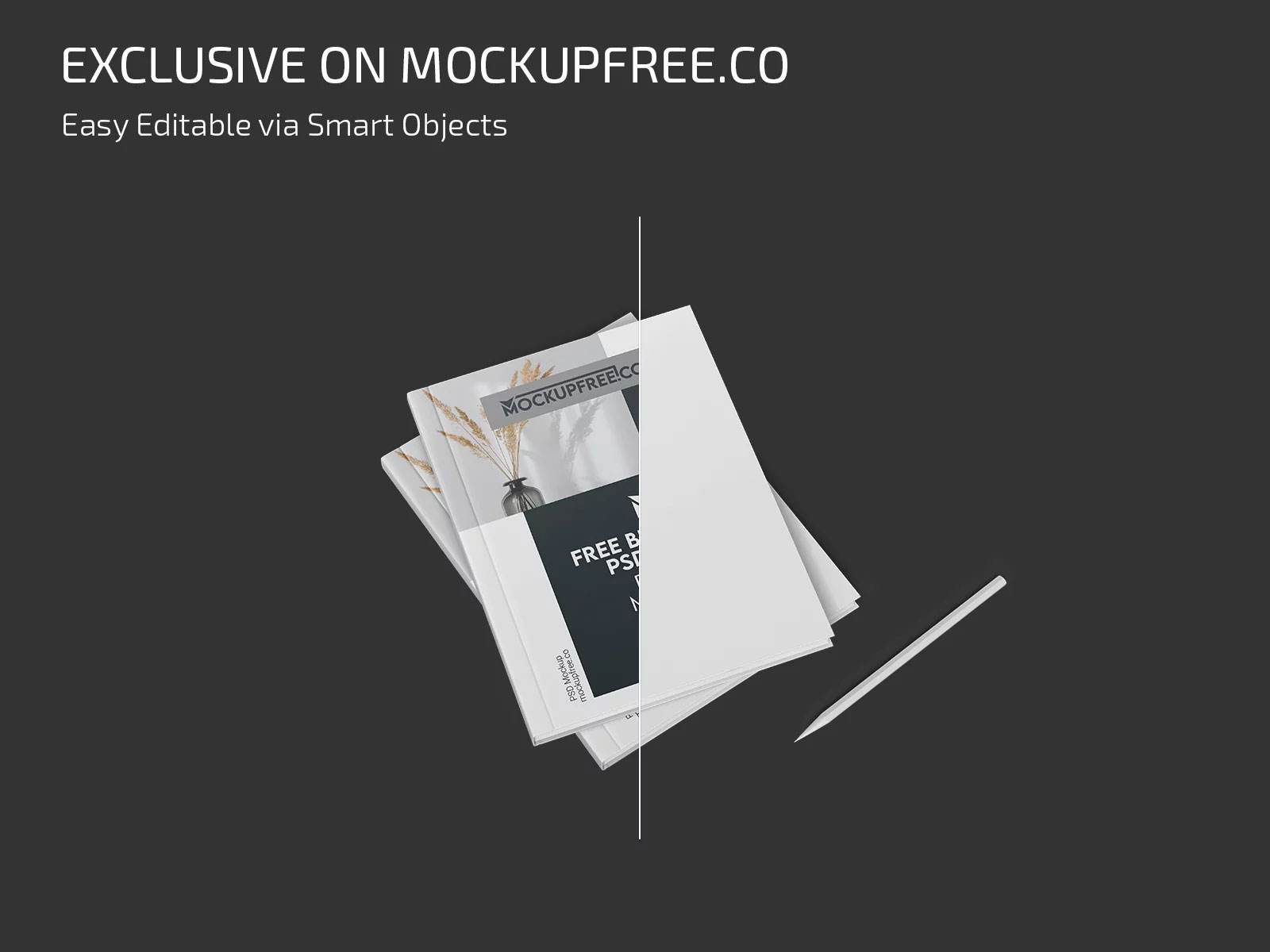
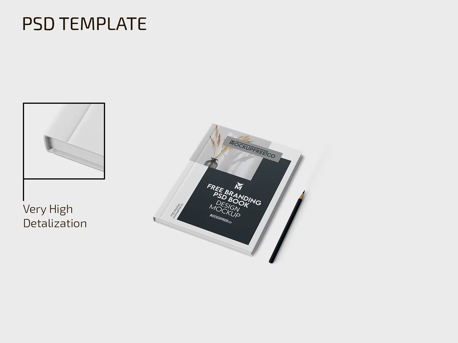
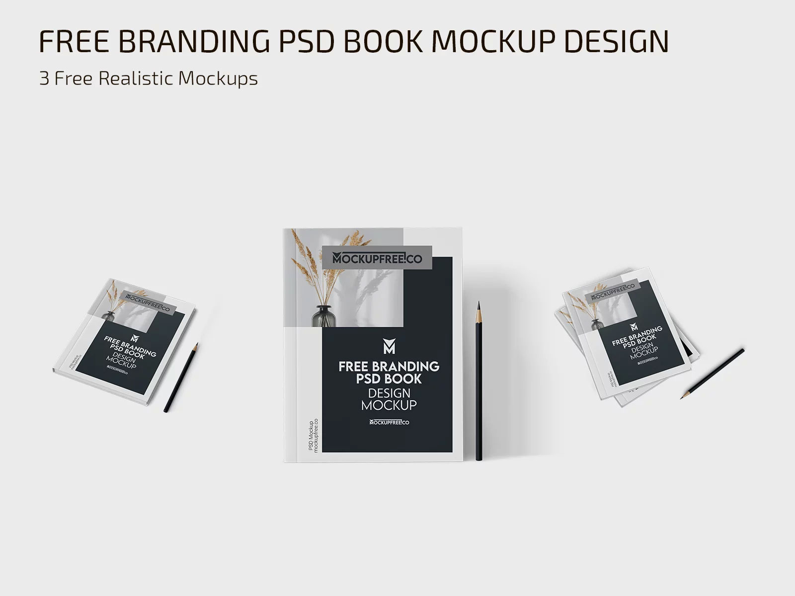
Branding books are the moments where systems become real. On a screen, guidelines can feel neat and balanced. In a physical book, you start noticing things that matter most in real use: hierarchy, repetition, spacing rhythms, color relationships, and how the rules actually read from page to page. That’s exactly why this branding book mockup feels so valuable. It lets you experience the difference between a concept on a screen and a visual system that feels complete, intentional, and ready to be handed to a client or team.
Creative studios, agencies, in‑house teams, and personal portfolios all benefit from seeing whether the system feels cohesive in a tangible context. Sometimes design maturity isn’t shown in a logo alone; it’s shown in how the rules live together.