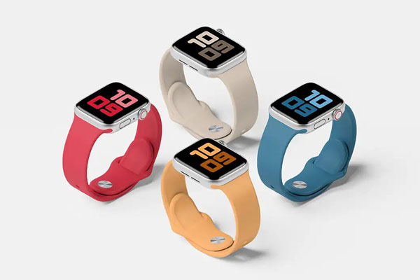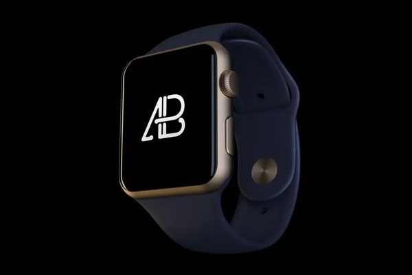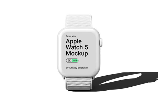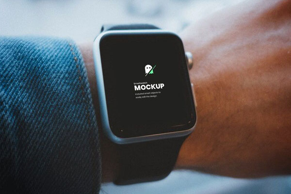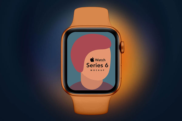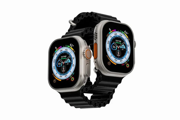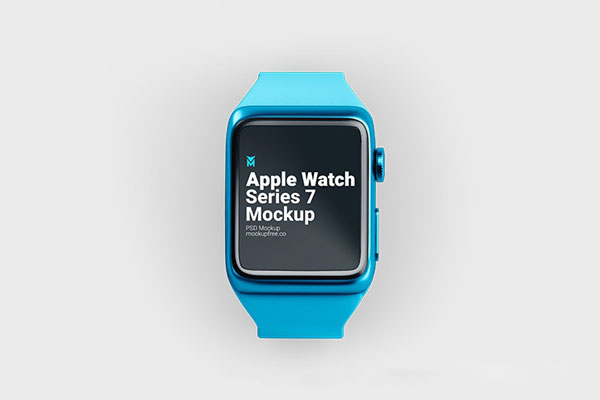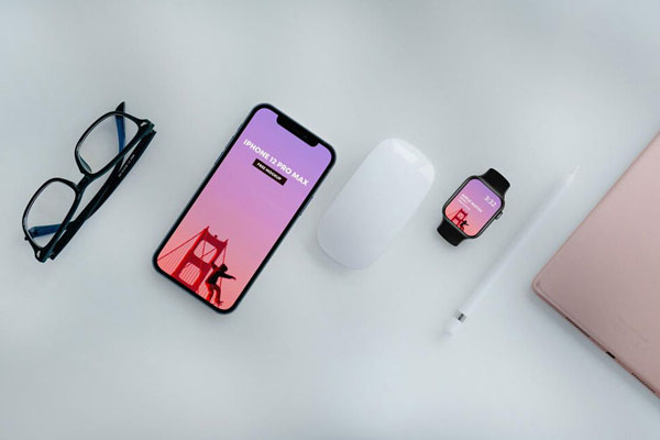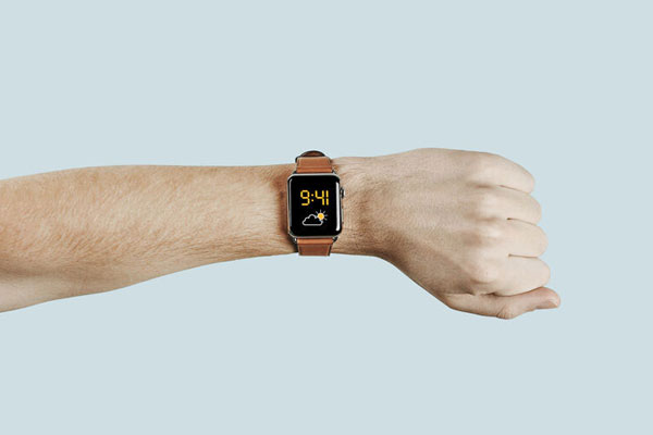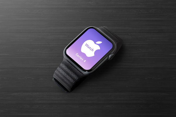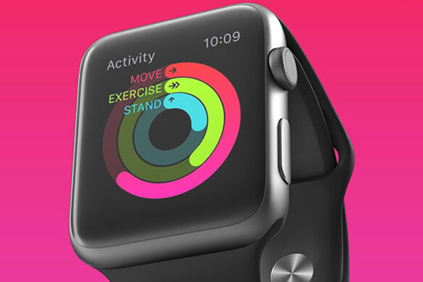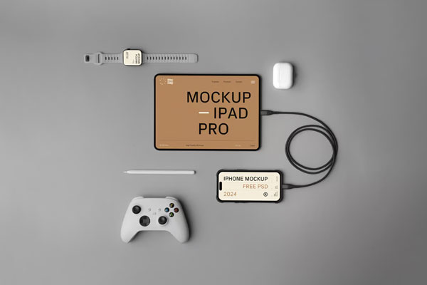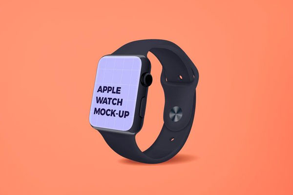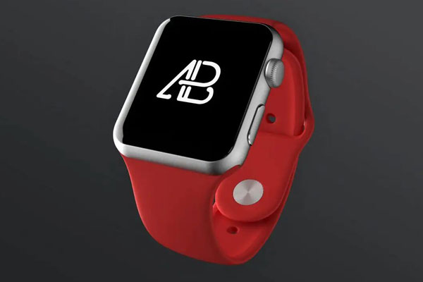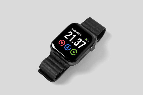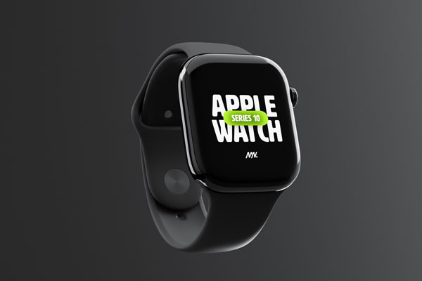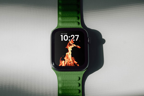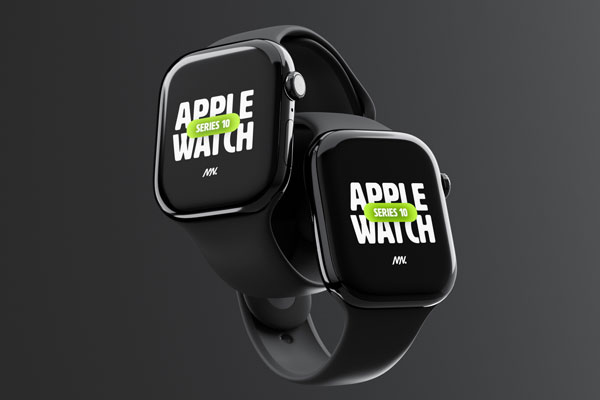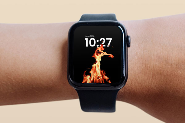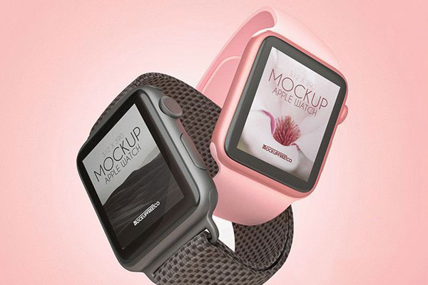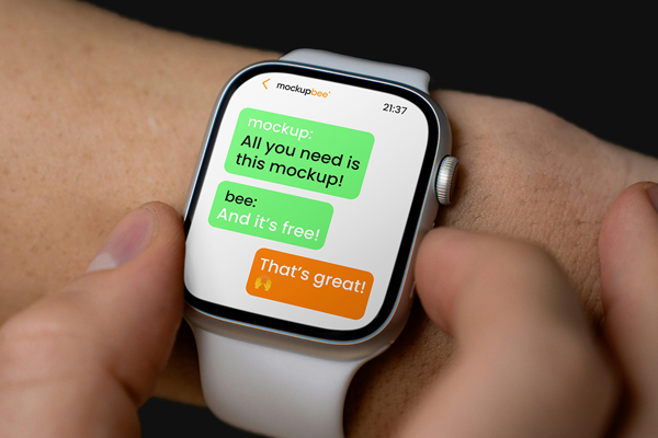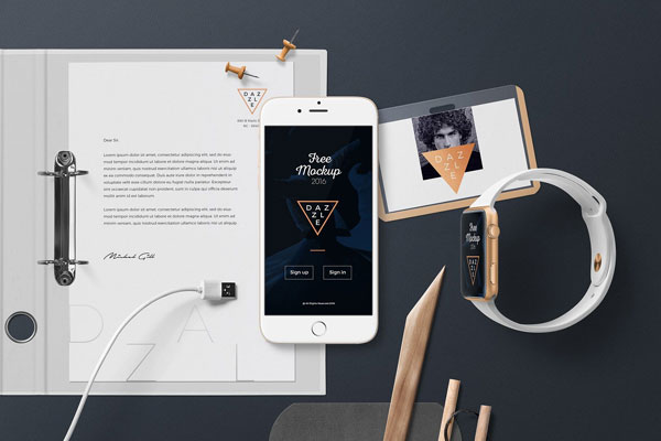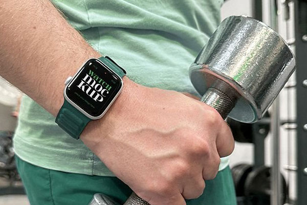
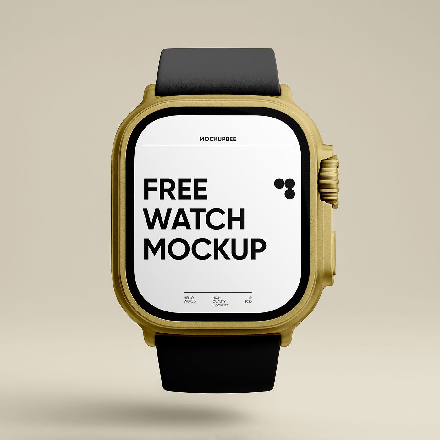

This smartwatch front view mockup gives your interface design a crisp, focused stage where every icon, stat, and color choice has to earn its place. From a designer’s perspective, that straight-on angle is great for checking balance and readability because nothing is hidden by perspective tricks. It makes health apps, watch faces, and notification layouts feel clean, modern, and ready for a real wrist.
The mockup works especially well for fitness branding, sleep trackers, step counters, event reminders, or wearable UI case studies. Strong contrast, simple data blocks, rounded icons, and bold accent colors will help the screen feel sharp and believable.