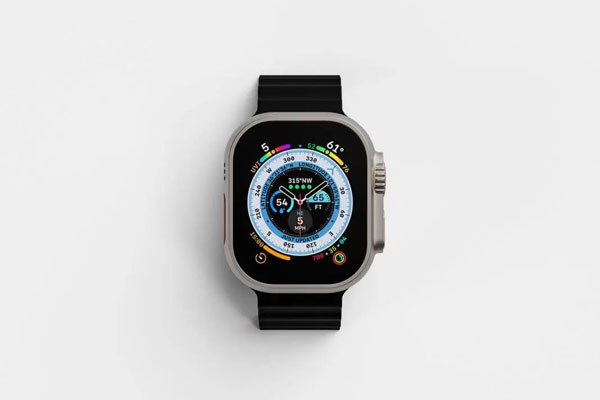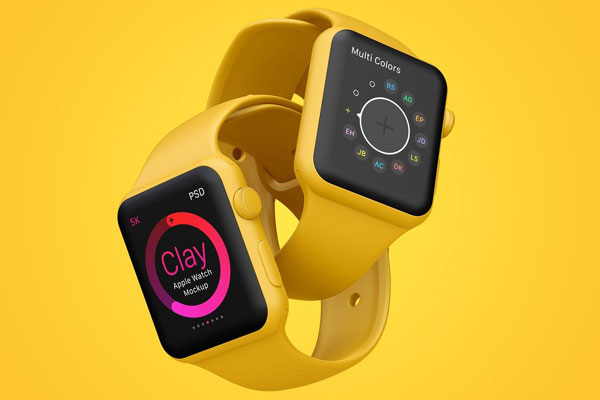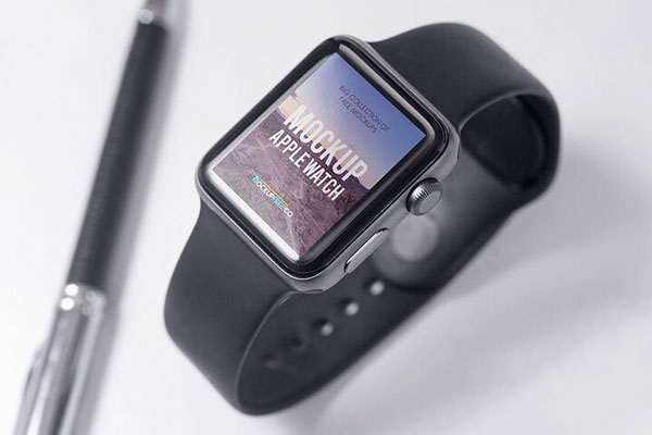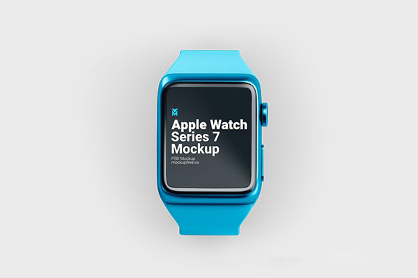
Apple Watch mockups can be deceptive. The screen is tiny, yet somehow it manages to expose design mistakes faster than a laptop, tablet, or even a smartphone. There’s simply nowhere to hide. Weak icons, cramped layouts, poor contrast, and oversized elements become obvious almost immediately. That’s exactly why this mockup is useful.
The clean top-down presentation puts all the attention on the interface itself, making it easier to judge whether your design actually works at wearable scale. Fitness apps, productivity tools, health dashboards, smartwatch faces, and notification concepts all benefit from that reality check. If it works on a watch, it’ll probably work anywhere.