If there’s one thing in common among all the signs in different cities like San Francisco, New York, or those on London streets, it's about how they attract your attention before you know it. That’s because reading those huge and distinctive street sign letters doesn’t require much effort. Within only a few seconds, your subconscious mind notices the sign in a glance. So whenever you want your writing to be at the center of attention, you have these highway fonts to rely on. When a font is grabby enough to take your notice while driving on the city highways, it can surely call everyone’s attention to your words in other designs too. Now if you want the greatest number of street sign fonts gathered in one place to choose from, only Resource Boy can give you that. Download from RB’s collection and take these attention-seeking letters from the street signs of NYC to your own artwork to make it work more effectively.
Everything you should consider before you choose a street sign font from Resource Boy
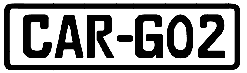
- For a stronger first impression, it’s the font style of your street sign font that counts. Usually, it’s the boss letters of street signs that make them so unique. The alphabet belongs to sans serif fonts so it has to be recognizable even from a distance. They don’t even need a complex design to make a memorable imprint. Instead of Victorian features and metal elements, they rely on basic characters with broad, dense, tall, or stretched bodies which might sometimes appear in blocky and geometric versions too. On top of that, these fonts can be available as old street sign letters as well. You can say everything that makes the highway signs so highly readable is also used for designing these fonts.
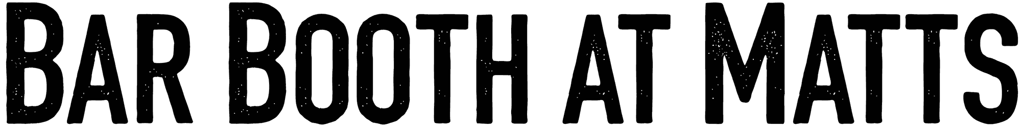
- You can communicate better with your audience if you pay attention to the mood of your chosen street sign font. Think about it. Even when you see a street sign that’s not written in English, you can still sense the urgency. So it's not about the language; it's about highlighting the importance of your words with these grabby fonts. The simple design of characters gives your lettering a clear message to get across, while the authority in your tone prepares the audience for quick but powerful communication. It goes without sharing that the more straightforward your text is, the more you sound capable of guidance and worthy of trust. Moreover, some of your designs may call for a font with a combined classic and street sign style, and that’s when you’ll appreciate cool retro features in your letters.
- Our street sign fonts are practical enough for your non-signage designs too. Obviously, these fonts can never be beaten by any other font category when it comes to creating signage. So go ahead and use them as name signs for avenues or stores, and transport fonts like direction signs on roads. Just bear in mind that your other custom-made typography projects may also turn out more successful with these letters instead of some other font. If you know how to pick the right font for a particular artwork, even your design ideas for banners and billboards can be more effective with the help of these fonts. So don’t hold yourself back from giving them a shot.
- Turns out the website with the top collection of street sign fonts is in the lead in a lot of other categories as well. If you have visited a few websites other than Resource Boy, you probably know how hard it is to run into such a rare collection full of different street sign fonts. Guess we are just that good! In case you need to see more proof, visit our huge collections of sign fonts, and sans serif fonts too for more similar options. After that, you’ll realize why you should pick Resource Boy as your number one font library for any font you need to download.