Even your minimal designs can use the extra weight that slanted fonts offer to your words. That’s the only way you can stick to your slim lettering but make sure you’ll get heard. If you’re already going with prominent characters, then these fonts will make your job a lot easier to receive instant attention. Even though the slanted versions seem less tall, they still get to add more urgency to your tone. So it makes a big difference to have at least a few pre-decided slanted fonts for when you come to need one. If you don’t have one, Resource Boy is here to help you choose right now. Just dive into our collection and you’ll be good to go.
Let us refresh your knowledge of slanted fonts in simple terms
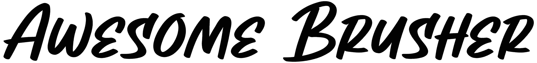
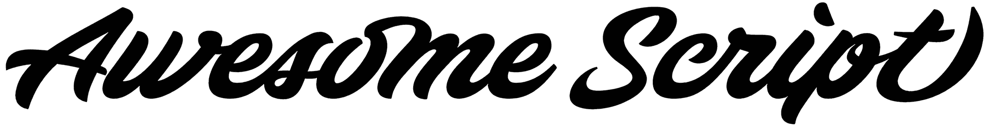
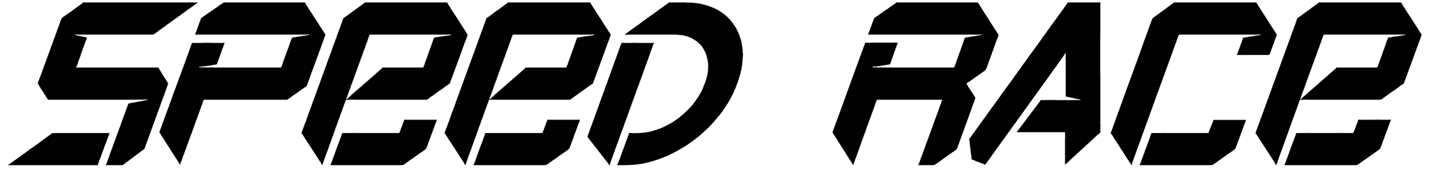
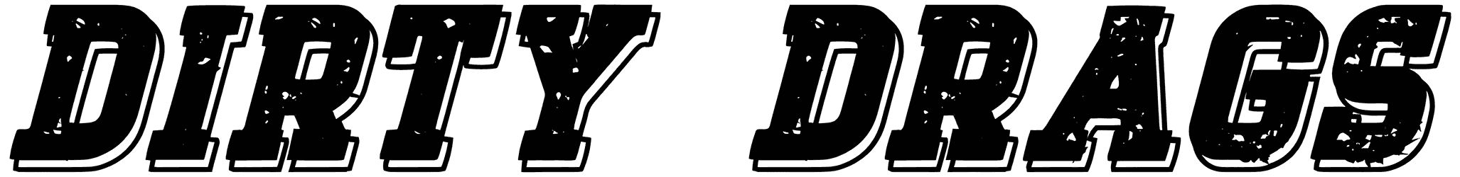
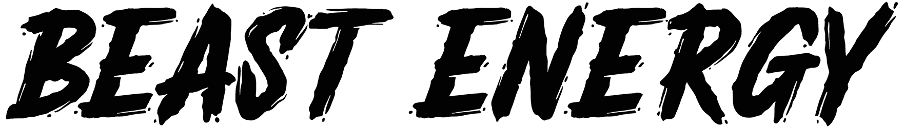
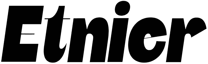
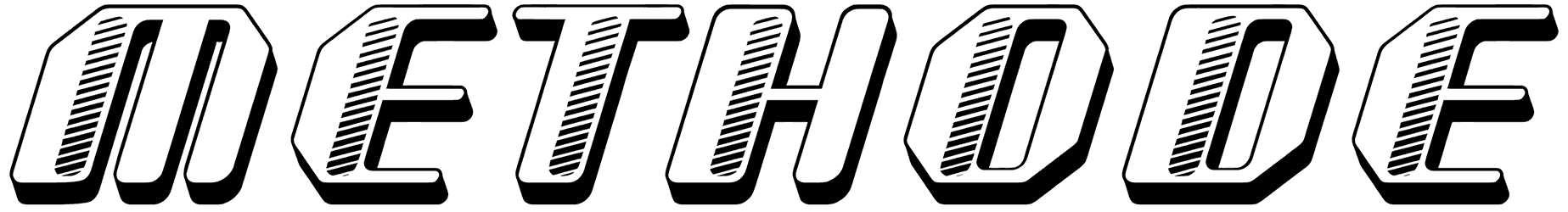
- What are the other visible traits of a slanted font? It’s easy to detect a slant in a sentence but there are some features that make these fonts different than one another. First off, each font is angled differently. Some look only subtly aslant and some are so skewed that it's quite hard to miss. Since almost half of this collection is made of handwriting fonts, you can bet that a cursive style is quite commonly seen here too. The other hand includes mainly sans serif lowercase and uppercase characters with a simple structure. To create more visual interest, slanted letters can sometimes appear as blocks, squares, and bubbles. The tips often look pointed, forming a sharp appearance for these fonts. Just bear in mind that they are not exactly the same as italicized fonts as they are only tipped toward the right. The slanted alphabet on the other hand can also be tilted backward, or to the left, thus offering you more options.
- How do these fonts make you feel? The mood of each of these tilted fonts depends on how it’s styled. The script versions can take both fancy and casual approaches based on how they look. You can also adjust the tone of your text by picking either a thin or a thick font from this collection. Generally, slants seem to be more compatible with the modern style of lettering. Some of them can even bring a sort of futuristic theme to your art. Regardless of how condensed the characters are, you’ll always sense the bold personality of these fonts. They will favor your writing with a strong quality and just like that, put more emphasis on your words.
- When will you find these fonts suitable to serve the purpose of your typography? There are numerous scenarios where these fonts can actually save the day. Solve the problem of your text not being interesting enough by involving them in your art, and just observe the huge difference it makes. As it looks like, they have an inherent compatibility with sports designs such as gym signs and promotional material for running competitions, and basketball matches. Their adventurous touch will also elevate your gaming artwork and let you design the coolest tattoos. Sure enough, you’re going to find them a great match for designing many of your aesthetic business logos just as well.
- Does it get even better than this? Of course, it does! What is in front of you now is just our slanted font collection which contains both free and premium items. Hundreds other font bundles on Resource Boy are even more impressive than this one. You can start by scrolling through our racing fonts, fast fonts, and italic fonts for now, but make sure not to sleep on the rest of our comprehensive library.