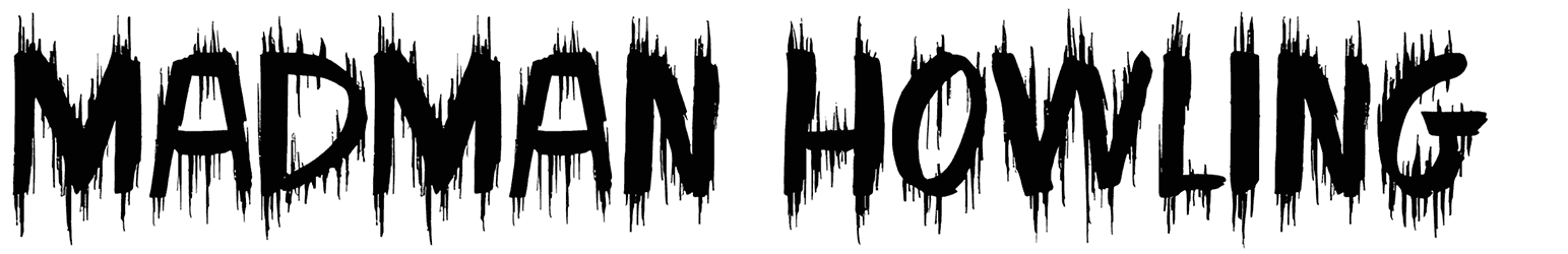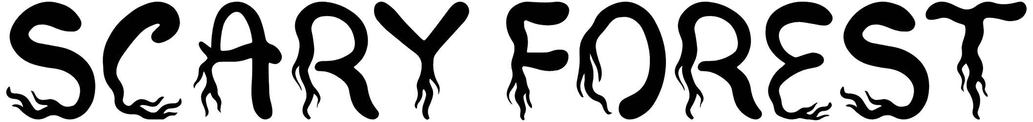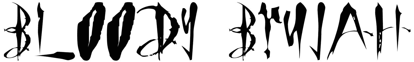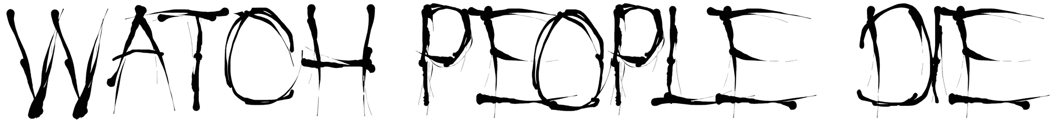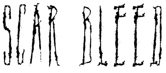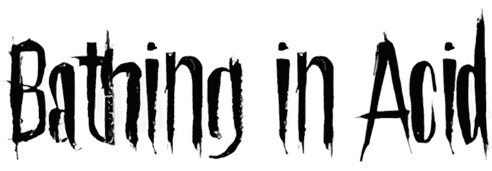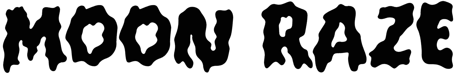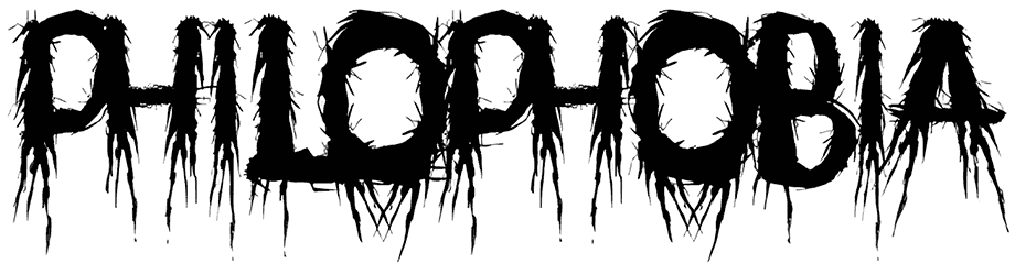
Philophobia looks very scary due to the combination of many narrow lines, and its hidden meaning can be understood quite accurately. This horror font hides a new style that compensates for the lack of numbers and small letters, and will open a new window to the day of designers.
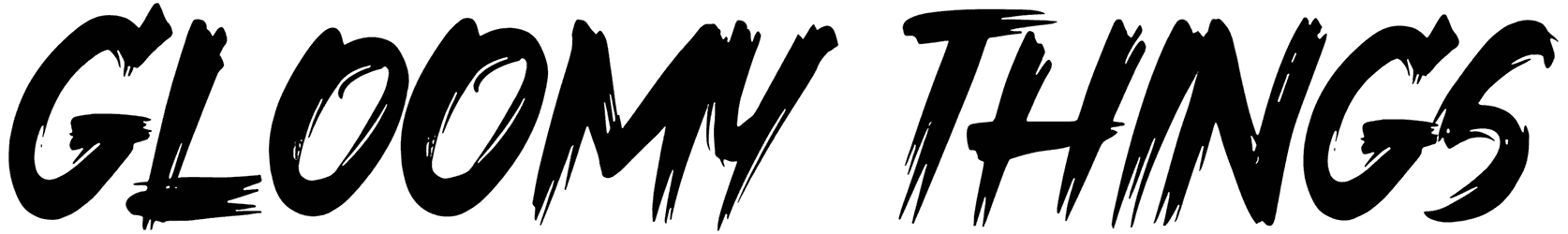
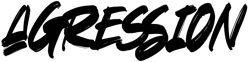
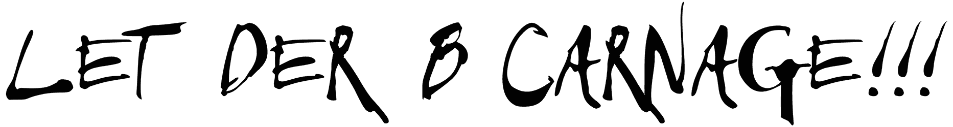
So it is time to use this aggressive font in your posters, advertisements, and invitation cards, and make them distinguished.
Note of Designer
use 1 to sub for lowercase a
Uppercase A: uppercase A
Lowercase a: uppercase A
Number 1: lowercase a (scaled 75% down)Business or commercial use not permitted without a font license.
Font usage infomation:
http://www.fontmonger.com | http://www.chrisvile.comfollow me!
Facebook: http://www.facebook.com/designsbychris
twitter: http://www.twitter.com/chris_vile