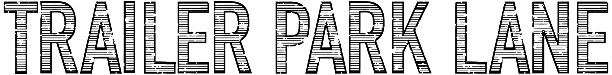
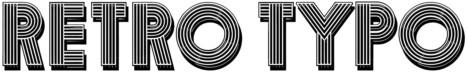
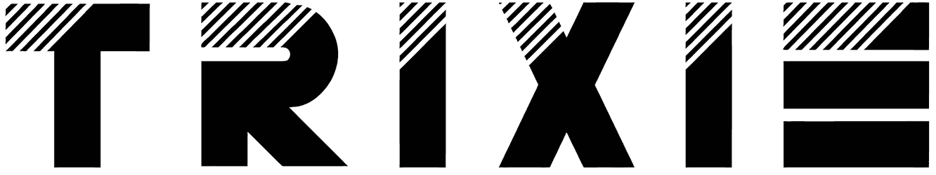
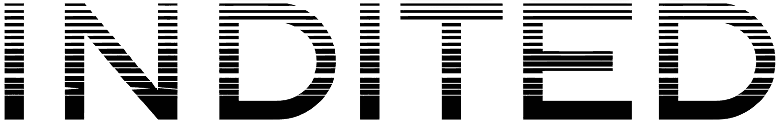
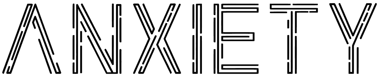
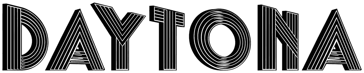
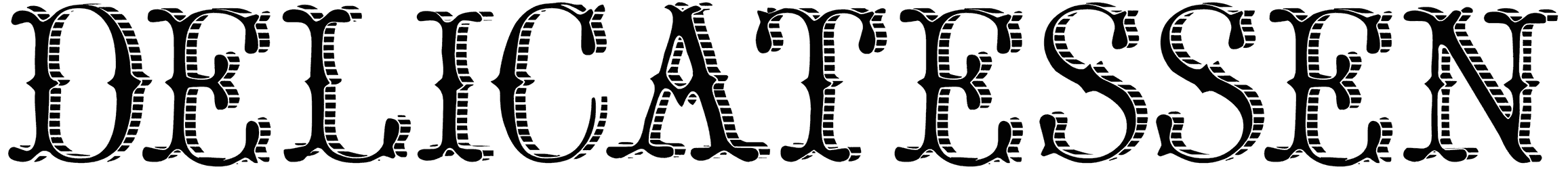
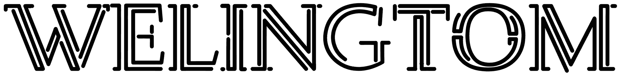
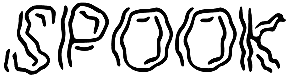
You don’t need to have something against the monoline fonts in order to switch to our multi-line fonts every once in a while. The trick is to give them enough space and they will steal the show, just like that. As long as you let these lined numbers and letters take charge, you can never miss your target. This whole class of font can create the kind of visual impact that is not at all easy to achieve. So you should be thankful that you can always find more fonts with lines through them right here on Resource Boy. Browse the list now and don’t think twice about any downloads.
The complete guide to the category of multi line fonts:
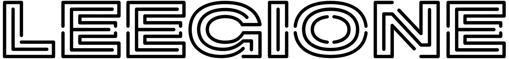
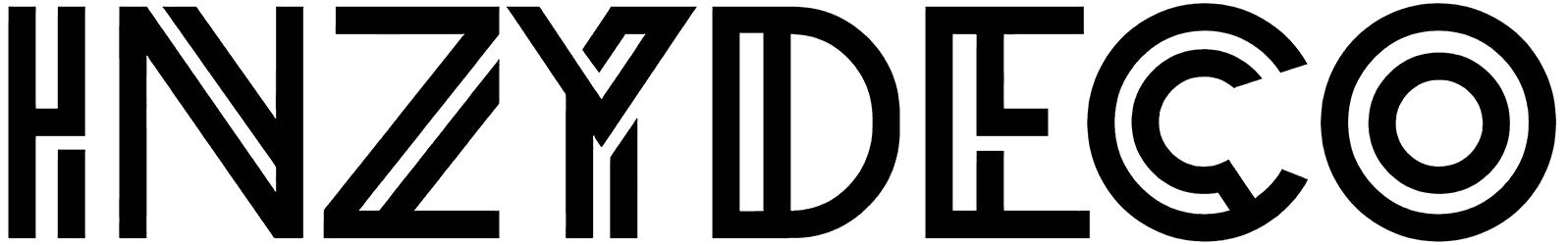
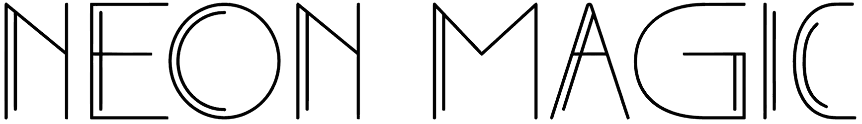
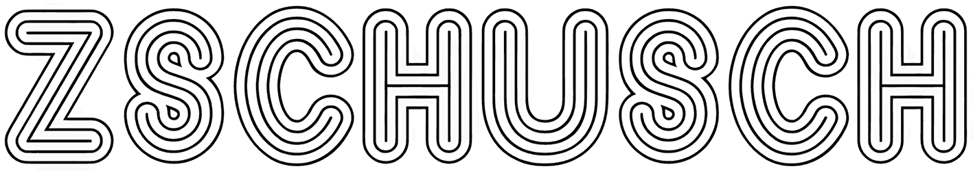
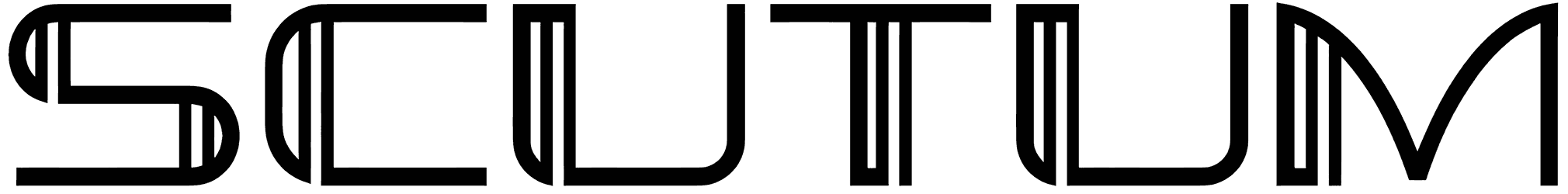
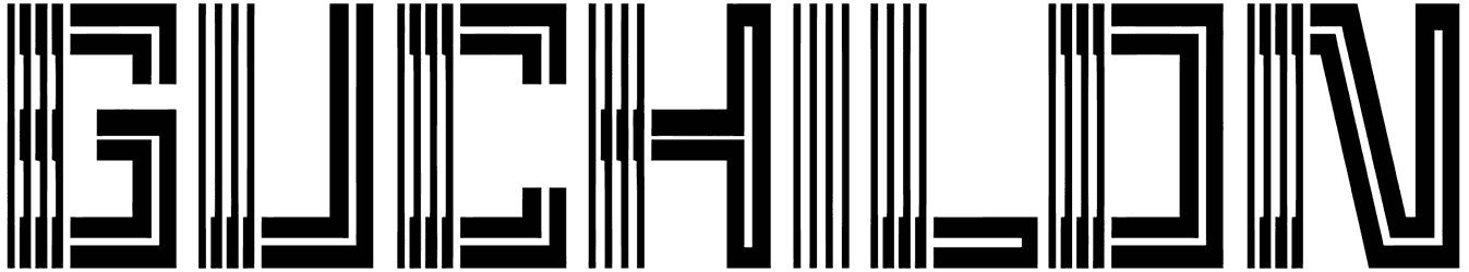
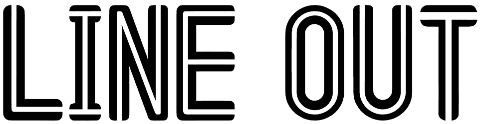
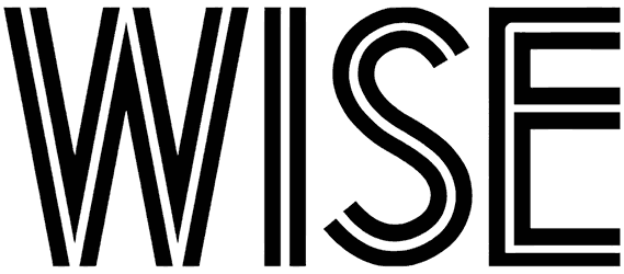
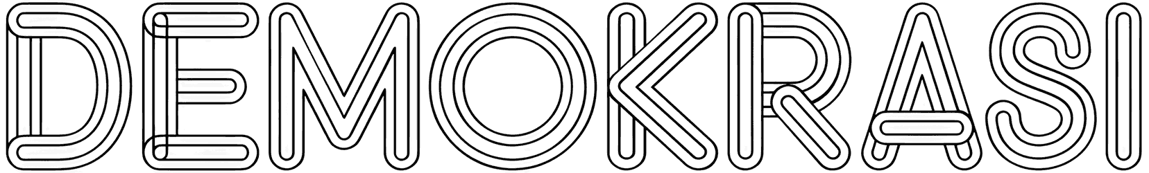
- How do multi-line fonts take care of the style of your writing? The simplest way to describe this category is that it includes only those fonts with lines inside each letter. It may make it a bit confusing to read, but that’s only if you pick something with a rather condensed alphabet. Just make sure there’s enough room between the letters and it doesn’t have to be at all complicated or misleading anymore. As you can see, these concentric lines in their structure often lead to a geometric design. Also, plenty of them are arranged in a monospaced style, and that’s only going to make your text seem a lot neater. The way these lines go straight and then curl to capture the outline of each letter lets you express your message in an organized fashion. It's safe to say everything works out to symbolize the concept of symmetry perfectly. It’s just amazing how the multi-line letters deliver a stylish piece of art almost every time.
- When you use one multi-line font, what is going to change about the way your words sound? Thanks to their unique design, the double-line fonts are all quite experts in attracting massive attention to any lettering. However, it’s not all just about the looks. These fonts can also add certain flavors to your typography. For instance, the inspiration behind this collection belongs to retro fonts. They can create the most authentic artwork with their nice classic charm and wow everyone. Nonetheless, that doesn’t make them any less suitable for your modern projects. What’s important is that they elegantly visualize art through their multi-line letters. Other than that, there’s even a nod to a digital theme sometimes. So you’ll never know their full potential unless you take a good look around this list. Besides, if you want these multi-layered characters to sound more playful or more formal, it’s just a matter of choosing between a line font with sharper tips or rounded edges.
- What should you use this pack for? This collection is here to provide you with a great load of display fonts to choose from for your next project. It can be a logo for an architecture firm, the sign for a jewelry store or an art gallery, the cover of a music album, or anything else you want. Just download a double-line font and let your imagination run free. Let them tastefully highlight your words in the headline of a website, banner, magazine, etc., and the next thing you know, everything looks a lot more interesting.
- Have you seen the rest of our amazing library on Resource Boy? Now that you’re here, you don’t ever have to worry about any font download you need in your next projects. Just like you found the ultimate source of multi-line fonts on RB, you’re going to access all the best inline fonts here as well. Lots of artistic options are waiting for you in our vast inventory and another one is our collection of outline fonts.