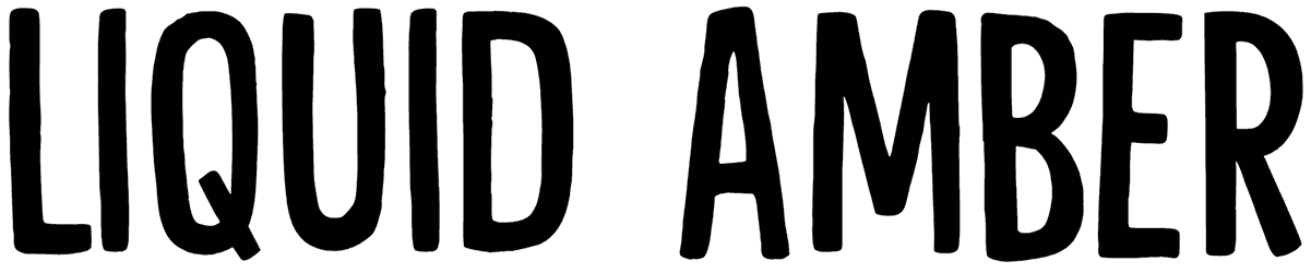

Cartenz gets its charm from weight rather than decoration. Thick, rounded strokes, compact counters, and softly squared curves give the letters a chunky, friendly presence, while the balanced proportions keep everything surprisingly clean. Even at its heaviest, the alphabet feels approachable instead of clumsy; a playful sans serif font with enough discipline to stay versatile.
Use Cartenz font for cheerful branding, packaging, posters, kids’ graphics, social campaigns, or bold editorial headlines. Its three weights give layouts useful flexibility: let Heavy Bold carry the headline, then step down for secondary text. Bright color blocks suit its upbeat side, while simple monochrome compositions reveal the tidy geometry underneath.
Note of Designer
This font is FREE for PERSONAL USE.
For COMMERCIAL USE, please purchase a license here:
https://letsfourlines.comIf you need any further information, feel free to contact me:
[email protected]Follow for updates, new fonts & creative content ✨
📸 Instagram: https://www.instagram.com/fourlines.stdTo support my small business:
https://paypal.me/fourzainThank you for your support 🙂
Regards,
Zain