If you’re always too focused on what’s new in the world of graphic design, you’re not going to be able to fully appreciate the tokens of the past. Once you see this awesome collection of 1940 fonts, you’ll realize why you shouldn’t underestimate the power of old times. Apparently, this rich era had so much to offer that it’s decades later and it’s still not finished. Considering all the stylish designs you can make with them, you’ll be at a huge loss if you take those earlier periods for granted. Download any of these fonts you please and upgrade your lettering with a nice classic touch like nothing else.
Every reason you need to be fond of our 1940 fonts:
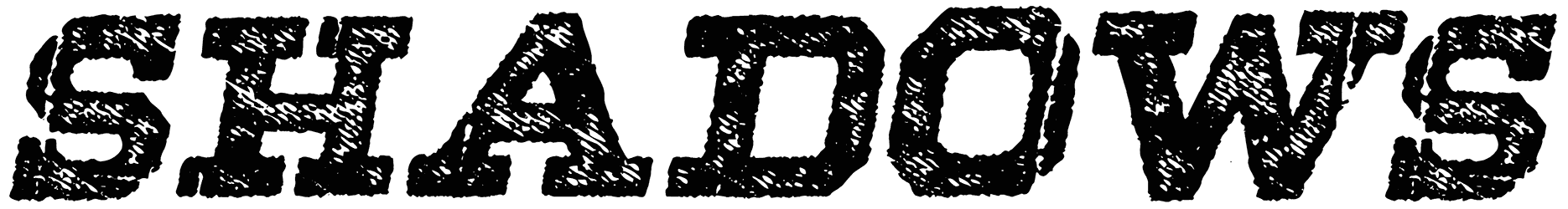
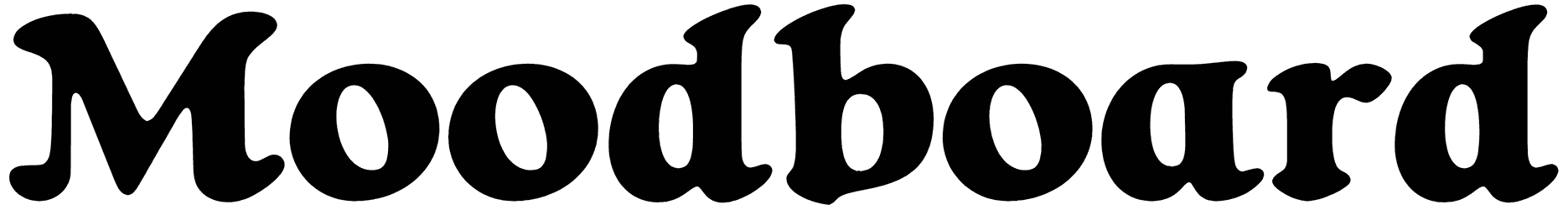
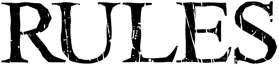
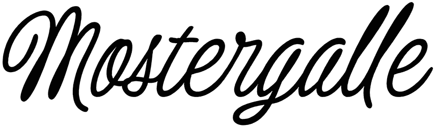
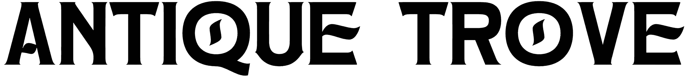
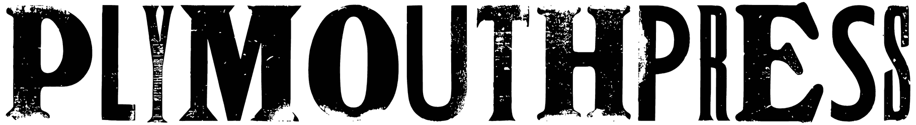
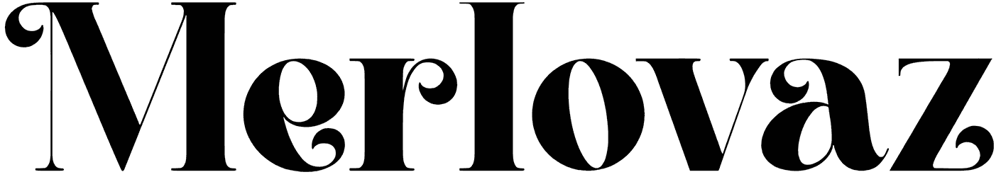
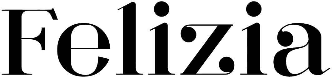
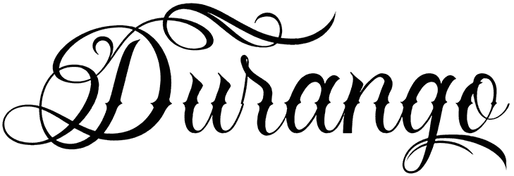
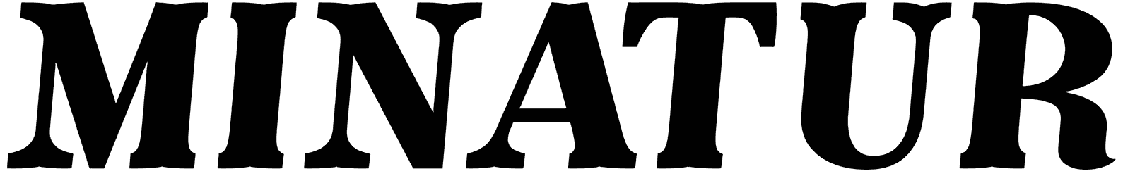
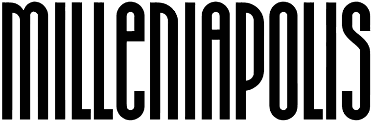
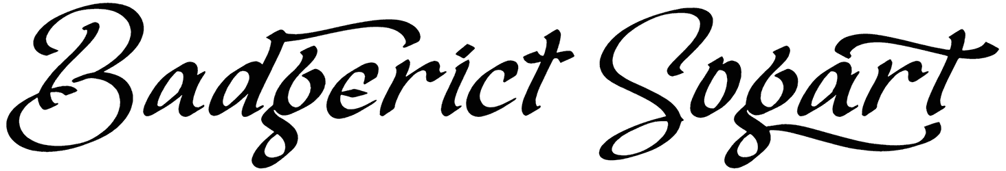
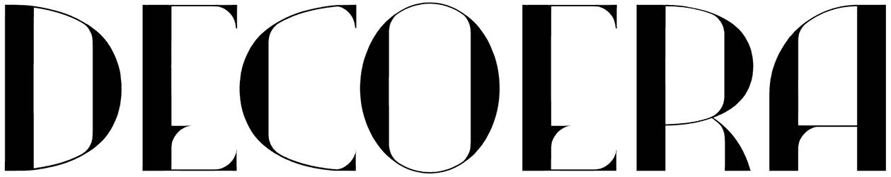
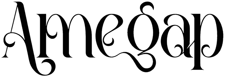
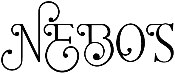
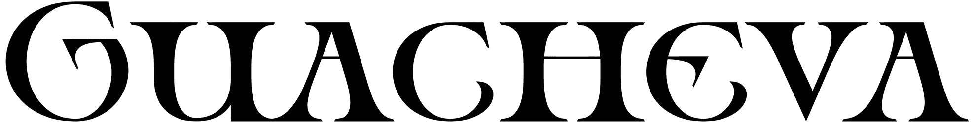
- What is the regular look for the fonts in this collection? Even though there’s nothing unconventional and exaggerated about 40s fonts, they still manage to set your text apart. Ironic, huh? After all, they have been around long enough, so there’s not going to be any surprises. In the meantime, that means that they have a long history of attracting attention and appealing to people. There’s usually minimal ornament present in their design, but despite that, they are considered to be highly engaging. It’s probably because their retro details feel familiar all the time. Plus, they are varied enough to give you lots of contradicting options. There are those blocky versions with their distinct letters against the handwriting and its nice cursive style. You’ll never know which of these two you’re going to need, because it all comes down to the type of project you’re dealing with. However, regardless of the font you choose, you would never have to worry about your letters and numbers being bold enough.
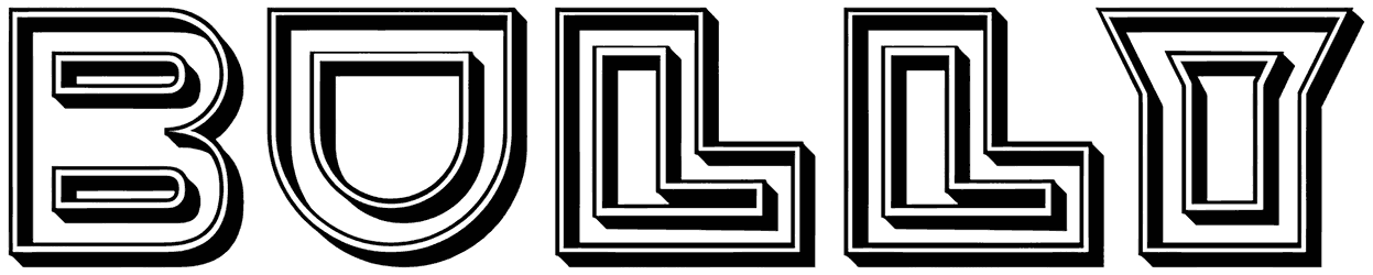
- How will you feel while reading the 1940s fonts? This collection of ours is filled with everything that makes that era memorable. However, it wasn’t all good and pleasant per se. That’s why these fonts kind of worked as a tool that allowed people to escape from the bad news of World War, the destruction, and the death. See how wrong it would have been to assume the 1940 alphabet is only good at provoking a vintage feel? It can do a lot more than that. For instance, because of the influence of war in the development of this font category, the 1940 letters had hints of patriotism all over them. Despite the tensions from that period, designers always seem to find a good reason to keep coming back to it. The fact that the Art Deco font style became a hit back then is one of those. As it looks like, the 40s are still a precious time for most people even after so many years. So if you care for some nostalgia in your writing, this is a good opportunity to design your art as an acknowledgement to the decade.
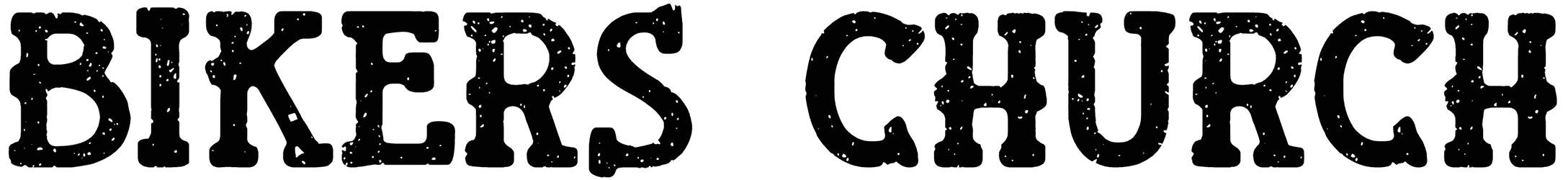
- Where do you see 40s fonts these days? There must be a reason that even after such a long time, 40’s fonts are still vastly popular. They’re not just incredible as a barbershop sign but for your social media banners too. They have a wonderful aesthetic touch to lend to your words, so if you’re involved in a project where you have to design a logo for a tire company, brands of apparel, beverages, or a retro movie, this is your best shot to nail it. Your classic music concert flyers or book titles can also benefit from this font collection.
- What are other examples of Resource Boy’s awesome treats for you? We have never failed to surprise you with our offers and this collection is only one example of that. For more, visit our excellent bundles of 50s fonts or 1930s fonts, and we will show you how it’s done.