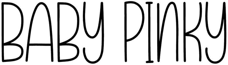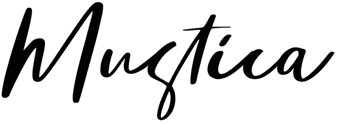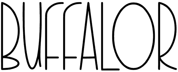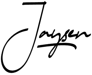

Clean geometry gives SP Butch Lite font a quieter kind of personality. Circular bowls, simple monoline construction, open spacing, and uncomplicated lowercase forms create a contemporary sans serif that feels precise without becoming sterile. The preview also shows the design holding together across lighter and heavier treatments, which makes its restrained shapes especially useful for building hierarchy.
Editorial layouts, architecture portfolios, skincare packaging, gallery identities, modern menus, and minimalist posters would all make sense here. Use this minimalist font with generous margins, grayscale photography, muted beige, cobalt accents, or thin rule lines. Switching weight between headline and supporting information can create contrast while keeping the entire composition unusually calm and coherent.
Note of Designer
– This demo font is free for personal use
– This font is reduced on weights and glyphs
– For Corporate use you have to purchase a Corporate license
– Here is the link to purchase full version and commercial license with more weights and glyphs:
https://www.myfonts.com/collections/sp-butch-font-studio-pulpPlease visit our foundry for more amazing fonts:
www.studiopulp.be