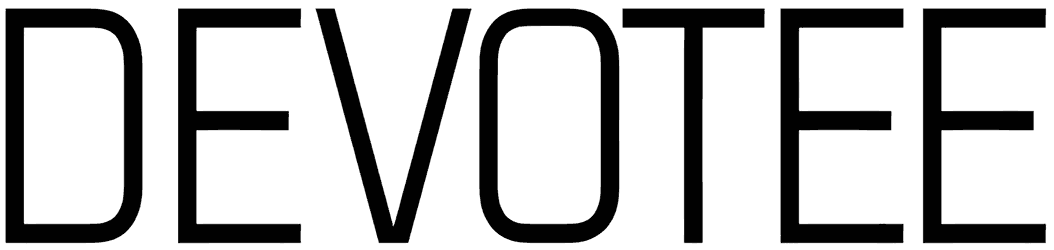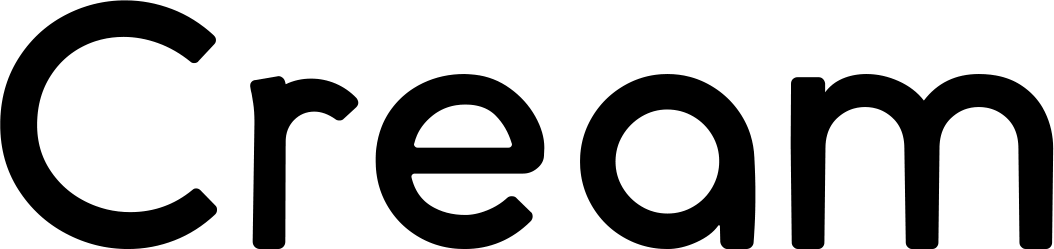

Being Nice keeps things light and lanky with tall, narrow letterforms, soft curves, and slightly irregular strokes that feel more drawn than engineered. Its playful proportions and subtle handwritten wobble give the alphabet a friendly, offbeat character without pushing it into full cartoon territory.
Use this sans serif font for casual branding, café graphics, greeting cards, playful packaging, social posts, or relaxed editorial headlines. Give it space and let the vertical shapes breathe; warm neutrals, muted pastels, or simple black-and-cream layouts suit its easygoing personality especially well.
Note of Designer
PLEASE READ THIS CAREFULLY :
By installing or using this font, you are agree to the Product Usage Agreement:
– This font is a DEMO VERSION and ONLY allowed for PERSONAL USE. NO COMMERCIAL USE ALLOWED!
– Here is the link to purchase full version and commercial license: https://noahtype.com/being-nice-font/
– For Corporate use, you have to purchase Corporate license
– If you need a custom license please contact us by email : [email protected]
Please visit our store for more amazing fonts : https://www.noahtype.com
Thank you.