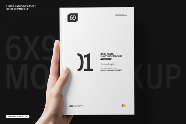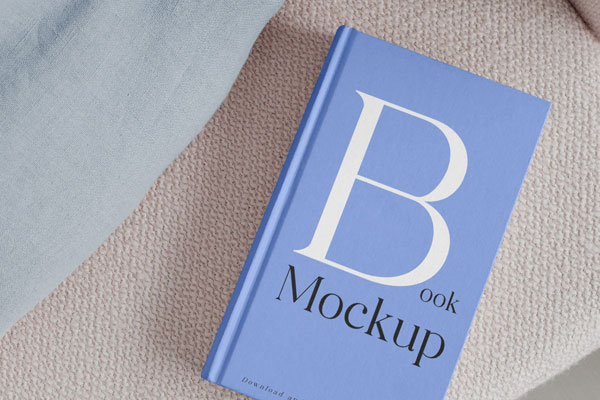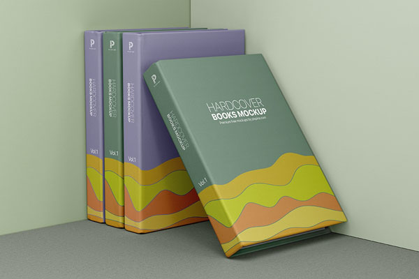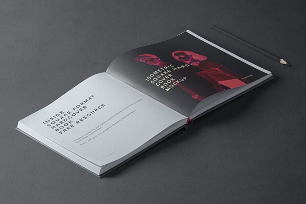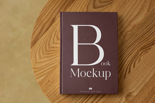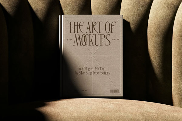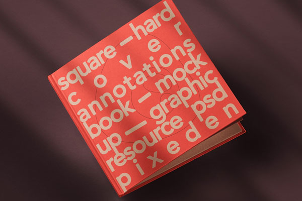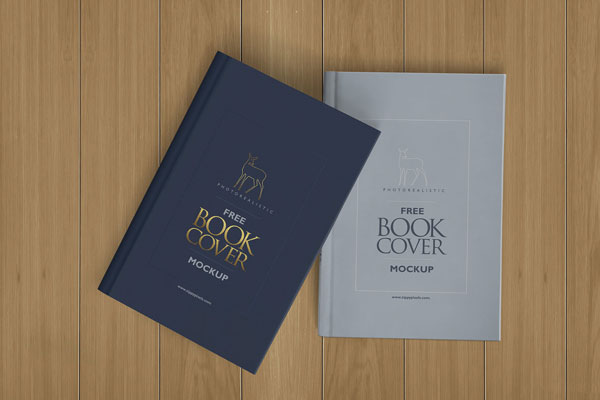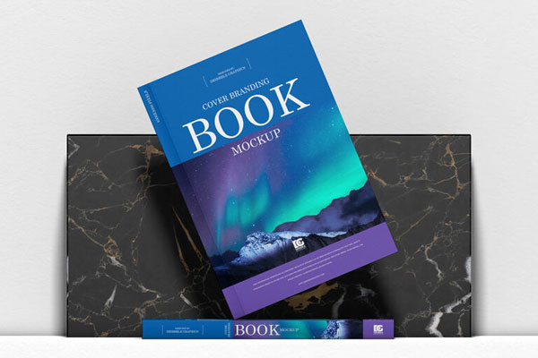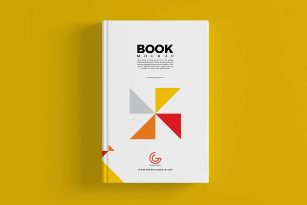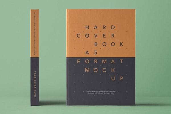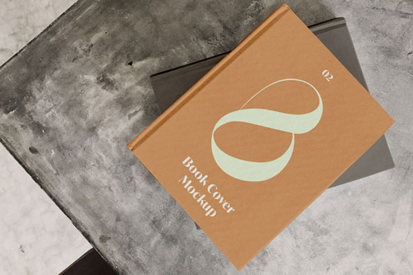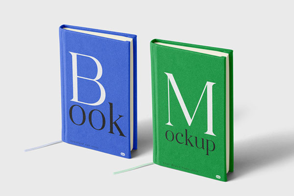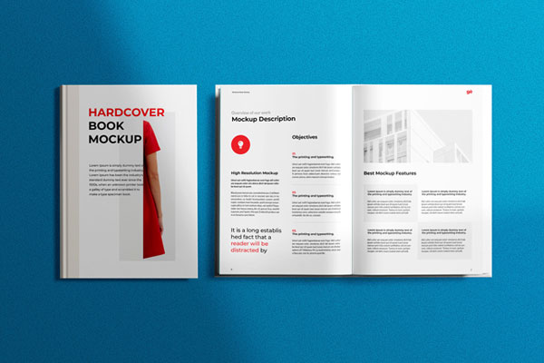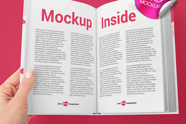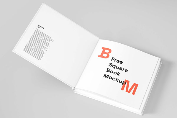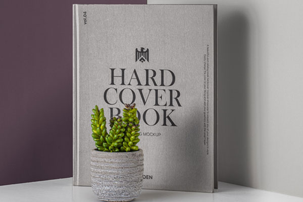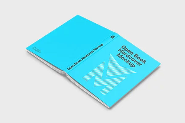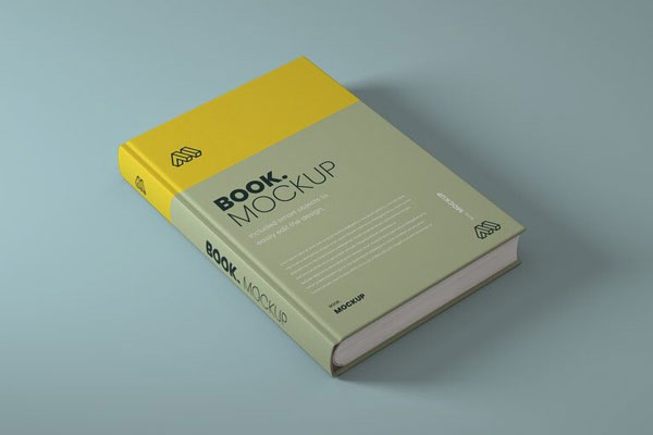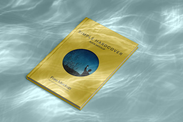
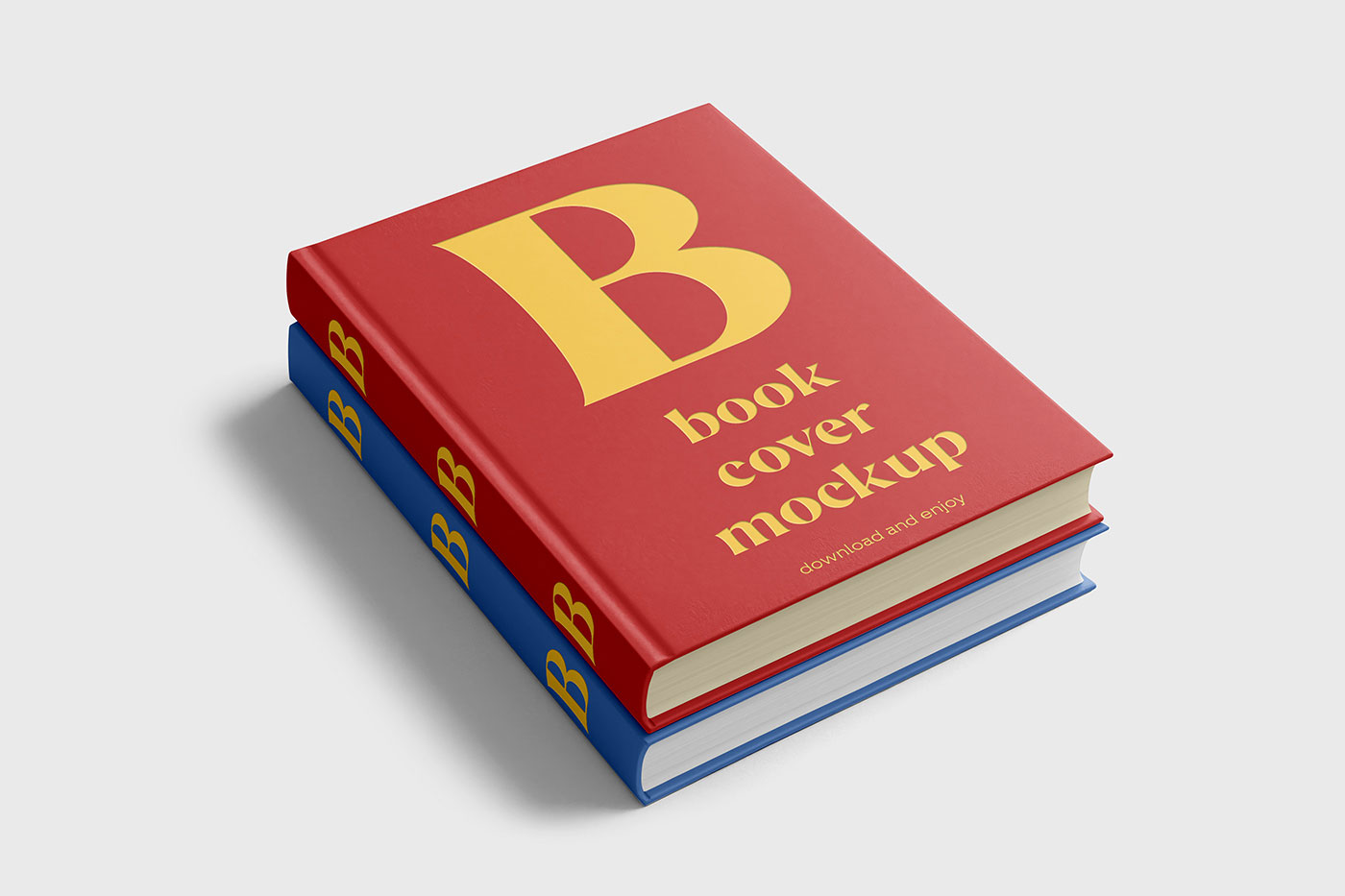
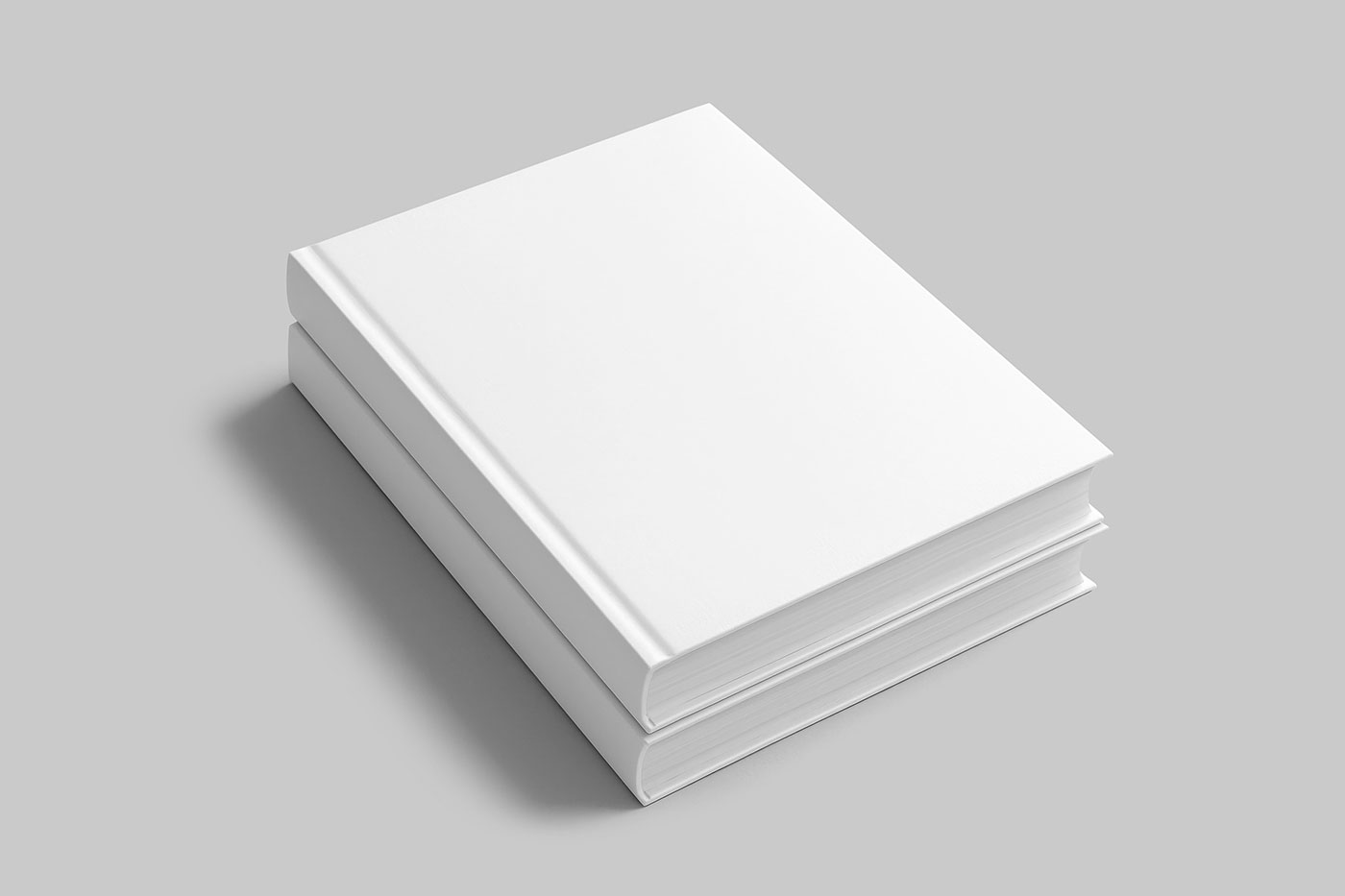
Stacks of books are one of those subtle presentation formats that instantly make a design feel curated. A single cover can look balanced. Two can feel like a collection. But a stack starts to feel like a library, a body of work, a narrative, a brand identity with depth. That’s exactly why this book stack mockup is such a valuable tool. The layered composition helps you evaluate how each cover interacts with the one beneath it, how color systems relate, and whether typography holds its presence across multiple pieces.
Editorial series, publishing houses, portfolio projects, author collections, academic works, and lifestyle projects all benefit from seeing their design in a pile that feels intentional and complete. Sometimes the best way to show depth isn’t through complexity. It’s through harmony in repetition.