There are certain times in typography design when you just can’t risk your words being made light of. There’s a whole collection of fonts to never let that happen that can put an end to your troubles for good. Explore the longest list ever made of warning fonts and download them from Resource Boy to guarantee your writing will get proper attention, especially when it’s essential to communicate a message to people. It’ll be really hard to ignore the distinctive letters in this bundle, and certainly, their strong tone is not going to let anyone pass over them either. So consider them sure-fire ways to get noticed.
Find out all the answers to the most asked question about warning fonts
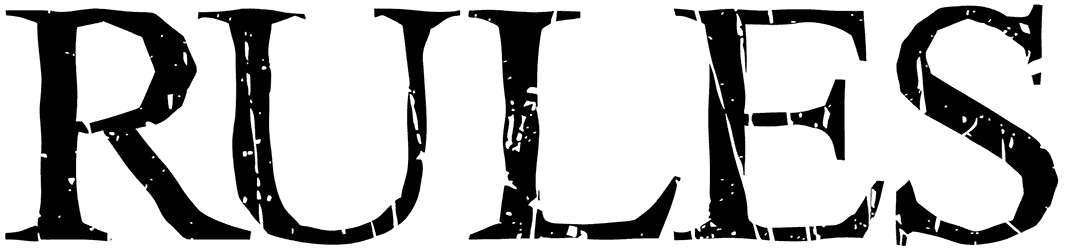
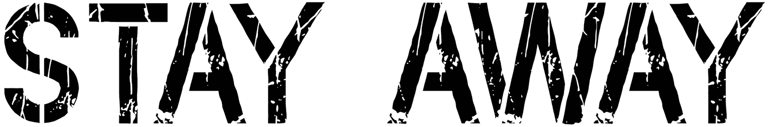
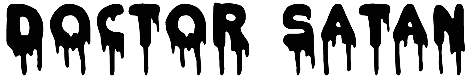
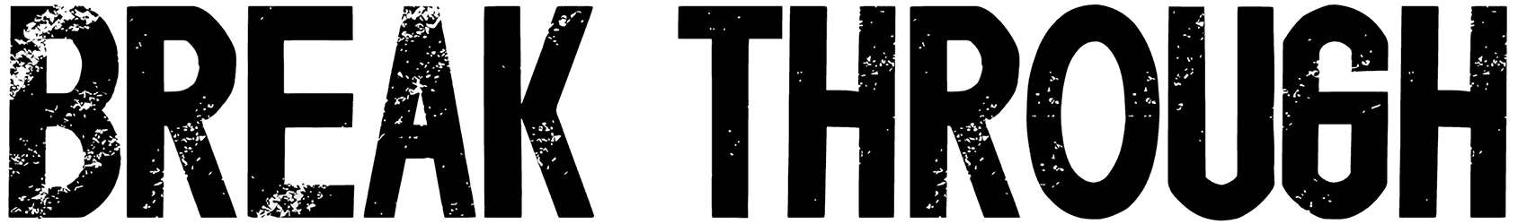
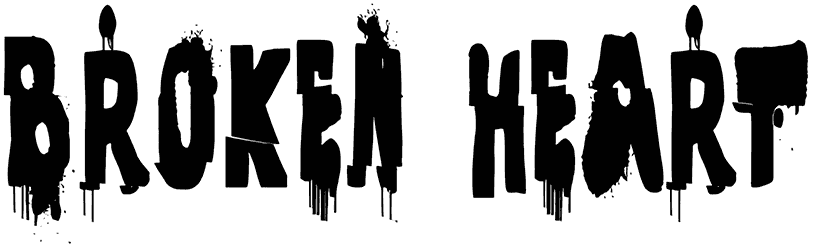
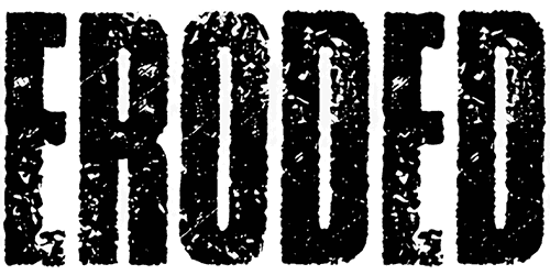
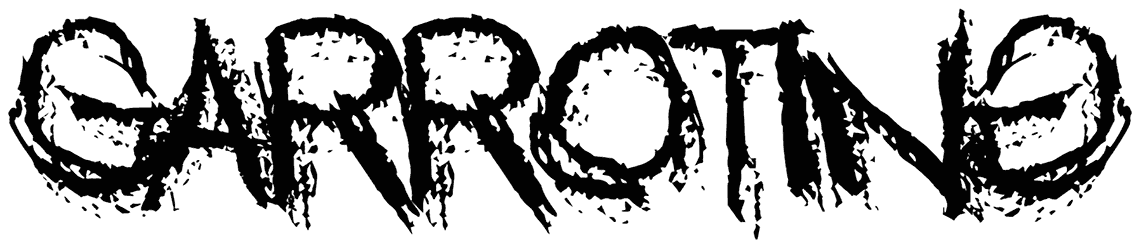
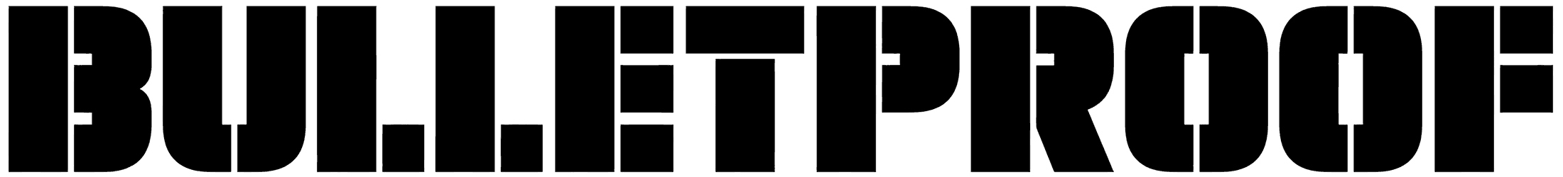
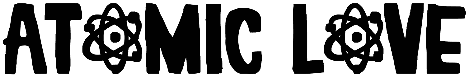
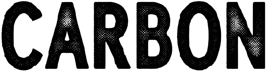
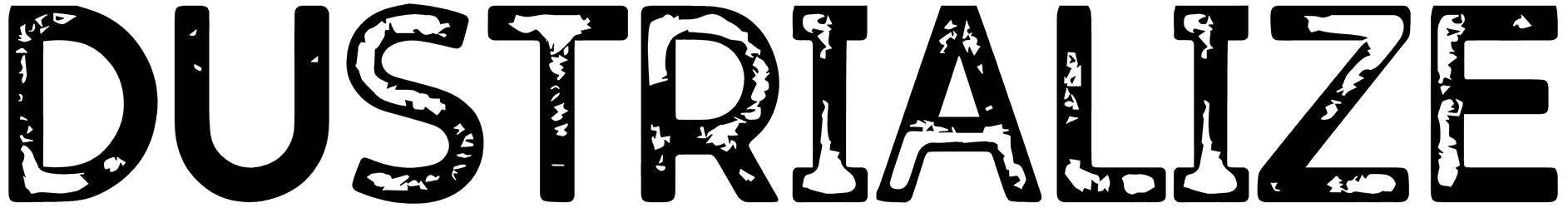
- What signs should you be looking for in a font style to see whether a font can warn people or not? The fonts in this bundle may differ in details, but they all share the same bold look that makes it impossible to not focus on their words. To deliver the message, these fonts are mostly designed to be easy to read, so there can be no confusion or misleading. The warning alphabet is often visually enhanced through geometric letters that are both expressive and straightforward. Some of them are designed as stencil fonts to add even more weight to what you want to convey. Other ways they use to highlight your text are turning your letters to sharply edged characters, applying a grunge effect to the words, and so on. Some of them are built with metal elements, bones, or written in spray paint that may even be dripping. If you want to really get in the mood, optimize your warnings with colors like red and yellow, and you’ll be all set.
- How do people usually respond emotionally to texts made with these fonts? This collection can make the viewers experience a variety of feelings based on what your writing is about. They may just be used as caution signs, letting you know that you have to be more careful with a task. If it’s the concept of hazard that you want to emphasize, these fonts can also help with that. The warning letters can properly signal a dangerous quality, and even take things as far as sounding deadly. Their serious appearance is clearly translated into an alarming tone that makes your writing induce fear and awe in people. Designed neatly to keep things to the point, these fonts are decorated with harsh characteristics that create a sense of authority. These rough fonts are also good at implementing a formal attitude that easily makes your design look official.
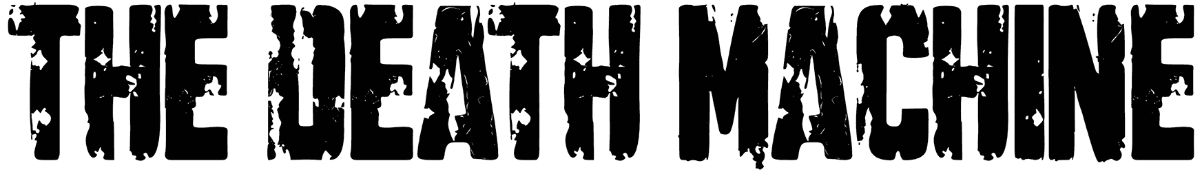
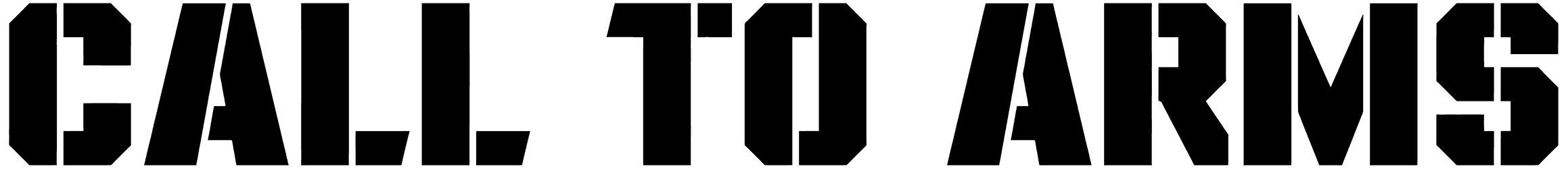
- When do you need one of the warning fonts for your lettering designs? Whenever you want to reflect the urgency in your tone, these fonts will do the trick. You can use them to mark the danger zone or design different kinds of warning signs for certain places and warning stamps that you may need for your documents. Besides, it doesn’t always have to be about signaling danger. They can also work as arresting logos for your action movies or excellent titles for your books with scary or adventurous stories. The possibilities are in fact endless if you think creatively.
- Don’t you want to explore the rest of our website and find more amazing features like this one? On RB, we have already hooked you up with so many great warning fonts that could have taken you days to track them all down from different websites. To help you even more in your next designs, download our awesome skull fonts and military fonts right now as well and you’ll get to work on an even more professional level.