Many of you probably don’t know yet that some texts are better seen and read the sillier they look. One of the perks of using this kind of fonts is that they’re pretty easy to understand. They just make sure the viewers enjoy reading the text quite as much as you do while designing it. So it’s going to be a win-win! It’s weird how the silly fonts can look so unconventional, and yet take your notice every single time. That’s how effective it is to include some playfulness in your lettering. So add these cool fonts from Resource Boy’s selection to your toolkit and wow everyone at first glance.
Upskill yourself in terms of silly fonts through the following Q&As from RB
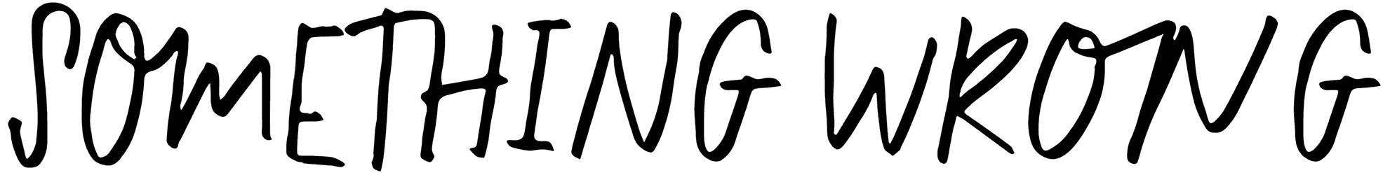
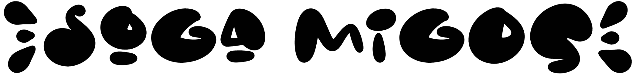
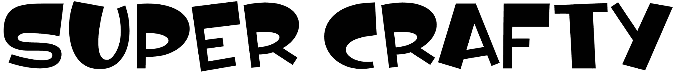
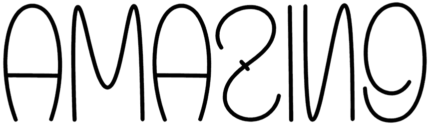
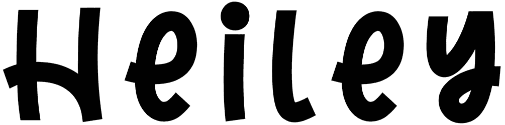
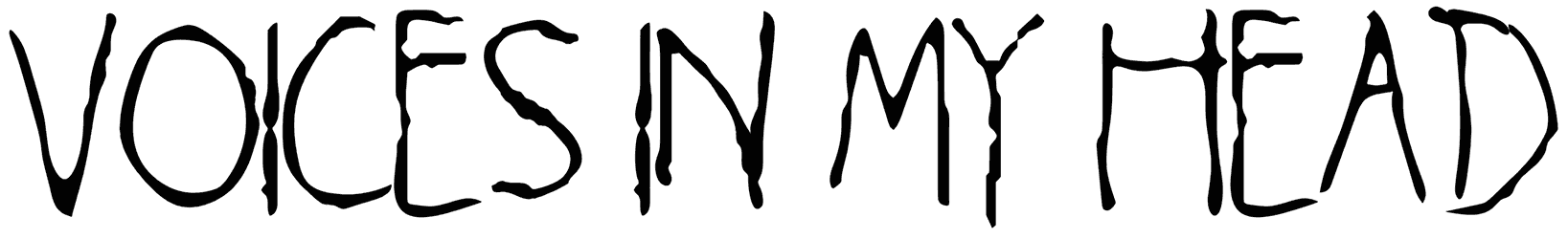
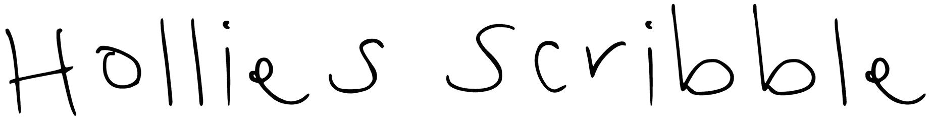
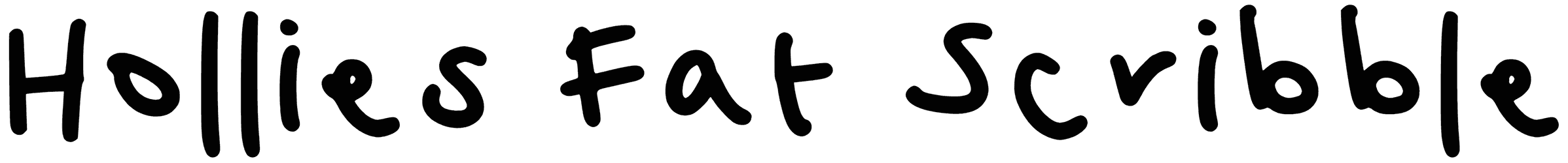
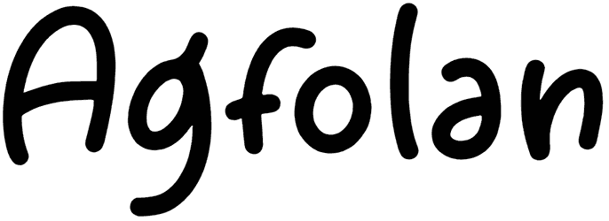
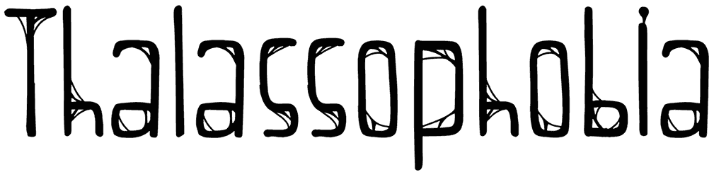
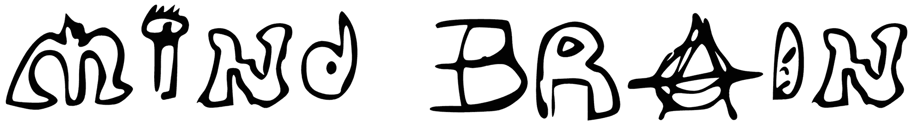
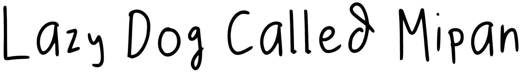
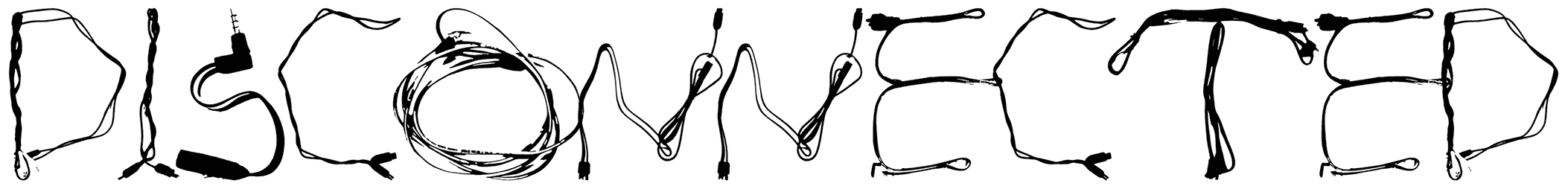
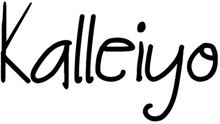
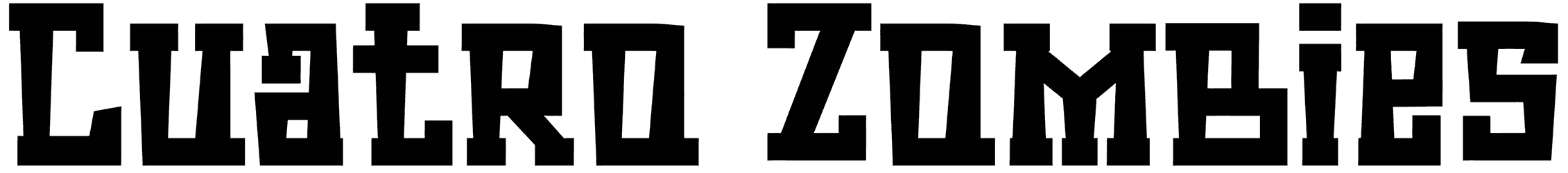
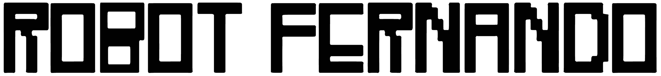
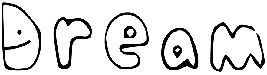
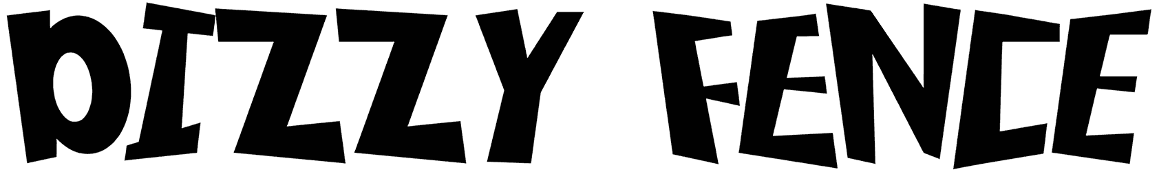
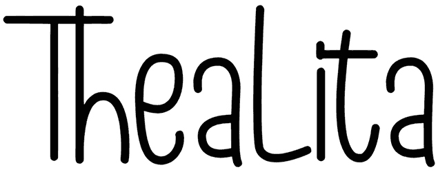
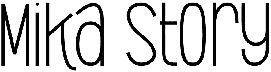
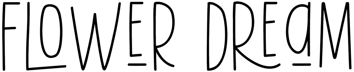
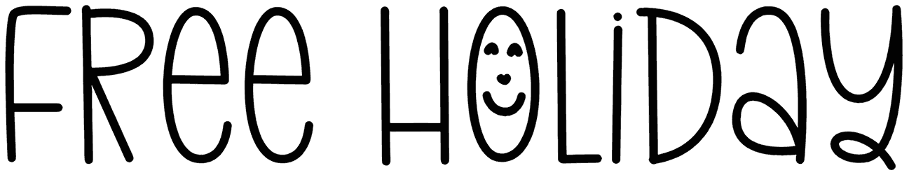
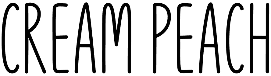
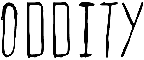
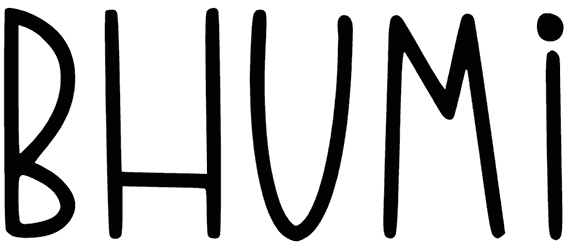
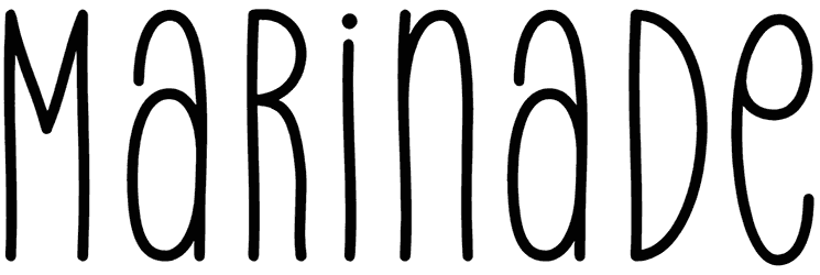
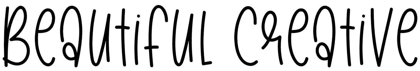
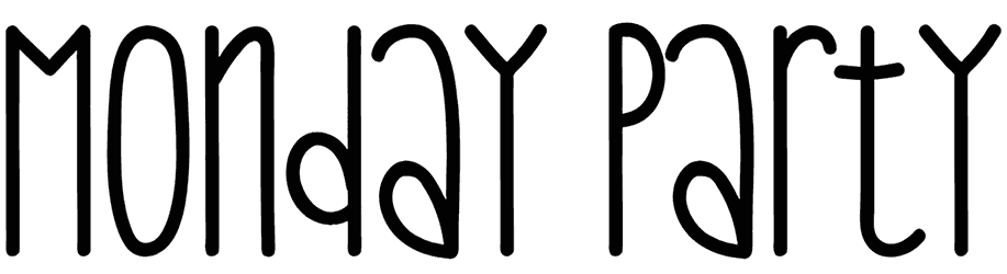
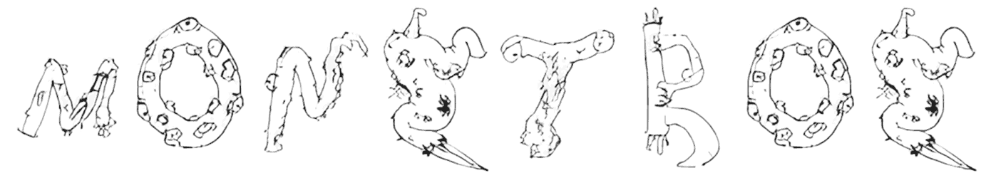
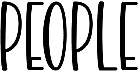
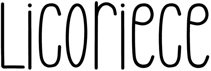
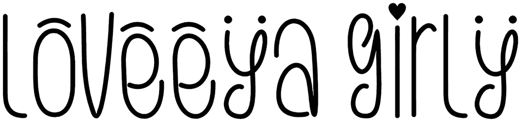
- What type of visual details do these fonts commonly feature? The greatest thing about this font bundle is that it includes only the fonts with irregular shapes in their structure. The silly alphabet is in fact defined by their unpredictable font style. So you’re going to find many surprises in this collection. Given the wide variety of fonts here, you’ll have countless options as to how to decorate your writing. It can even get as crazy as having monsters, ghosts, and dinosaurs lurking among your words. There can be all sorts of drawings, doodles, and cartoon characters used in their design, making each of these cute fonts different from the rest of them. It’s funny that they can take the most casual approach with the audience even though they look so exaggerated in their style. They’re called silly for a reason, and that reason seems to work for the best!
- How does a silly font change your text in terms of mood? If you want your audience to appreciate just how delightful your words sound from the very start, these fonts are exactly what you need. They may seem a bit unusual sometimes, but that’s just a small price to pay for how sweeter your design tastes after you add these fonts. Let’s just say that the silly letters allow you to have fun as you work on improving your text. That humorous tone is so appealing that you won’t be able to stop yourself from using these fonts in every last informal project of yours. However, you can choose just how far you’re willing to take it. Sometimes, it’s only a nice whimsical touch that you crave, while there may be some other times that you want something quirky out of it. On some occasions, you may even reach a psychedelic level too.
- When are you definitely going to thank God for having such a perfect selection of fonts at your fingertips soon enough? If you ever thought that this category is only designed to be amusing to the kids, you couldn’t be more wrong. The truth is that this collection is so full of unique fonts that it can turn any project of yours into something way more creative. They will just be perfect on the covers of your books, headers of your websites, menus of your videogames, and everything else at all. The point is, wherever you decide to go with one of these fonts for your typography, you’ll have such a great time working with them that it just makes you want to keep pushing the keys on your keyboard forever!
- What are some of the other interesting collections like this that you can find on Resource Boy? This collection in front of you doesn’t give you a chance to resist falling in love with it right away, but that’s just the case with any offer from Resource Boy. Want to see it yourself? Then you should visit our fun fonts and playful fonts as your next collections for font download. It’s going to blow you away.