Sometimes you expect such impact from your typography that no other font can quite do it like shadow fonts, a font that works like a text effect in highlighting your words but doesn’t need that much effort. It gets even more enticing when you are informed that all the greatest shadow fonts have been finally tracked down and assembled here on Resource Boy. So if it used to take you hours to search for shadow characters and several open tabs in your browser, from now on it will be only a couple of minutes and you will only need the Resource Boy website. That’s all. With that being said, let’s see what we have to show you on RB’s shadow collection now.
Things you need to know if you want to make the best use of our shadow fonts
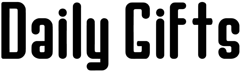
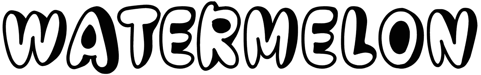
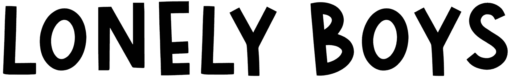
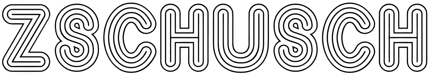
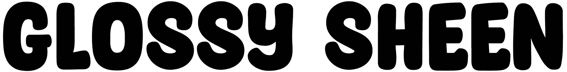
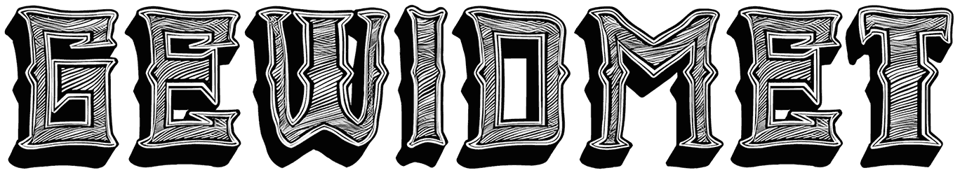
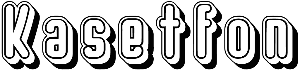
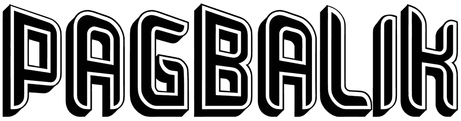
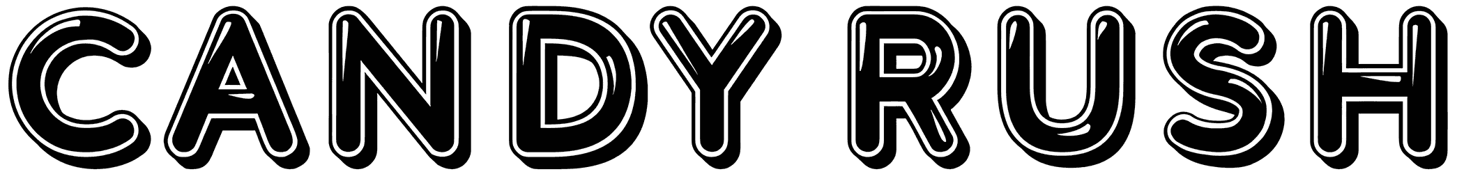
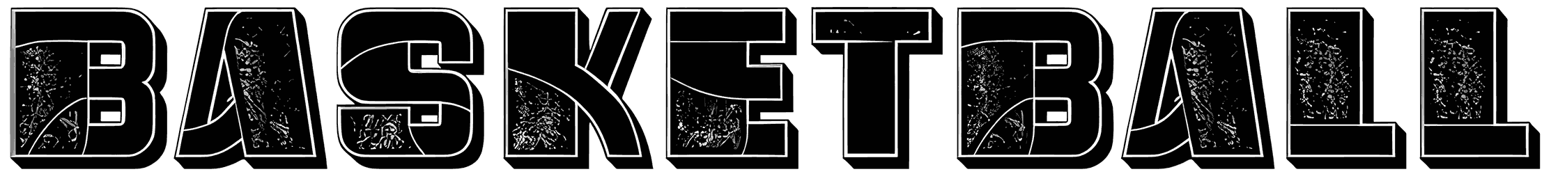
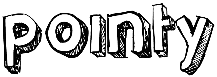
- Our shadow fonts are here to make sure your words stick out. The whole point of using shadow typography is to make your letters bolder and more eye-catching. So it’s better for the shadow letters to be properly spaced. In other words, don’t use a calligraphy shadow typeface unless you’re okay if things start to look a little complicated. There’s nothing wrong with hand lettering though, as long as you keep things simple and it doesn’t seem too much. Some serifs and italic styles can also tag along to add more weight to your writing, but even without them, our shadow fonts do just fine. If you’re after delivering a clear message, you’re going to like the shadow letters in blocks instead of cursive. There are also hand-drawn graffiti shadow alphabet for creating cute texts as well as script shadow fonts which are often picked for their friendliness.
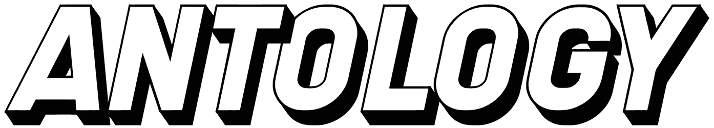
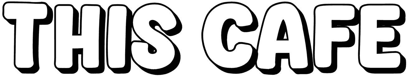
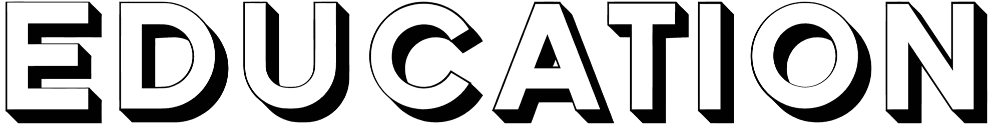
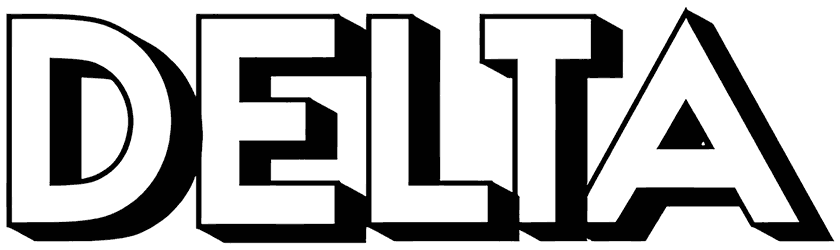
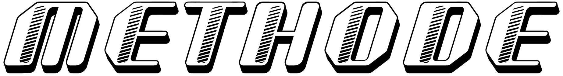
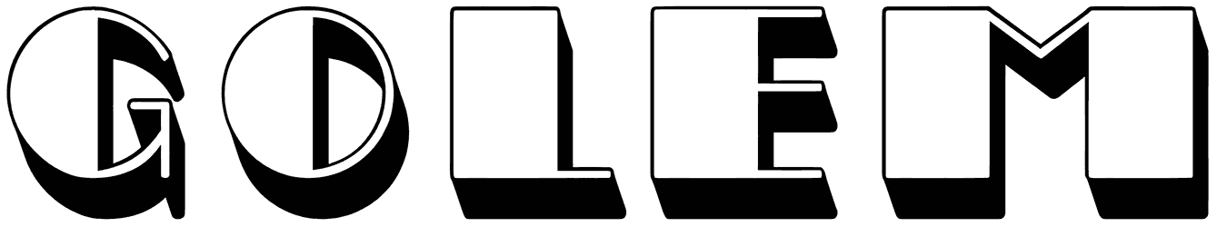
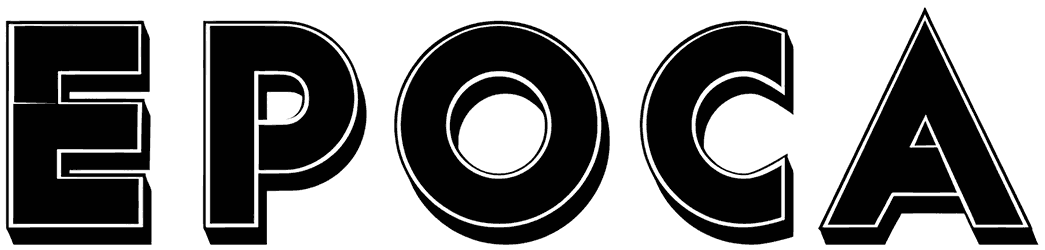
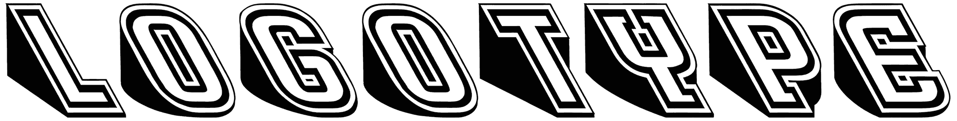
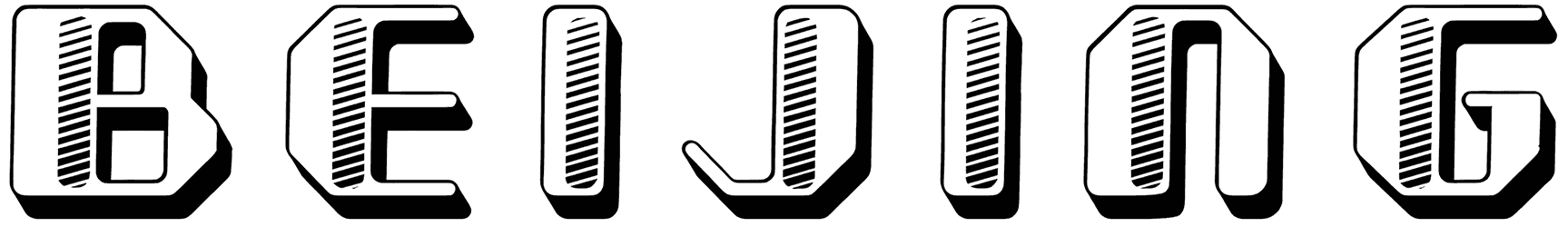
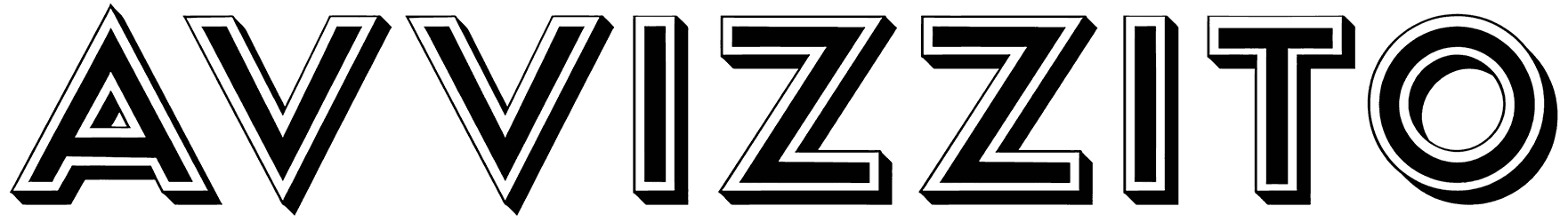
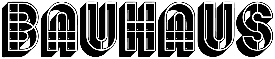
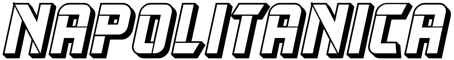
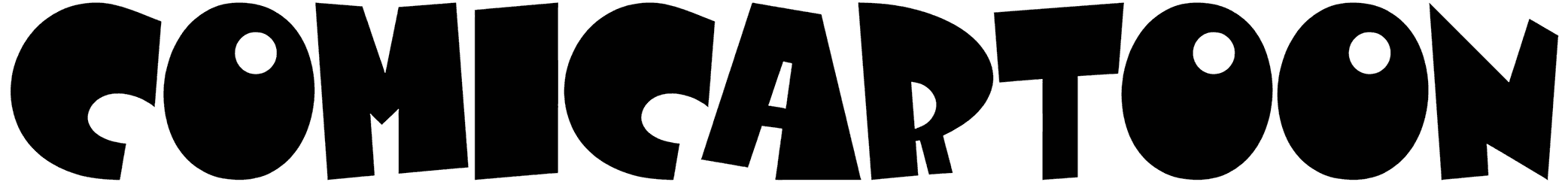
- Shadows might have been always associated with a sense of fear but the mood of shadow typefaces is not exactly like that. Even though these 3D shadow fonts can have a strong decorative effect on your artwork by adding depth and dimension to it, they also elevate your design by making it more emotionally relatable. First of all, our shadow fonts don’t really belong to a specific period of time. So you can count on them for both your retro and modern typography designs. While the drop shadow ensures a bold output, the cute and colorful handwritten shadow letters establish a closer bond with the audience whereas the grunge shadow letters simply look creepy. Anyhow, apply these shadowy fonts to your letters and the readers will be compelled to pay extra attention to what your design has to say.
- Our shadow fonts will help you be a better designer in almost every last one of your projects. There’s nothing ordinary about the way these shadow outlines give your artwork an artistic edge. Case in point, any bullet journal with our shadow letters on its covers is more likely to be the one that gets picked among other notebooks in a stationery store. By the same logic, shadow letters and numbers are perfect for when you want your tattoo to look aesthetically realistic and curious. Some of them are even classy enough to turn into contemporary logos for your brand while some others can be used in the name of your next popular cartoon series. As you see, the only limit here is your creativity.
- Download the best shadowy fonts from Resource Boy, and then a bunch of other great graphic design assets too. Our shadow collection is probably more than enough for when you want your art to be easy on the eyes, cool, and unique all at the same time. However, the opportunities are endless in the Resource Boy library. There are hundreds of other font categories professionally organized on our website but only a few of them can be just as visually interesting as our shadow fonts. Our 3D fonts and sketch fonts for instance are the closest any of them gets, but definitely not even half as impressively as Hyperpix's 3D text effects do it.