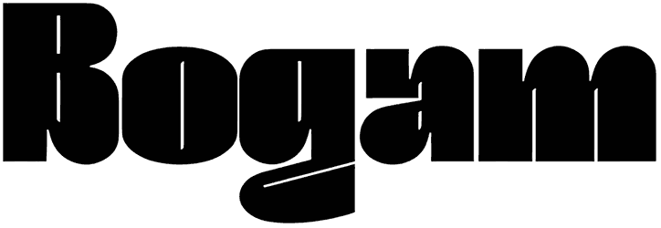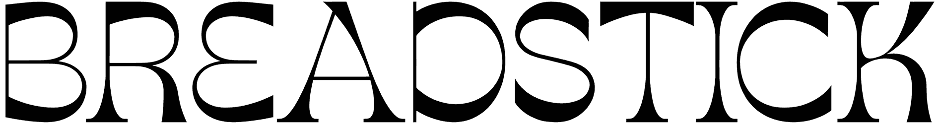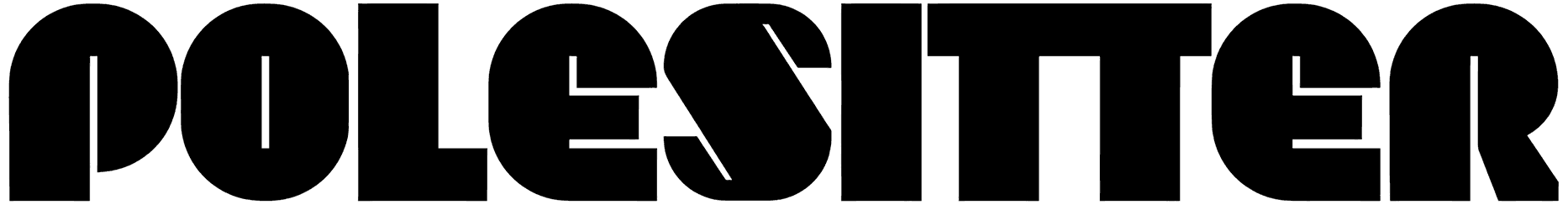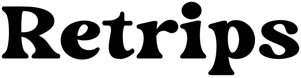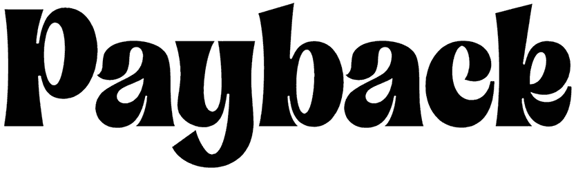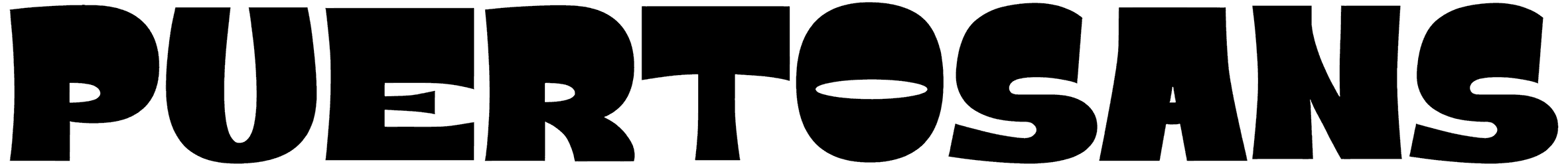
Okay, don’t be offended if you feel like Puertosans is mocking you with its unorthodox style. That’s just its way of attracting attention, and you have to give it to it; it seems to work just fine every single time. Try it yourself.
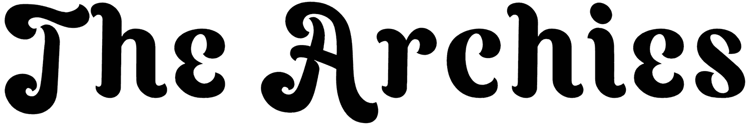
The way that the top of the letters is so much thicker than the bottom creates a visual significance that’s both fun and eye-grabbing, making this groovy font perfect for your retro designs, clothes store posters, western movie banners, etc.
Note of Designer
Thank you for downloading our font!
NOTE: This demo font is for PERSONAL USE ONLY!Link to purchase full version and commercial license:
https://justtheskills.com/product/puertosans/Please visit our store for more great fonts :
https://justtheskills.com/vendor/pinisiart/Donations are appreciated to support our work and let the creative juice flow.
https://paypal.me/thebigbundles to buy me a coffee.For licensing inquiries or questions, reach out at [email protected].
For detailed licensing information, please visit https://justtheskills.com/license/
We take licensing violations seriously, so beware beware 😉We hope you enjoy using our font! Your support means everything to us. If you have any feedback or questions, don’t hesitate to reach out. Thank you!