When it’s a matter of adding sophistication to your art, simply apply a monogram font and it all will fall right into place immediately that there will be nothing else left to do. Everything will be fixed right away with the stylish words of monogram fonts once the classic flair becomes quite hard to miss. Sometimes, even a single letter is enough for these fonts to imply an aesthetic touch. However, you’ll need one of those master circle monograms if you plan to achieve a luxury level. So believe us when we say you don’t want to use monogram letters just for monograms. It would be such a huge waste of its glorious letters. Resource Boy is now prepared to help you find your ideal fonts from its extensive collection in the shortest time. So let’s jump right in without much further ado!
The 3 following paragraphs work as a cheat sheet for monogram fonts, including all the details that you’re supposed to know yet are nowhere to be found:
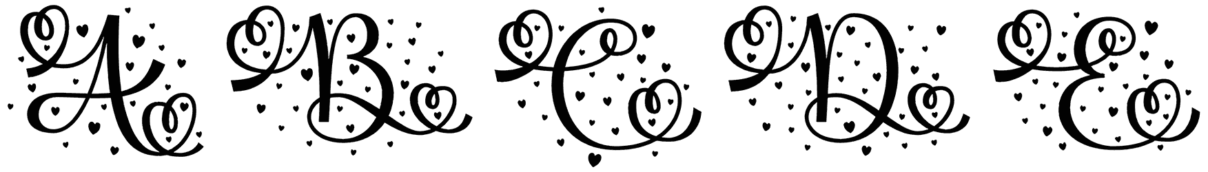
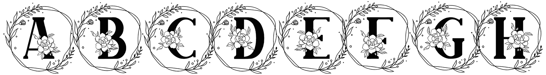
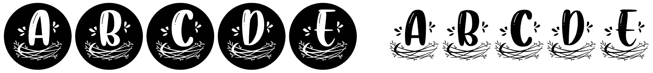
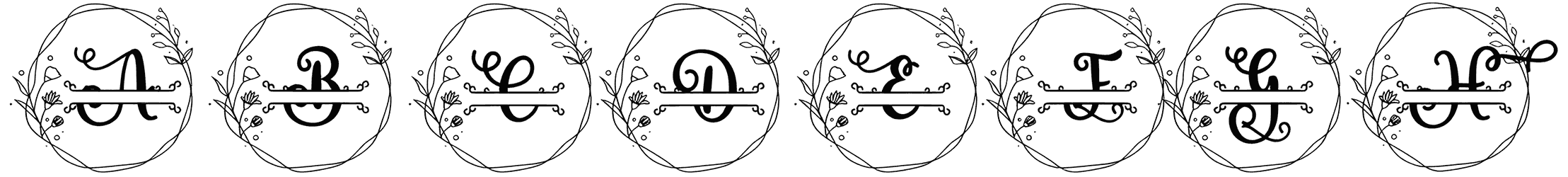
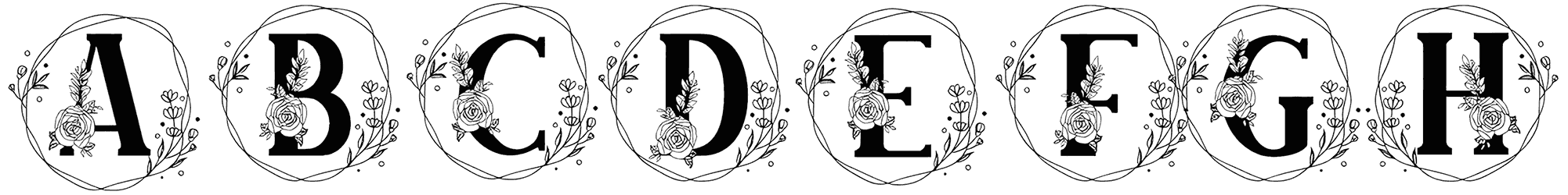
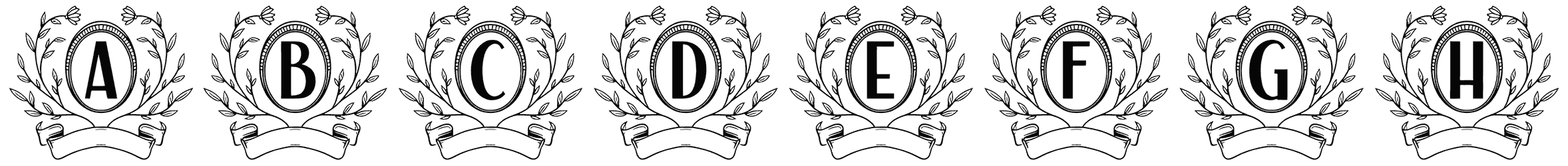
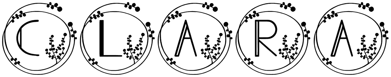
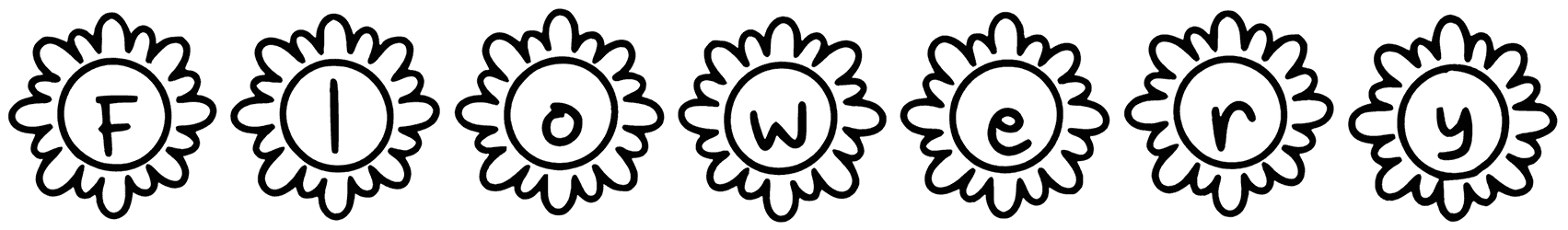
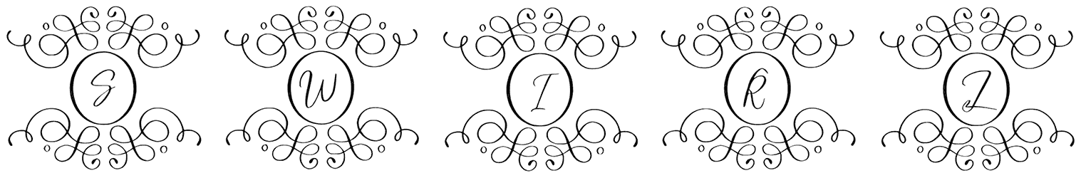
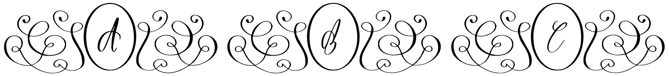
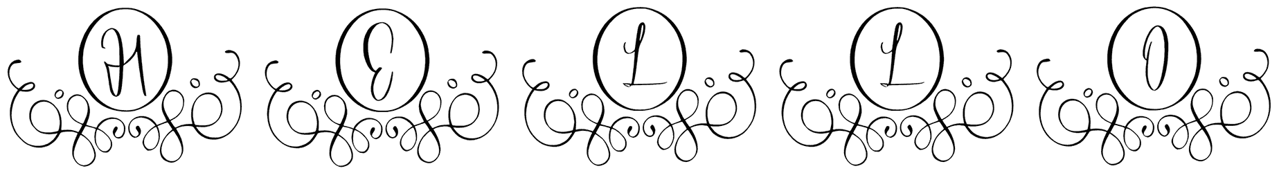
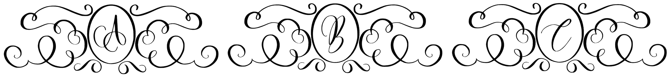
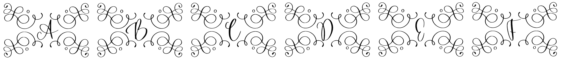
- The intricacies of monogram fonts and their style: One of the most interesting features of these fonts is that they can fit up to two or three letters inside a circle or a hexagon. This specific arrangement makes the final text look a lot like a diamond. Creative, right? What’s more, they don’t just adopt a simple cursive style like the rest of the font categories. Instead, they can take things to a whole other level by showing up in a much more complex version, an interlocking monogram. Nevertheless, if you prefer to keep the readability as easy as possible, it’s probably a better idea to stick with monogram fonts with split letters. Although many believe that monograms are far more engaging in script letterforms, silhouettes of letters are abundantly used in this font family, just as they make the greatest cricut letters as well. Everywhere you look in this selection, there’s a curly font decorated with fishtails or flourishing tips that can also remind you of vine fonts.
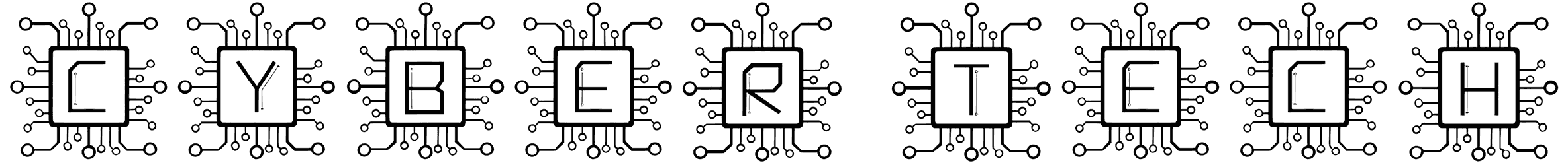
- The kind of feelings provoked by the monogram alphabet: There’s every reason to call a monogram font fancy, but that is not the same as saying that they’re only suitable for appealing to ladies’ tastes. While in fact, the monogram fonts are biased toward neither boy nor girl audience. Even those floral ones can do a lot more than just establishing a feminine theme. The whole point is to deliver an elegant piece of text through the neat blocks of monogram letters. It gets even easier to reach that exquisite outcome if your monogram font is designed to follow a nice Victorian style. Long story short, it’s inevitable to embody a rich expression and an accomplished character in the decorative letters of monograms, whether they’re highly detailed or kept minimal. As you can imagine, the end-result sleek monograms are not far from channeling futuristic vibes.
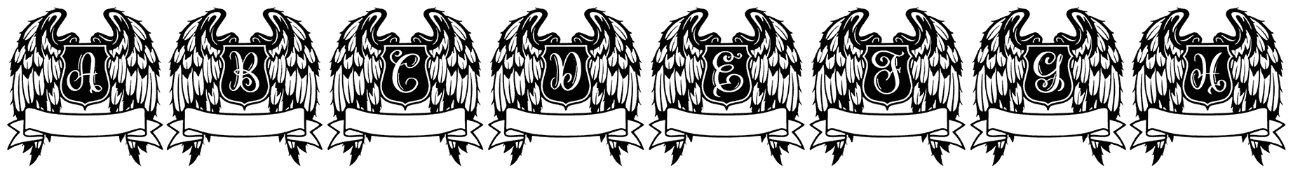
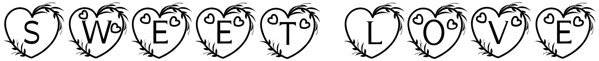
- Designs in which monogram fonts shine the most: Usually the first idea that comes to mind for putting a monogram font to great use is embroidery. The thing is, we haven’t collected all these SVGs and TTFs of these fonts just for that. They are undeniably perfect for designing artistic initials but that shouldn’t stop you from considering other options as well. One of the obvious opportunities for taking advantage of them is to come up with a cutting-edge logo. Plus, wedding cards are another one of those artworks that it’s most likely to see a monogram font used for them. In a nutshell, their vivid trendy quality makes sure they are tasteful enough for all your cool fashion designs, carvings on pieces of jewelry, and other branding projects.