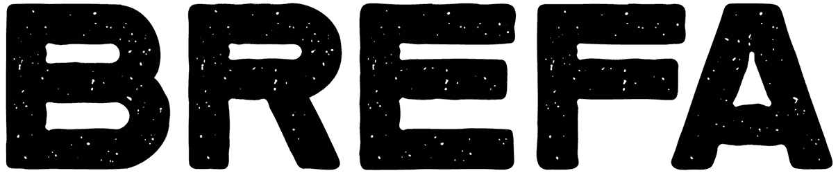
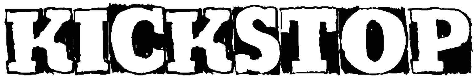
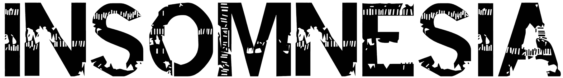
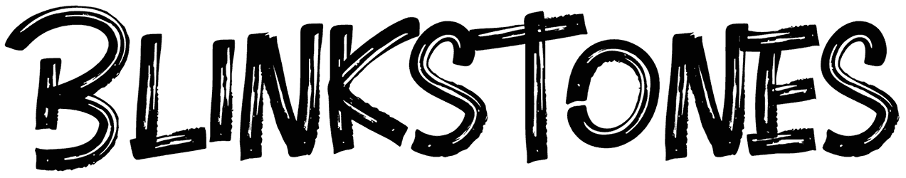
If you’re one of those people who thinks everything about their text should be perfect, you’re about to regret that. These awesome grunge fonts, even though a little unclean, can do your design a great favor. Turns out you don’t always need the best version of letters to make a memorable influence on your viewers. Sometimes a bunch of rugged hand-drawn elements does it better than any fancy style. It’s just more realistic when you try to capture the impact of time in your writing. Give it a try with something from our superb grunge font collection and you’ll just love it.
The ultimate guide to the entire category of grunge fonts:
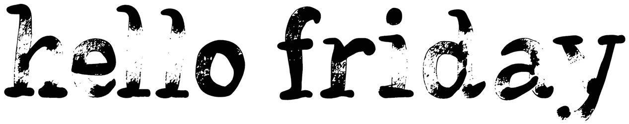
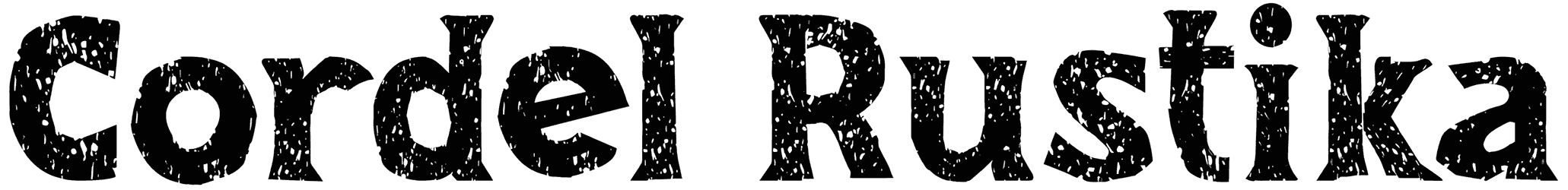
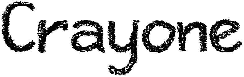
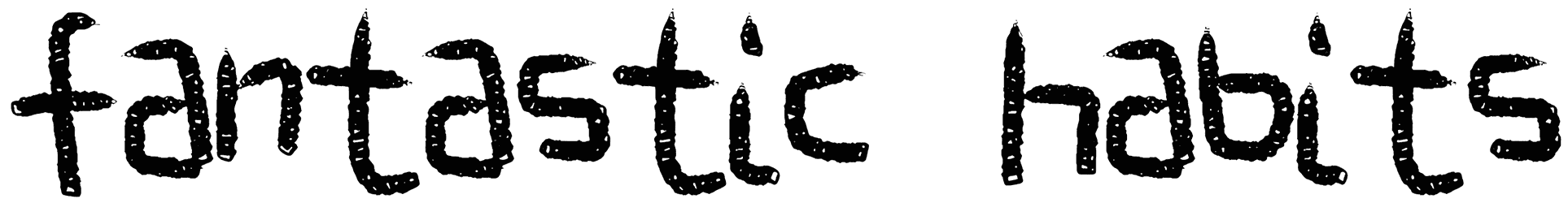
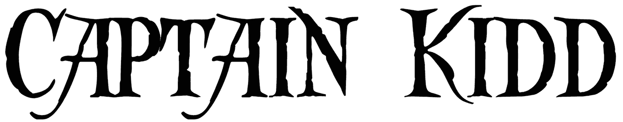
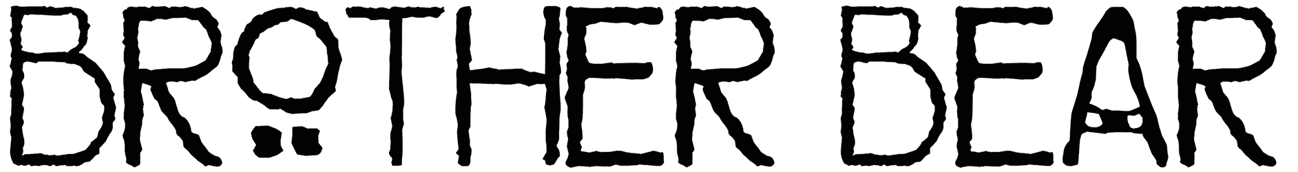
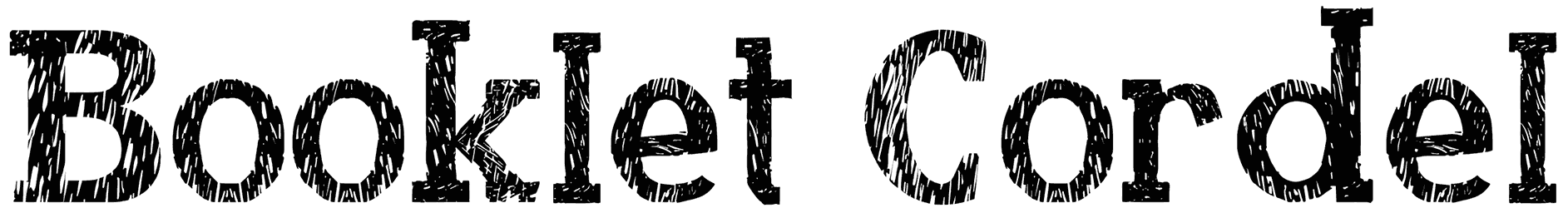
- How can grunge fonts make your words more visually significant? There’s a certain charm about distorted styles and that’s the cornerstone of this font bundle. You can apply their eroded text effect on any of your designs and praise the outcome. It may sound a bit ironic but sometimes your words become far stronger and more attention-seeking when they fade over time. So you may want to skip ahead and start with the aged version right away. That's when this category enters the game! That may ruin the intact structure of your basic words a bit, but it’s all worth it. A little messy look is not going to hurt anyone, it’s just going to make them more curious about your lettering. Sometimes it’s so intense that you may even think they have endured an explosion or something. Anyway, all kinds of rough textures will multiply your chance with the audience to actually get them hooked. Don’t you find the typewriter or stamp fonts more appealing than the conventional alternatives? This is why! However, you should know the grunge alphabet has its handwritten versions too. That includes words written in spray paint, crayon, or chalkboard and looking completely worn away. Also, for a more artistic touch, you can always go with one of those scratched or stained options and attract even more interest.
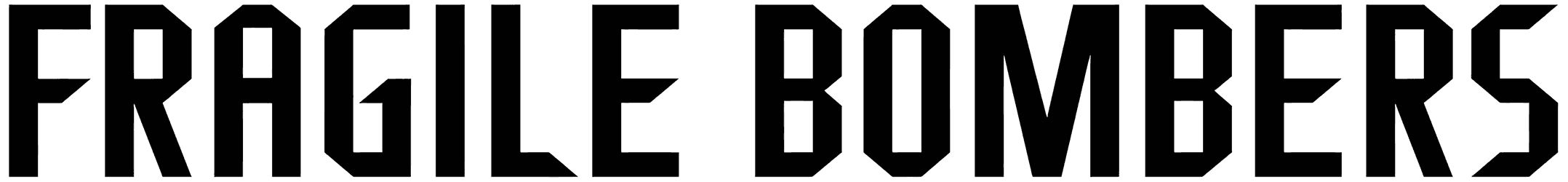
- What will be different about the mood of your text after replacing grunge fonts? Despite their imperfect font style, grunge letters do everything else so perfectly, like adding some meaning to your design. For instance, you’ll instantly notice their bold character, especially when they take a more hardcore approach. Besides that, those marks on their bodies are pretty much enough to point out how old they can be. These fonts are also the ideal match for any typography about war, and that’s why it’s often seen teaming up with decorative stencils. That makes it easier to notice their warning tone. They can even be used to symbolize the concept of death flawlessly, especially if you spill some of our free blood textures around it and let things get crazy.
- What are some of the incredible things you can do with them in your designs? Professionals constantly choose grunge fonts for more visual intrigue and for good reason. Those distressed characters would fit the bill for all kinds of rock music band logos, indie flyers, army-themed videogames, Caribbean designs, and more. Sometimes all you need to turn heads is a grunge font in your art and that’s it.
- How should you catch up with all the unique graphic design tools offered by Resource Boy? There’s such a wonderful variety going on in our library that it’s absolutely impossible to say which one is better to check out first. So for now, let’s just go with those more similar to this current list and visit our collections of dirty fonts and destroy fonts before anything else. Then you can check out the world's greatest free grunge patterns here on RB too. It's just going to get more and more interesting.