One of the positive features of Gravtrac compared to other fonts is that all the characters of this condensed font are designed in two different styles, which widens your selection range. You can convey a sense of aristocracy and respect to customers by using Gravtrac to design logos for prestigious brands and advertise flyers.
Note of Designer
Enter the world of Gravtrac, a typeface that doesn’t just occupy space—it commands it. This is typography distilled to its purest essence, a masterclass in efficiency that proves less isn’t just more; it’s everything.
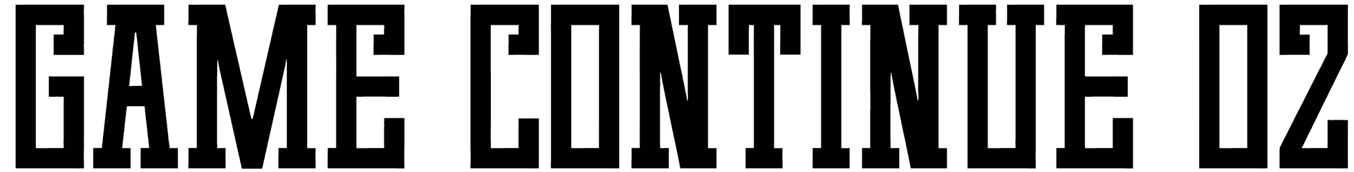
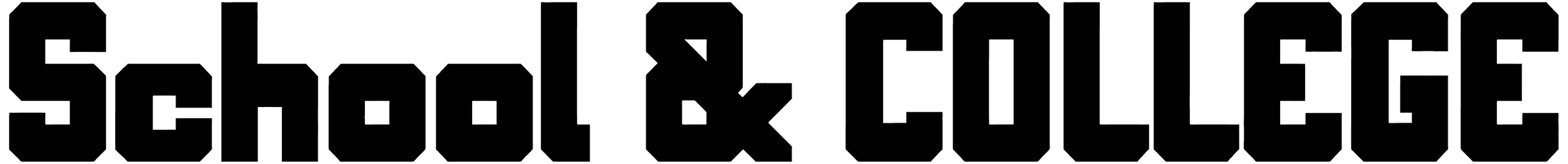
Gravtrac isn’t just inspired by mid-twentieth century classics; it’s the evolution they’ve been waiting for. It takes the DNA of Univers 59 Ultra-Condensed, the swagger of Helvetica Inserat, and the audacity of Compacta, then forges them into something entirely new—a typeface that’s as much a tool as it is an art form. Picture each letterform as a precision-engineered component, its flat sides and tight curves working in perfect harmony to create a rhythm that’s not just seen, but felt. From Ultra-Light to Heavy, Gravtrac’s seven weights offer a symphony of options, each one a different instrument in your typographic orchestra.
But Gravtrac isn’t content with mere condensation. It pushes the boundaries of legibility with its Compressed and Crammed variants. These aren’t just narrow; they’re a designer’s challenge to the very concept of width. And for those who dare to go even further, there’s Crushed—a typeface so slender it seems to defy physics, turning negative space into a powerful design element. Gravtrac doesn’t just speak languages; it whispers, shouts, and sings in them. Supporting a vast array of Latin-based European, Vietnamese, Greek, and Cyrillic-based writing systems, it’s a linguistic chameleon, ready to deliver your message with impact whether you’re designing for the streets of Hanoi or the avenues of Athens.
This isn’t just a typeface; it’s a designer’s Swiss Army knife. With 58 styles at your fingertips, including OpenType fractions, numeric ordinals, and old-style numerals, Gravtrac is ready for any typographic challenge you can throw at it. Need to fit an entire manifesto on a business card? Gravtrac’s got you covered. Want to make a single word fill a billboard? Gravtrac can do that too. In a world where space is at a premium and attention spans are measured in milliseconds, Gravtrac is your secret weapon. Whether you’re designing for print, screen, or the side of a skyscraper, Gravtrac delivers your message with an efficiency and style that’s nothing short of revolutionary.
So, are you ready to push the boundaries of what’s possible with typography? To squeeze more impact into less space than you ever thought possible? Choose Gravtrac, and watch as your designs transform from merely visible to utterly unforgettable.
This font includes a license that allows free commercial use: sometimes referred to as a desktop license. This allows you to install the font on a computer and use it to create posters, web graphics, game graphics, t-shirts, videos, signs, logos and more. Read the license agreement for details.
If you’d like to embed these fonts in an app, on the web or anything that’s not covered by the desktop license agreement, visit the link below. You’ll find distributors who offer different types of licenses, or you can contact me for help.
https://typodermicfonts.com/gravtrac/
This free font is part of a larger font family. Check out the rest of the family through the link above.