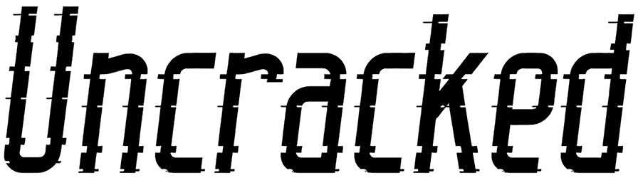
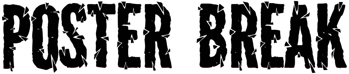
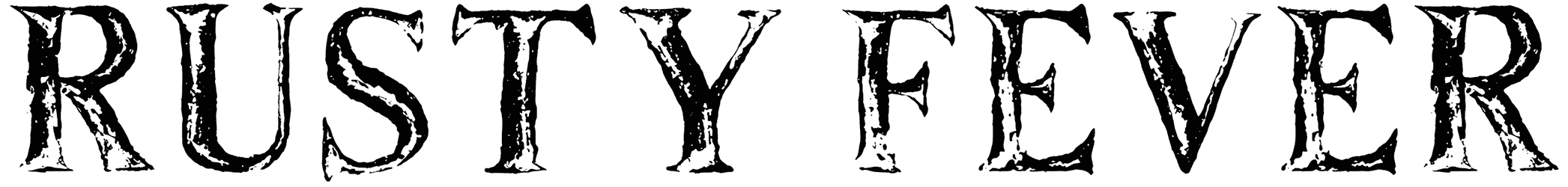
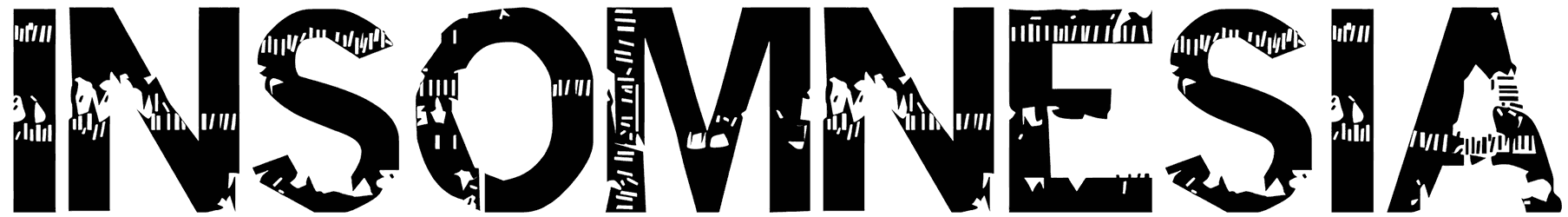
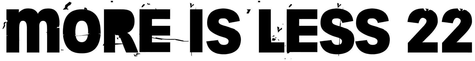
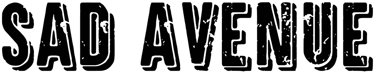
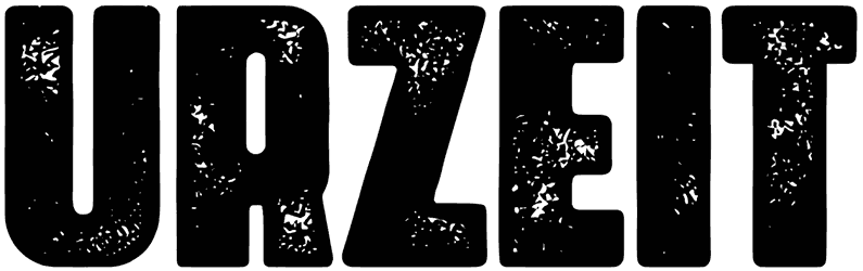
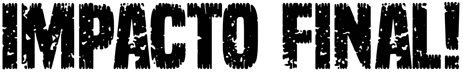
When it just doesn’t look striking enough, the solution for your text is a destroy font. Show no mercy and don’t be afraid to make a wreck of your words when you can get a lot more attention in return. In fact, the more ruined the letters, the more visual appeal you can achieve. You should only see how far you’re willing to take it and then go for it. Before that, let’s just make sure you’ll never have to go through any trouble to find destroyed fonts for any of your future projects. Resource Boy is here to get you covered all the time. Browse the list, download your fonts, and make them wow!
Read the instructions below to learn more about Resource Boy’s huge destroy font collection:
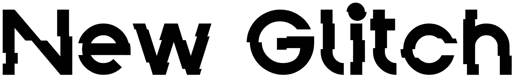
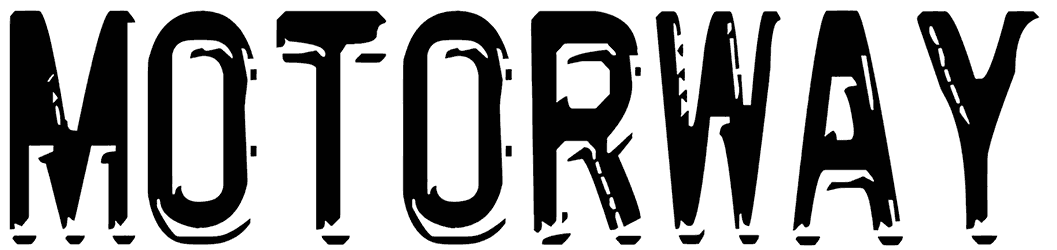
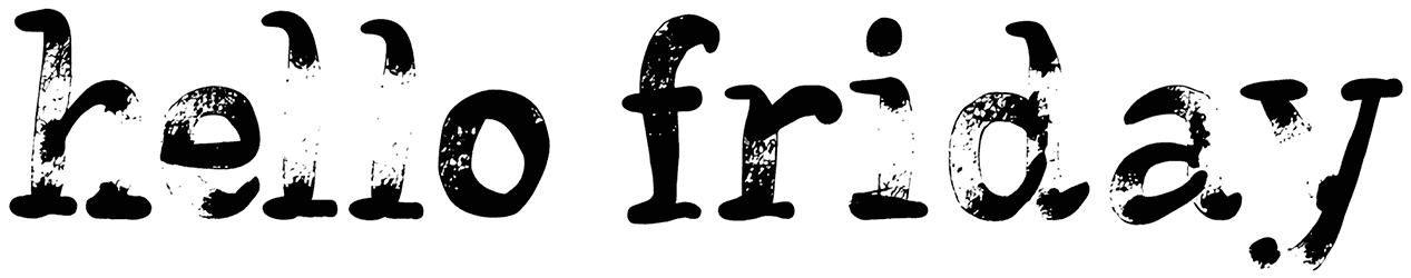
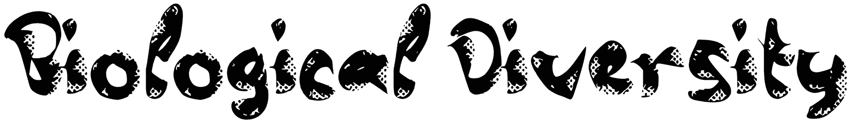
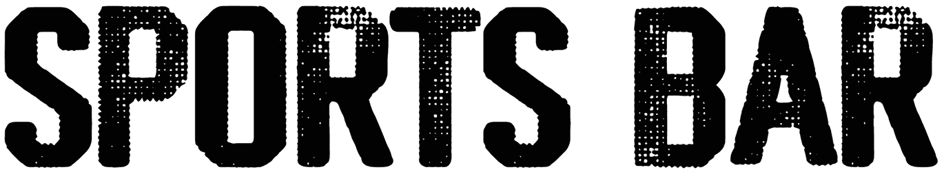
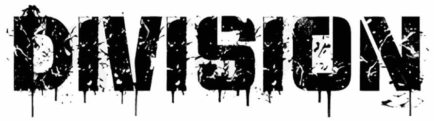
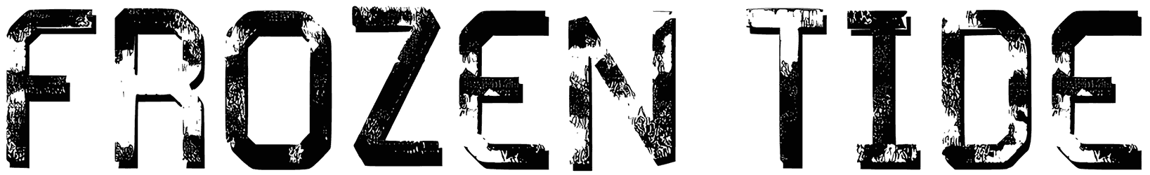
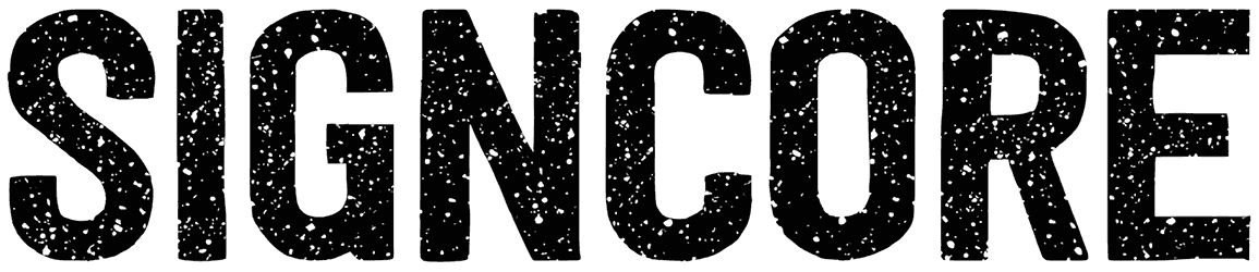
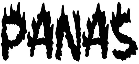
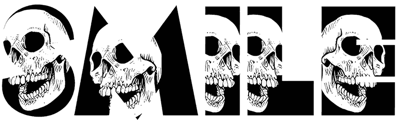
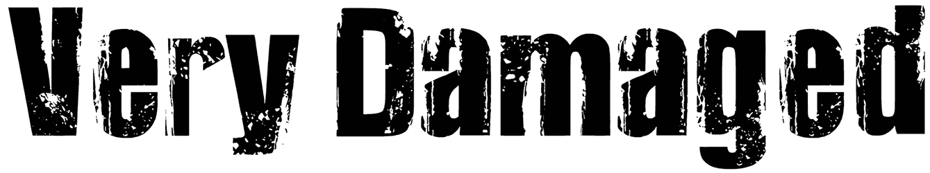
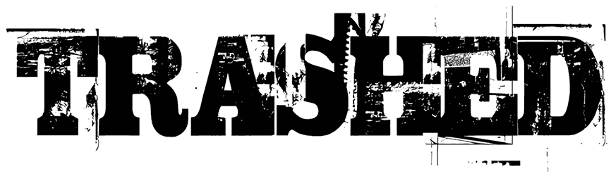
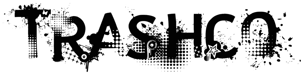
- What’s so special about the general design of these fonts? It takes a lot of guts to break your letters into pieces on purpose. So if you go for it, a bold character is only one of the many things you will be rewarded with. Here you’re going to learn never to underestimate the power of grunge texture in elevating your writing. Besides that, if it wasn’t for the random cuts, stencils, and broken edges, your text would have been a lot less impressive. You can always opt for a more devastated design by including some dirty patterns, splashes of spray paint, or scratched characters as the main element of the font style. These clever imperfections are enough to produce a highly decorative touch for your writing. So the basic design of the destroy letters is sans serif because you don’t want to make it too much and risk losing the viewer’s attention along the way. It’s important to know just how much mess to make to get the perfect result. You can also set the mood with the use of black or red color in the design and make it more interesting.
- How does a destroyed font add more emphasis to your lettering? Over time, our mind is trained to associate destruction with disaster and loss, but what if for once you can actually gain something positive from this concept? That’s where the destroy font alphabet shines. In fact, those scary predefined assumptions can be to your benefit here, compelling the viewers to take you more seriously than ever. It may sound crazy, but this strategy works better than you think. By conveying urgency in your typography through demolished items, you get to highlight your words with a strong tone. This hardcore attitude can be interpreted as rage or a warning of an upcoming danger. This intimidating aura helps you a lot when you don’t mind sounding a bit dark and harsh in your art. Sometimes, it’s just supposed to highlight the effect of time and portray your letters as old to make a point.
- Why are destroy fonts so practical for the professional levels of design? Even though many people may not dare use destroyed fonts in their routine projects, you’re going to have a lot of fun with them if you’re brave enough. Choosing to go with the destroy alphabet requires a certain type of taste that may seem a bit strange and unforeseen but it works incredibly. That extra force lent to your letters makes them perfect for punk band music covers, digital posters, gaming logos, and more. It’s everything you need to go beyond your usual creativity limits.
- How would you like us to treat you to other gems on Resource Boy? There are so many other peerless items for download on this website that you’re going to run out of time exploring them all. So why don’t you let us give you a hint for your next visit? After checking out the best destroy fonts here, try some of our explosion fonts and distressed fonts too, and thank us later.