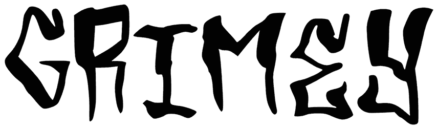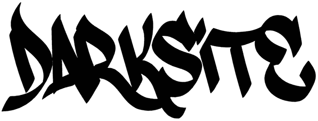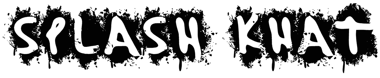

Coarse Lime font has that zesty roughness that makes a headline feel hand-cut, loud, and slightly sunburned in the best way. Its chunky display style brings playful texture to the letters, like something made for fruit labels, summer posters, or a snack brand that wants to look fresh but not too polished. You get energy, flavor, and a little handmade chaos without losing readability.
Think juice packaging, taco menus, beach event flyers, farmers market signs, kids’ snacks, cocktail-style graphics, or bold sticker designs. This graffiti font would look great with citrus greens, warm yellows, grainy shadows, and simple fruit illustrations for a layout that feels sharp and juicy.
Note of Designer
for commercials please visit scrapstype.com