Perfectly suited for your important typography designs, the Broadway font category can always create a more pronounced version of your words. Guaranteed, that’s going to be hard to forget instead of needing any special effort to remember. It’s like those bold letters are made only to steal the show with their familiar tone and their striking style. Even the lowercase characters here manage to stick out remarkably, leaving their decorative touch everywhere. That’s why you need Resource Boy’s Broadway fonts more than you know. Download them from our selection now, and make sure none of your projects misses a nice aesthetical appeal.
This is where you’re going to find answers to your questions about Broadway fonts:
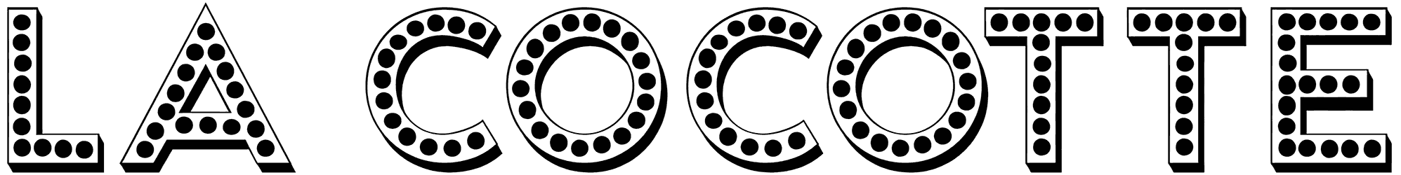
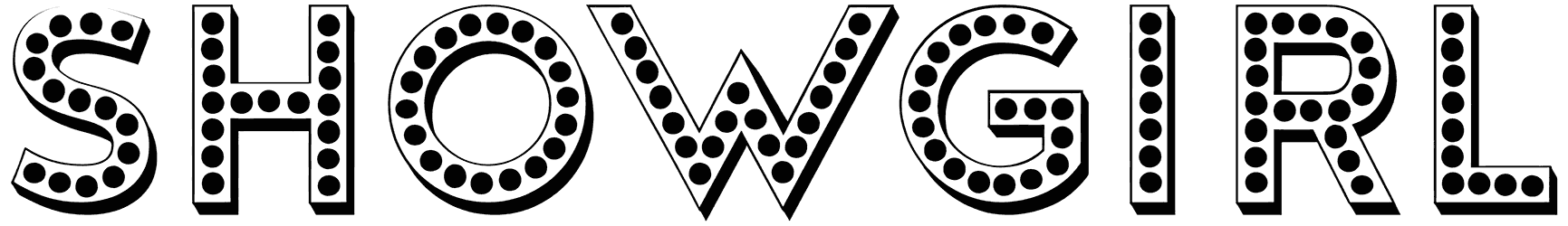
- What shapes of letters can be considered a Broadway font? These fonts might not all have the same looks but they definitely share that distinct outline with one another. Many of them draw inspiration from Art Deco and its neat details. For the rest, you can notice the inconsistency in the thickness of letters, creating a rather unique output. It’s as if each character is built with both heavy thick vertical bodies and thin lines tastefully attached. The art is how each part contradicts the other, lending a strong visual touch to any writing regardless of the subject. Among the other variations of the Broadway alphabet, there are some imitating casino fonts and the lightbulbs on their dotter letters. It may get a little tricky for the rest. For instance, they may not exactly have a lot in common with calligraphy fonts but some of them can also appear as cursive letterforms and still attribute the same kind of old-school properties to your design. So it looks like you have more than one way to style your letters with these fonts.
- What does this class of fonts have to represent in emotional terms? Whenever you feel drawn to a piece of text, feeling comfortable as if you’ve known them for a long time, that’s probably your cue. The Broadway letters are actually responsible for a lot of our good memories, so it’s only natural to feel a particular fondness for everything that reminds you of that. Their retro structure is not just here to bring a classic charm to your artwork. Along with them also comes a powerful wave of nostalgia that can leave you overwhelmed. So it doesn’t really need an expert to point out their simultaneous cultural and historical significance as well as the personal endearment they’re blessed with. It’s not just about the sophistication in their style but their inviting approach too. It may not be the first thing you notice about them but there’s some sort of elegance in how they express themselves, combined with pizazz that have made them timelessly popular. Plus, considering their close association with the musical genre, you can almost hear the theme melody in the background, bringing your words to life more than ever.
- Why do any of you need Broadway fonts in your toolkits? Because you’re going to be thankful for that when you have a movie poster or a music cover to design! As a matter of fact, those bulging numbers and letters are the best at creating signs for theaters, intros for television shows and other productions of the entertainment industry, and even wicked designs for commercial purposes. After all, it’s the easiest to have fun with your lettering project when you know where all the best Broadway fonts are.
- How would you like to explore the rest of Resource Boy for more treats? You have our entire library to browse and download from. So be our guest. However, if you’re looking for something similar to this current collection, you might want to start with our marquee fonts.