You’re not always going to find the answer to reaching out to more people by making it excessively harder to read your text. There are plenty of times when a basic font beats the stylish touch of calligraphy. You just have to find the right time and place to use them and then you can express your message clearly. In fact, it’s pretty easy to please the audience once you discover the charming effect of this font category. Since the perfect selection of basic fonts is right in front of you now, download whatever you need and worry about nothing.
If there’s something you feel you’ve missed about basic fonts, make sure to keep reading!
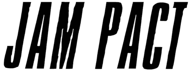
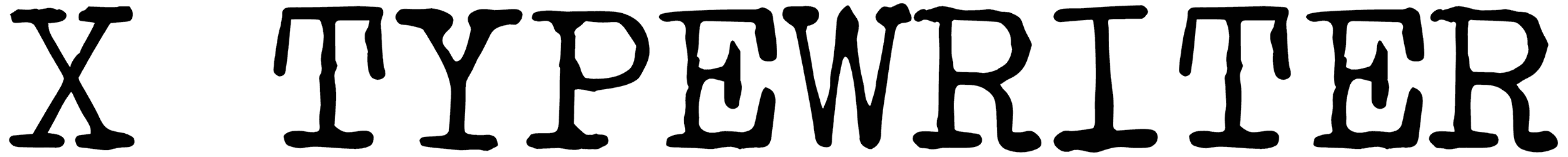
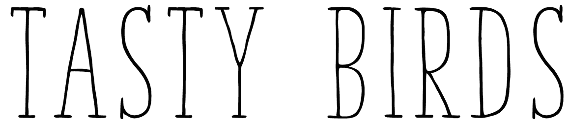
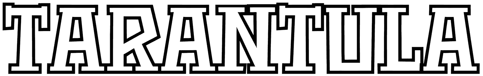
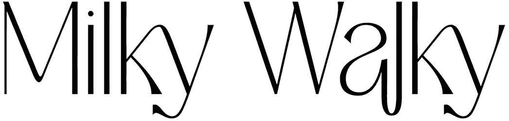
- How does the look of your text change when you apply these fonts? The whole point of using one of these fonts is to keep things simple. When you customize your writing with them, it’s supposed to stay away from a cursive style and be as plainly designed as possible. It lets you make sure you’re making it extra easy for the audience to grasp the idea you want to convey. It’s not just going to be Bauhaus fonts and brutalist fonts gathered here after all. As long as the outline is neat enough, you can get as playful as you want. So don’t just limit yourself to sans-serif fonts. We’re here to offer you a variety of fonts so that you can give some style to your lettering just as you like. It can look geometrical, or bring the old charm of typewriters to your artwork. Regardless of how thick or thin your words are, you can turn them into blocks of letters, or let them sound much gentler with some complimentary rounded tips.
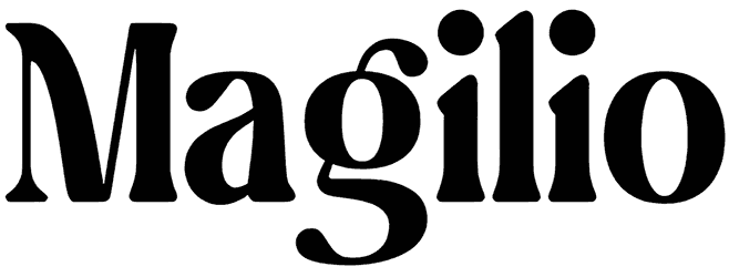
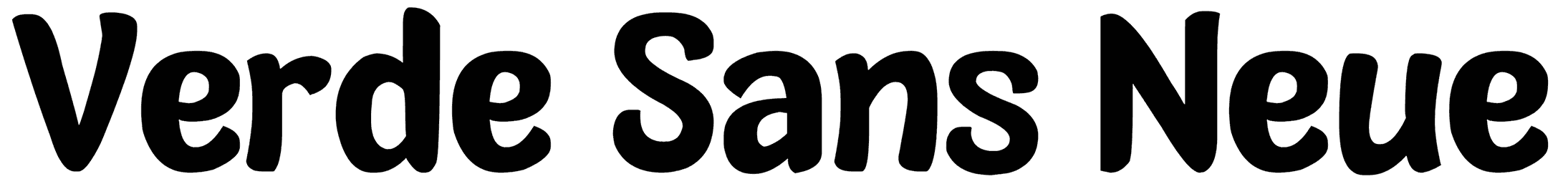
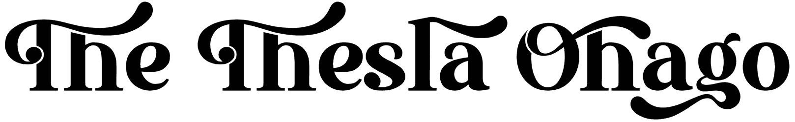
- What do these fonts usually imply about the mood of your design? Soon you’ll realize you won’t need anything decorative to draw attention to your lettering. Sometimes the most elementary approach works better than anything else. The basic alphabet is here to show you that. However, you’re going to come off differently depending on how you choose to proceed. For instance, by including a handwriting style in your typography, you get to achieve a warmer tone and get more people hooked on your design. Also, a touch of retro flair or some modern vibes is not going to get in your way of clarifying your message for the viewers. If anything, it makes your statements more memorable. The good thing is that you get to steer it in whichever direction you want. Whether you desire some fancy traits, a formal theme, or maybe even something cute and friendly, you can find the answer right here in this collection.
- Where do you usually see these basic letters being used? Let’s say you’re working on a logo that needs to be state-of-the-art and straightforward at the same time. That’s one of the things you need this collection for. Ironically, the basic letters can help you demonstrate a pretty sophisticated identity. So if you want to use them for your brand logo, just go ahead. On top of that, they can be both bold enough to fit in your street signs and minimal for your aesthetic tattoos. When it comes to designing eye-leasing headlines, they can also be one of your best shots. So just don’t hold yourself back.
- How would you like us to offer you some other interesting items to help you design more professionally? Other than this big pile of awesome basic fonts, we know just the thing you like to see next. Check out what a great job we’ve done gathering all these simple fonts and minimal fonts for you, fellow designers. Feel free to look wherever else you want on the net, but it can’t get better than this.