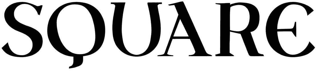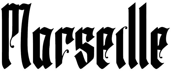

Article Premier font feels lifted from an old printed proclamation, with classical serif capitals, uneven ink weight, roughened contours, and lowercase forms that look noticeably more hand-cut and irregular. That contrast gives the alphabet a wonderfully historical texture, formal at first glance, but full of small imperfections that keep it from feeling museum-clean.
Try this old-style font on book covers, heritage posters, museum graphics, wine labels, literary packaging, or editorial titles. Warm ivory, faded black, deep burgundy, engraved illustrations, thin ornamental rules, and lightly distressed paper can reinforce its antique print character without burying those distinctive letter shapes.
Note of Designer
The Declaration of the Rights of Man typeface based on Le Barbier painting.