If you want your audience to treat you any differently, you should also present them with something special. A unique style of typography that has been around since the 60s is a perfectly fine choice that clashes with today's trends. It’ll let you deliver your words in a more familiar manner, and probably remind the viewers of something dear to them. If that doesn’t compel them to acknowledge your text, nothing else will. Let these groovy and psychedelic letters of 60s fonts into your design and they will welcome the nice vintage aesthetics of the era in return. All you need is this perfect selection of Resource Boy, ready to be discovered.
This is where you get all your answers about 60s fonts:
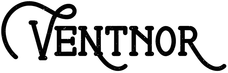
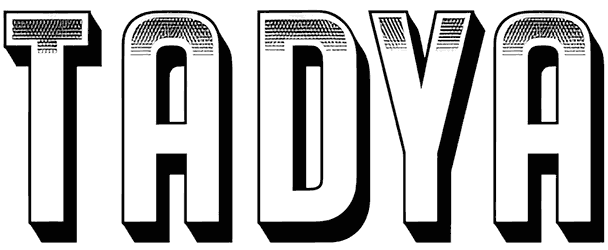
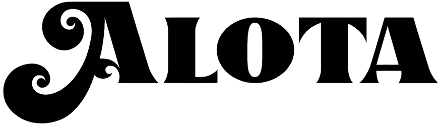
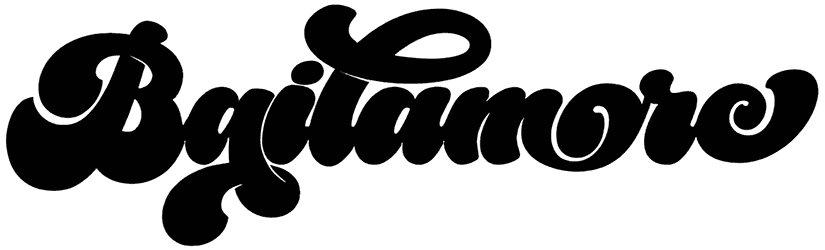
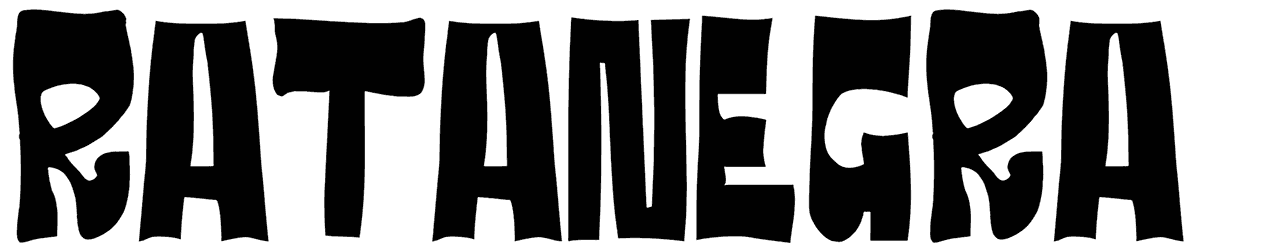
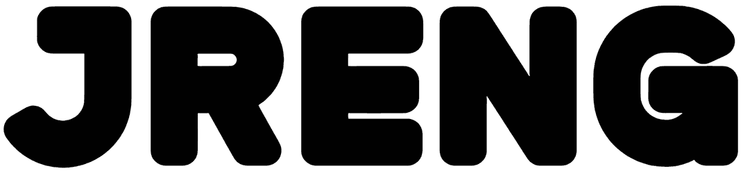
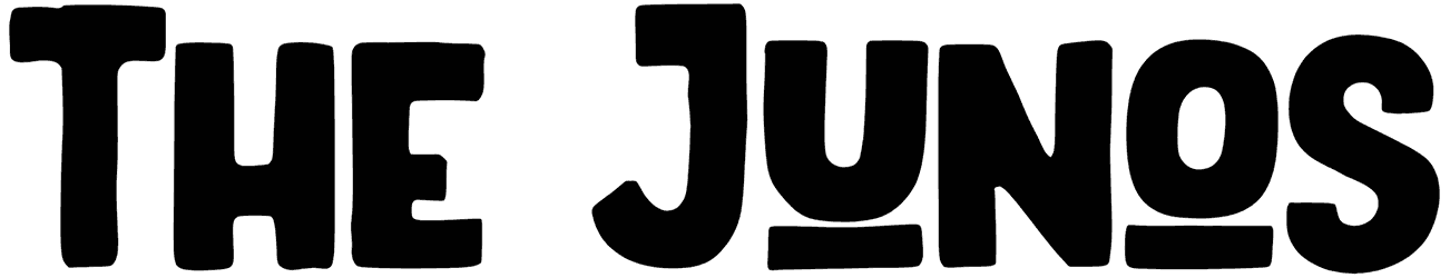
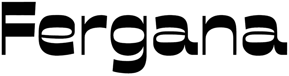
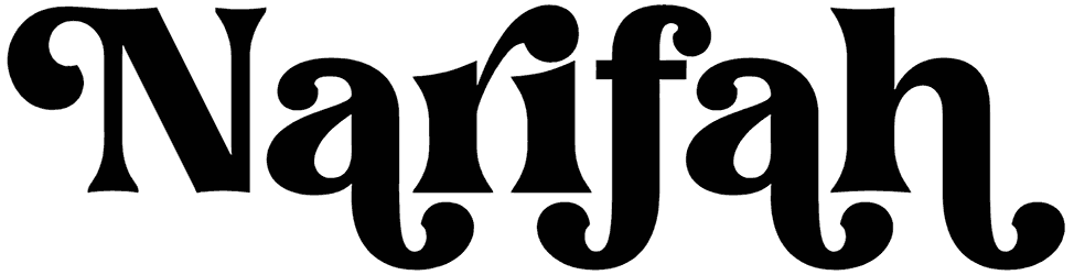
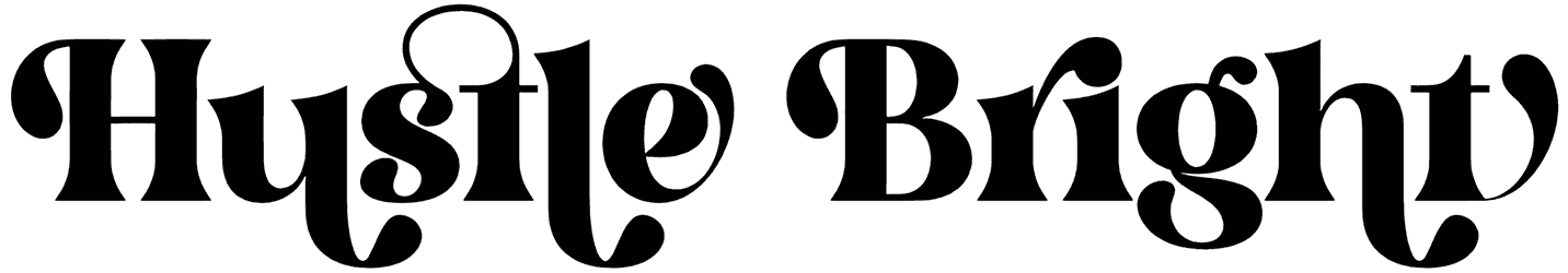
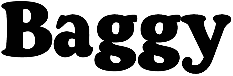
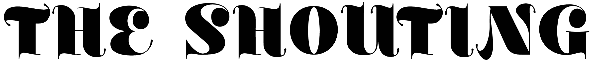
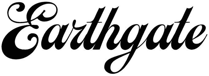
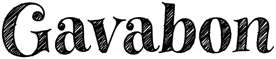
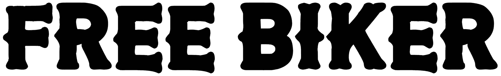
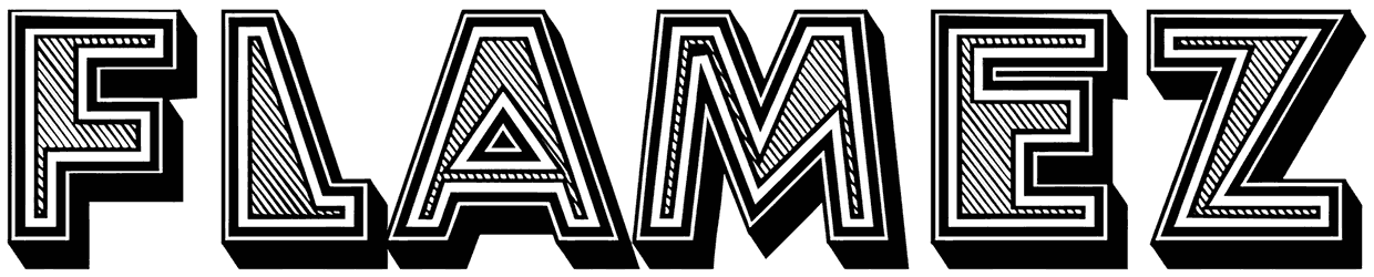
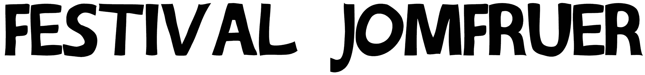
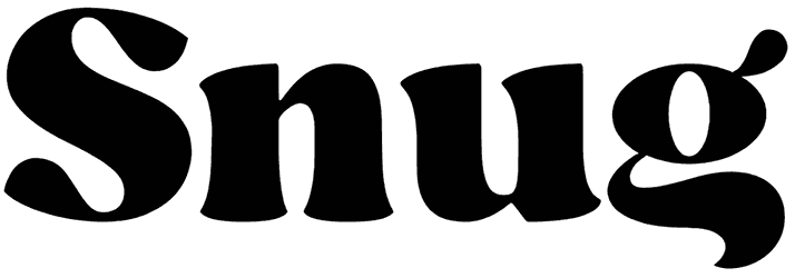
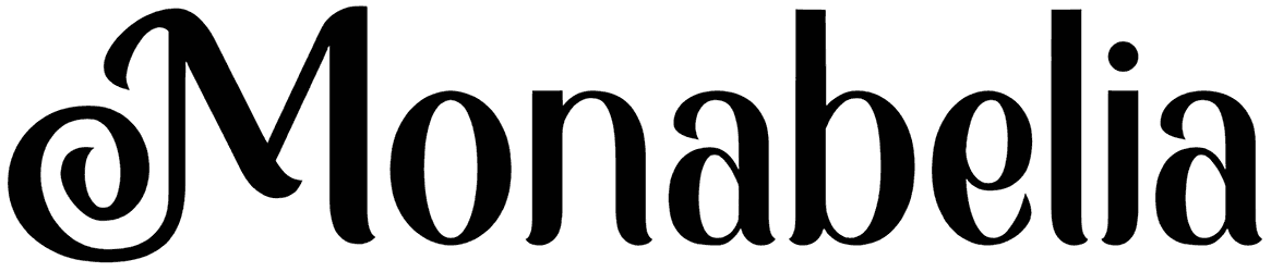
- How do 60s fonts change the view of your lettering? Choosing to go with a '60s font is one thing, but deciding among its multiple subcategories is another. It gives you the chance to make a better choice if you just know what it is you’re looking for. For example, do you think round and cute letters shaped like bubbles are suitable for your art? Or is it better to stick to the playfully cursive style? Also, in case you haven’t noticed, most of the fonts in this collection feature curved bodies with fluid-like designs. Maybe you prefer to go with one of those. After all, it’s going to be really hard not to pay attention to a text written in letters with such fat bottoms. In fact, one of the signature traits of this font category is that they’re so fond of exaggerated shapes. So there’s a pretty good chance that you also run into some sans-serif fonts with tall and compact characters. Just so you know, 3D letters accompanied by shadows were also pretty popular back then. Other than that, multi-line letters are another souvenir from that time period. It was basically the era of unconventional letterforms. A nice eroded or faded effect is also usually present alongside these fonts, mostly to highlight their old design.
- What happens to the mood of your text after applying these fonts? When you use the 60s alphabet to customize your writing, it’s not just going to feel retro. They make sure your words communicate peace and positive energy as well. In fact, this class of fonts is inspired by such a good time that it can elevate any design of yours with its strong nostalgic charm. That must be the reason everything here feels so comfortable too. The influence of pop art is also pretty obvious in the 1960s fonts. It’s like they’re supposed to portray a sense of longing for the past that's just bittersweet. At the same time, they can improve your words with their nice hippie vibes, resulting in a piece of text that can smoothly approach anyone with its casual attitude. It’s in their nature to add a trippy theme to the art and enlighten the mood. In fact, they’re known for their happy tone as well. You can tell that by the frequent use of bright colors in their design.
- When do you need 60s fonts for your projects? There are all sorts of things you can do with 60s letters. They look great on barbershop signs, games, cool social media content, classic music covers, or any creative flyer for advertising purposes. Basically, you can have all the fun you want with these fonts in your work of art.
- What are some of the other special offers of Resource Boy for designers? You can always find more professional assets in our library. For similar results, start by digging into our collection of groovy fonts and enjoy the variety. You can also try the artistic flair of the following decade with our 70s fonts and see which one you like more.