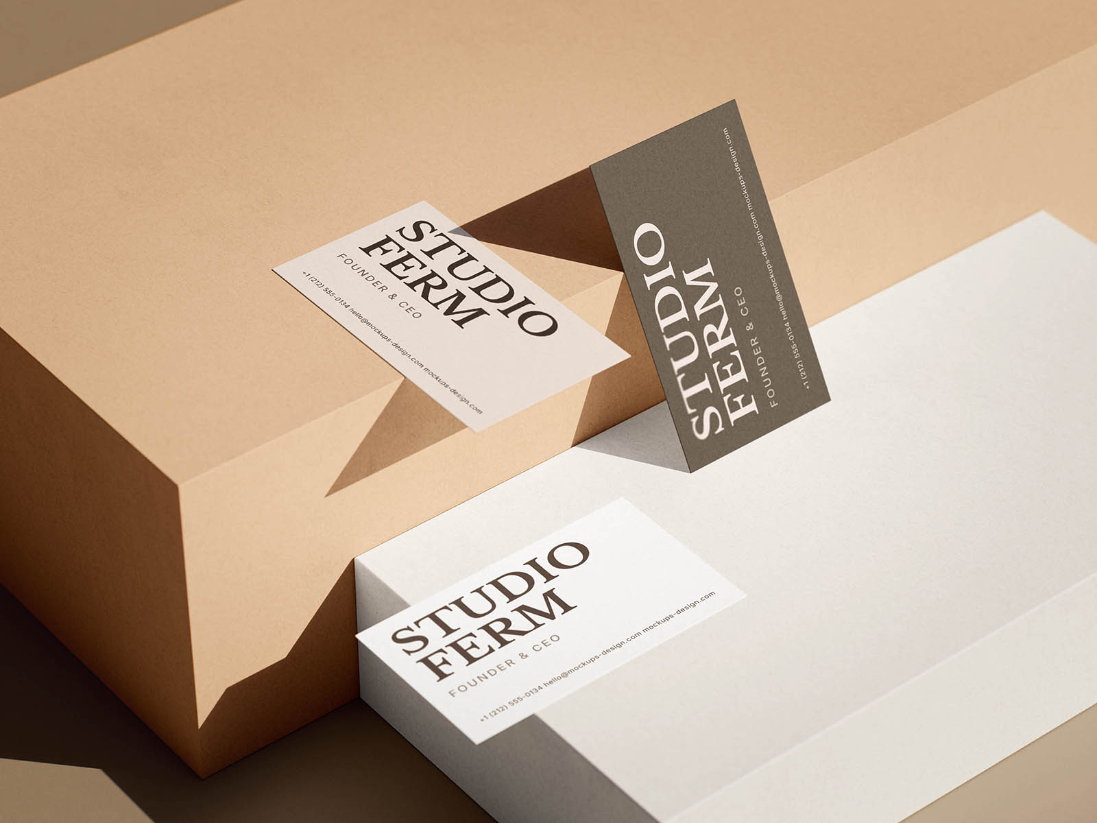
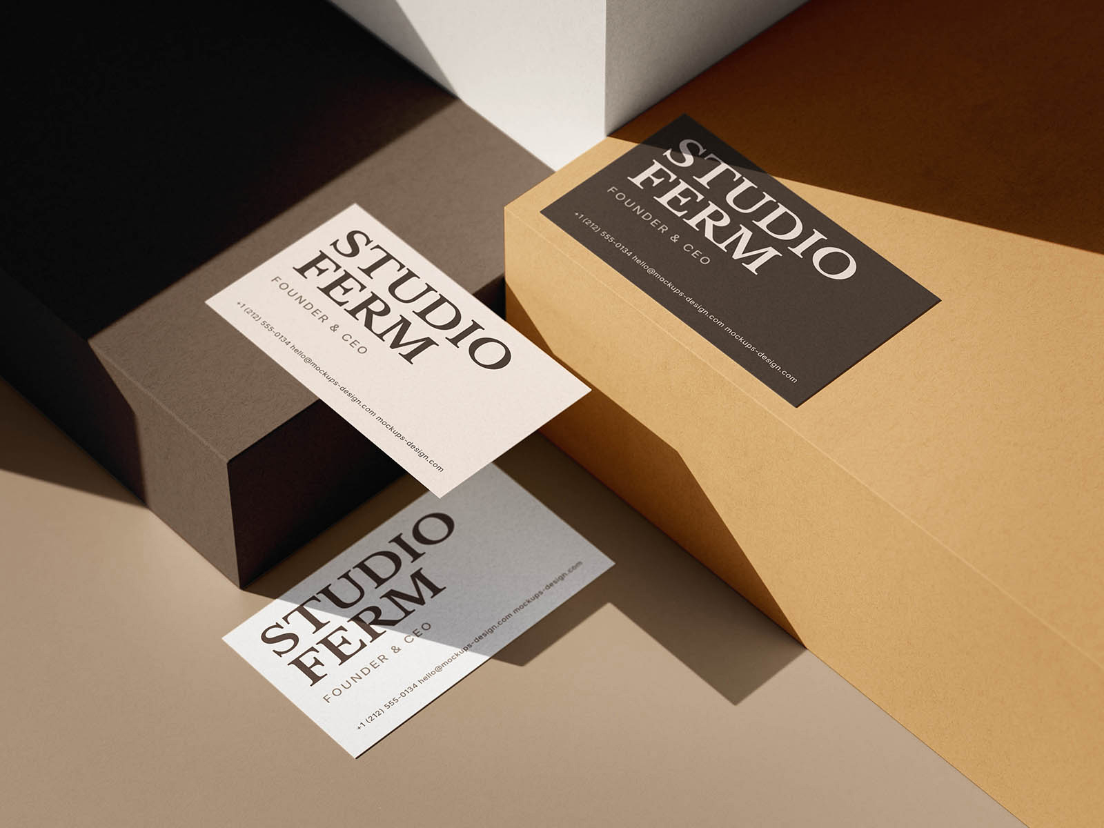
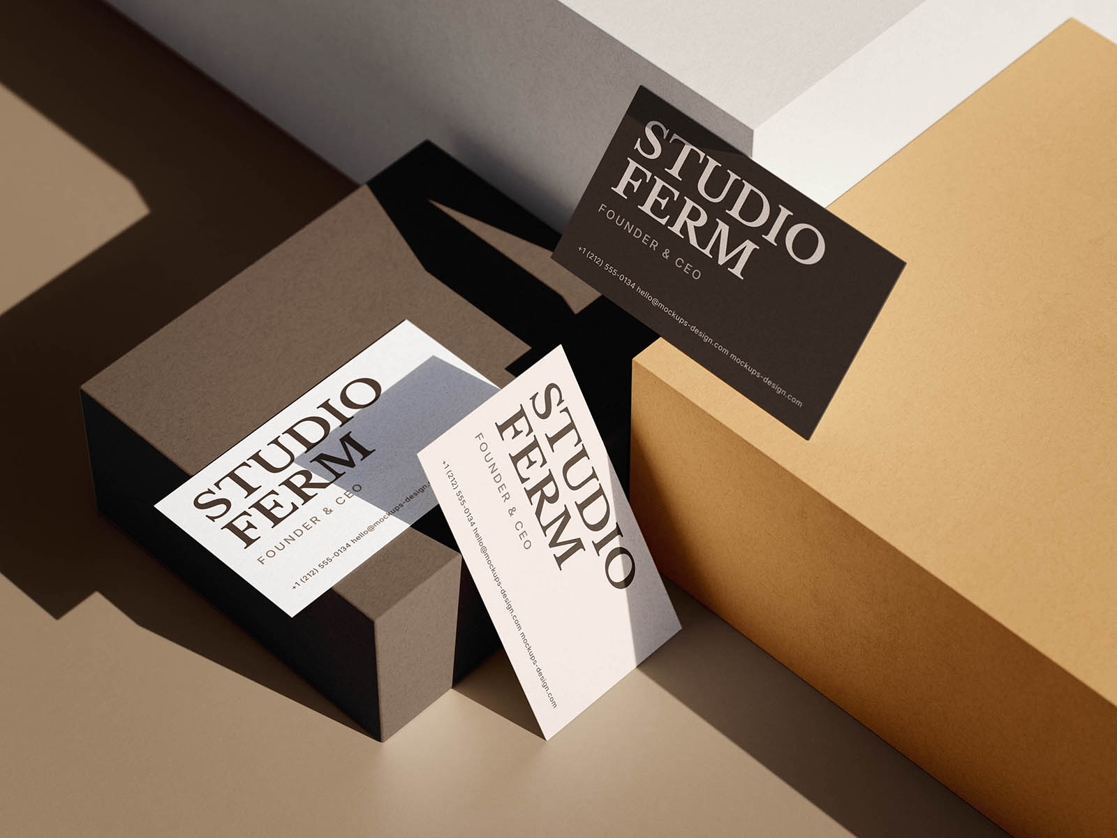
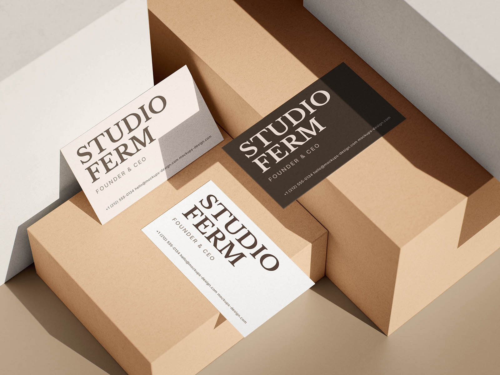
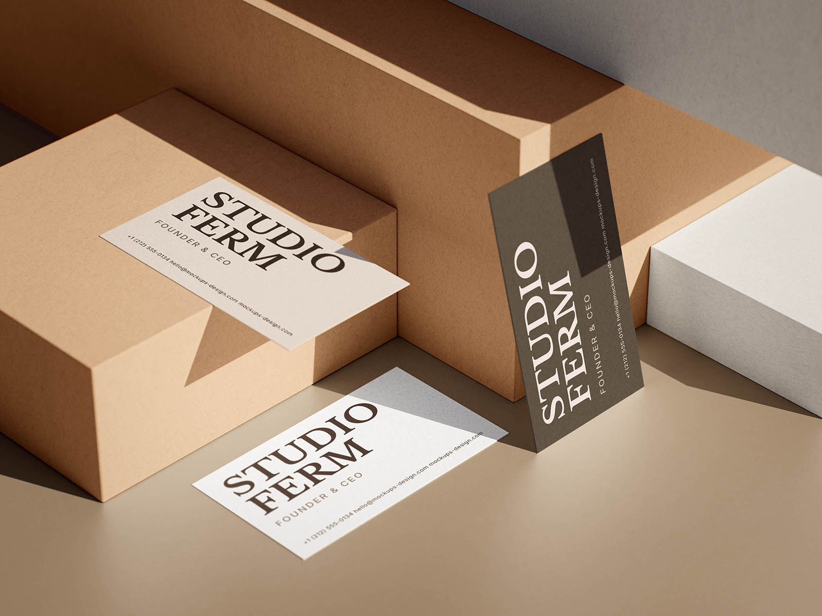
Give identity work a more sculptural presentation with this boxed business card mockup. The cards are arranged across chunky geometric podiums in warm beige, taupe, white, and ochre tones, with hard directional light creating crisp shadows and strong architectural depth. Upright, leaning, and flat card positions make typography and logo work feel more dynamic while still keeping every detail easy to read.
We especially like the mix of neutral paper tones and dramatic staging for refined brand systems, studios, fashion labels, or premium services. Different arrangements let you show multiple sides or color variations together, turning a simple stationery piece into a polished editorial composition with real visual weight.