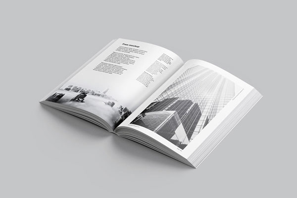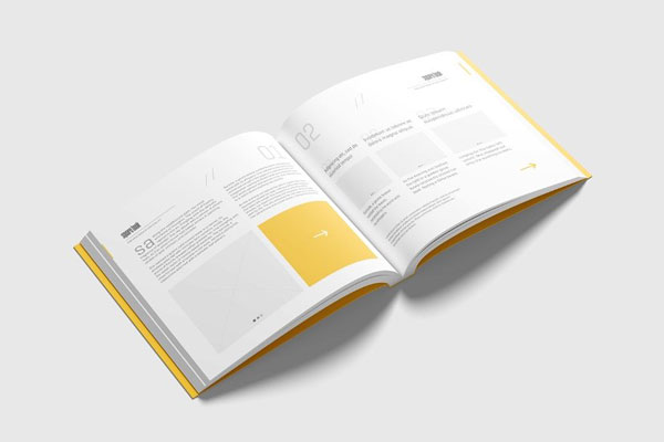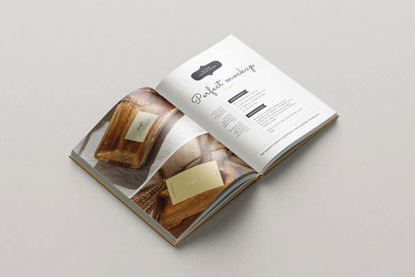
Brand‑guideline books can look beautiful on a screen, but the moment you hold them in your hands, you start noticing details that never stood out before: typography hierarchy, spacing rhythm, color harmony, and how well the rules actually read from page to page. That’s exactly why this isometric open brand‑guidelines mockup feels more useful than most static presentations.
It lets you evaluate a visual system in a way that feels tangible, as if someone has already picked up the book and is flipping through it. Creative studios, brand agencies, corporate identity systems, and client deliverables all benefit from that kind of context. Sometimes design maturity isn’t shown in a logo alone; it’s shown in how the rules live together.