![]()
![]()
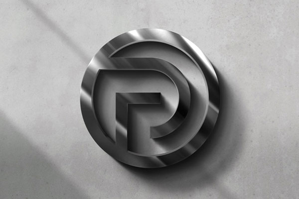
Raw concrete isn’t a surface here, it’s a statement. This 3d logo mockup turns typography into architecture, where every logo feels carved under pressure, as if it had to earn its permanence. We approached it like a material study rather than a presentation: light abrasion, micro-shadow tension, and the subtle unpredictability of stone pores doing half the storytelling. Perfect for brands that don’t want to look “designed,” but discovered.
It works especially well for brutalist identities, experimental studios, or anything that leans into permanence, weight, and raw industrial honesty. This is not decoration, it’s compression of identity into matter.