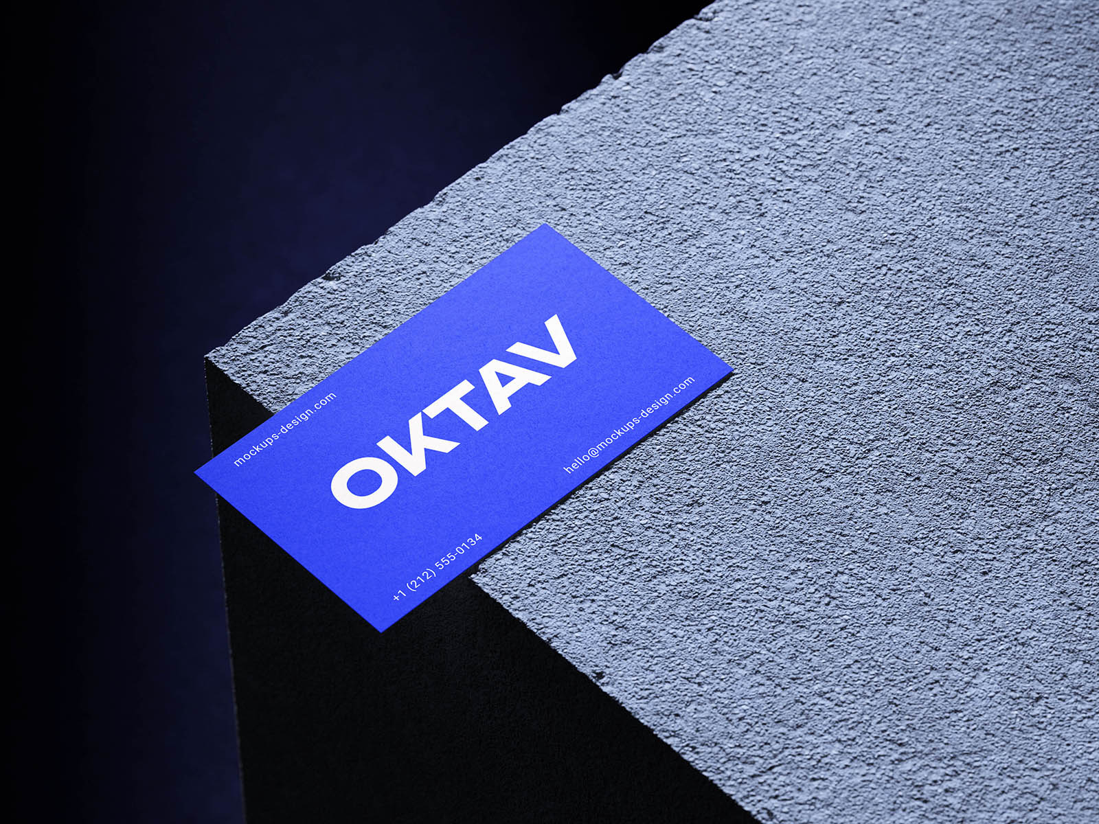
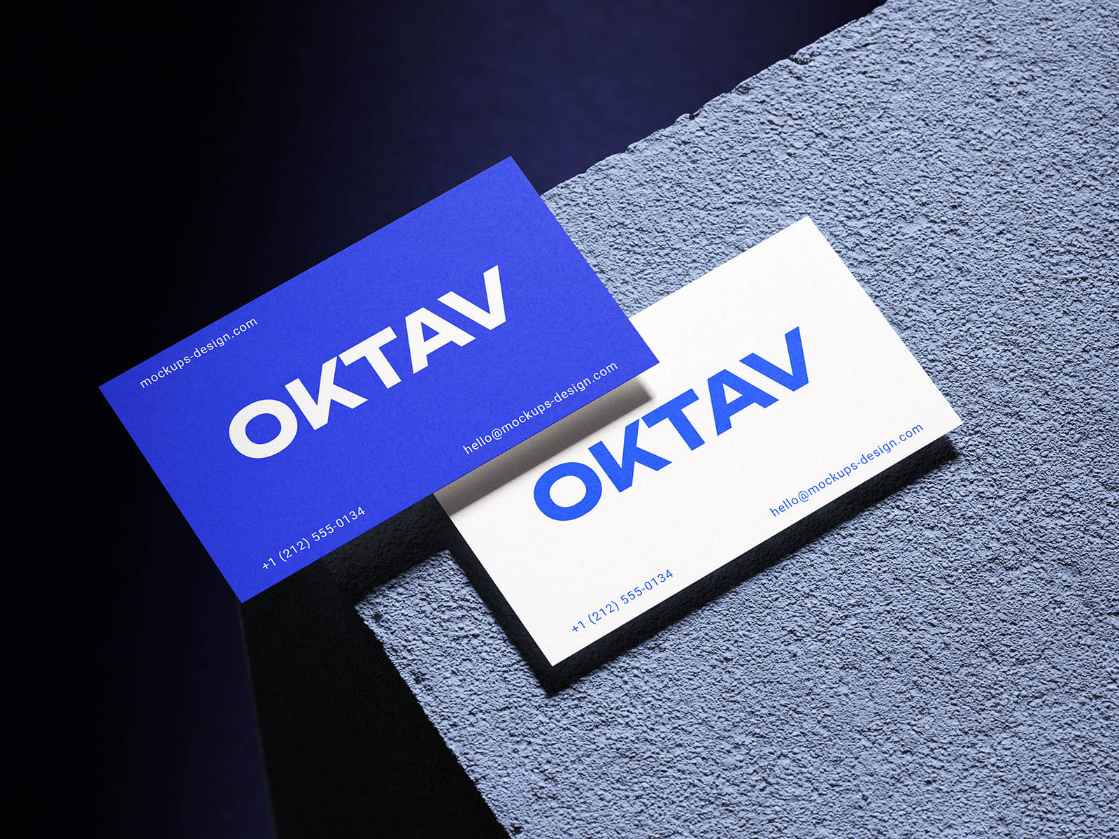
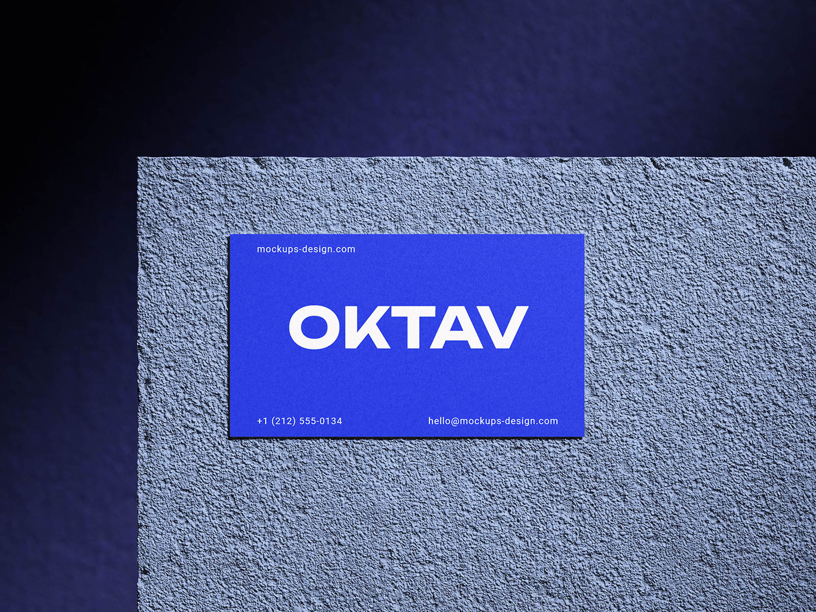
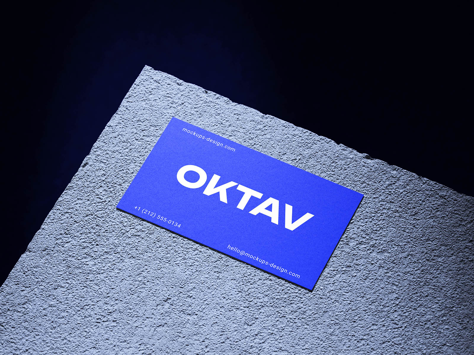
Hard side lighting cuts across a coarse gray stone slab, giving these business cards a sharp, almost architectural presentation. The rough mineral texture contrasts beautifully with the clean paper surfaces, while cards resting over the edge reveal their thickness and cast crisp, dramatic shadows. Four different compositions move between single-card close-ups and front-and-back arrangements, keeping the set visually varied.
This business card mockup turns a small identity piece into something bold and tactile. Minimal logos, fashion branding, studios, personal identities, and typography-heavy cards can all benefit from the stark stone backdrop, especially when strong color and restrained layouts need a tougher, more editorial setting.