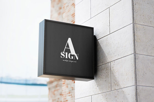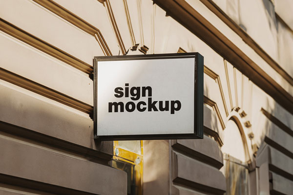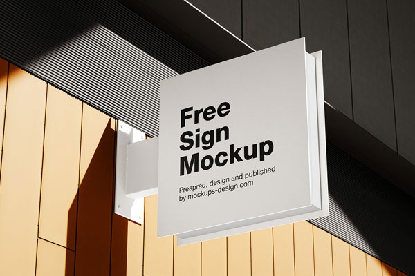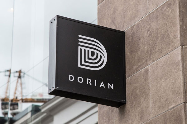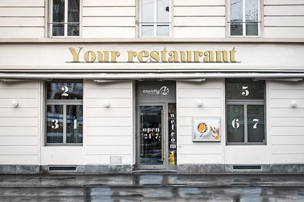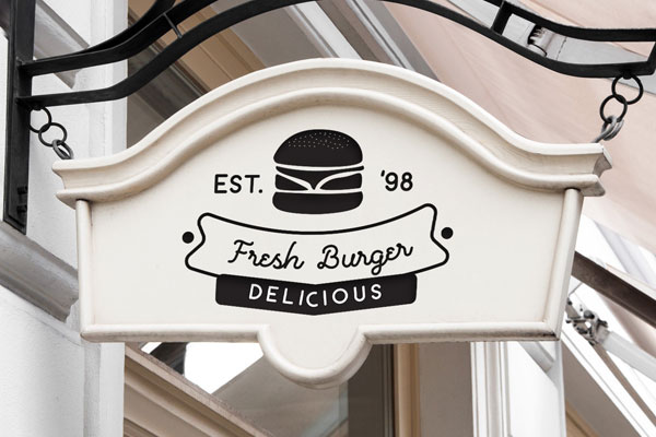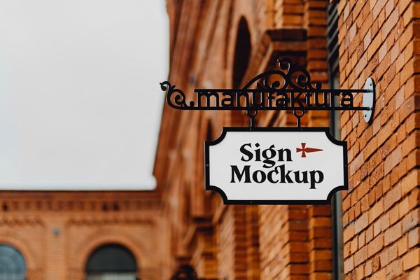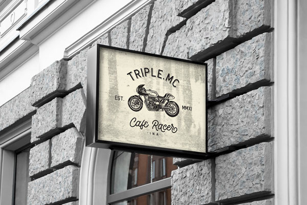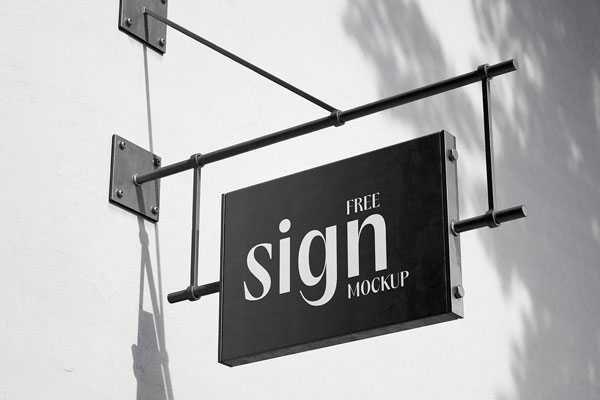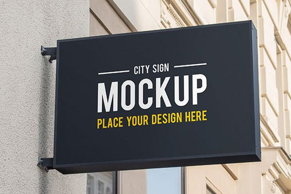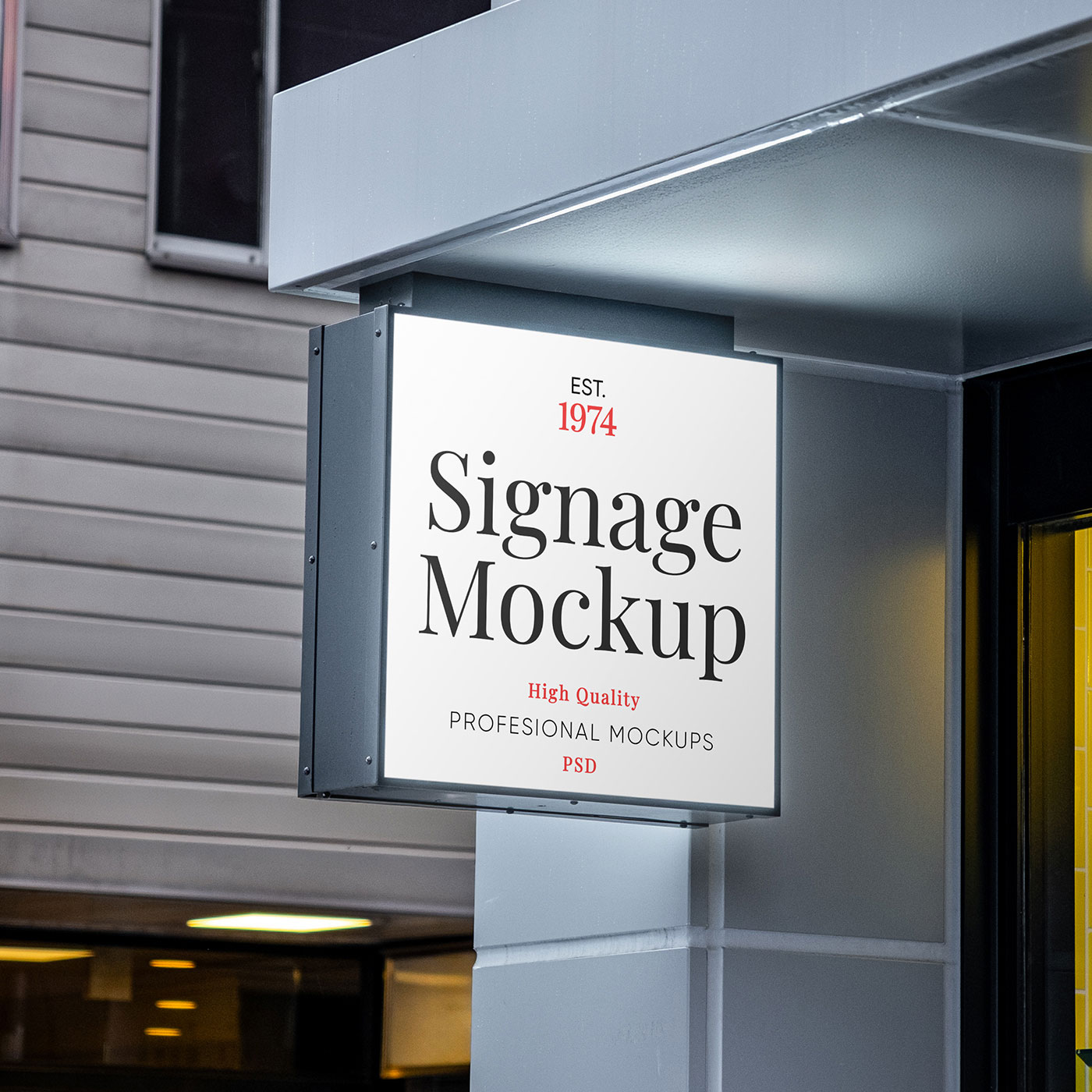
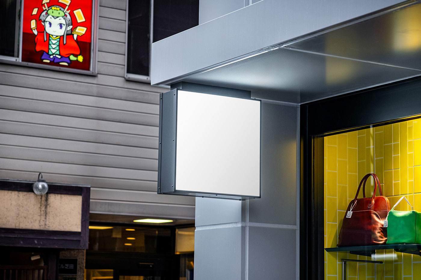
Square signage looks simple, but that’s exactly what makes it such a revealing test for your design. There’s no dramatic perspective or environmental storytelling to distract the eye; what you see is literally what people will notice in real life. That means hierarchy, contrast, type size, and spacing all have to work together instantly.
This store sign mockup gives you that reality check before anything goes to print or production. Cafés, boutiques, galleries, event pop‑ups, wayfinding signs, and retail identities all benefit from seeing whether the design can actually communicate at a glance. It’s a subtle pressure test, but surprisingly honest.