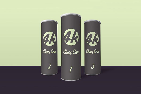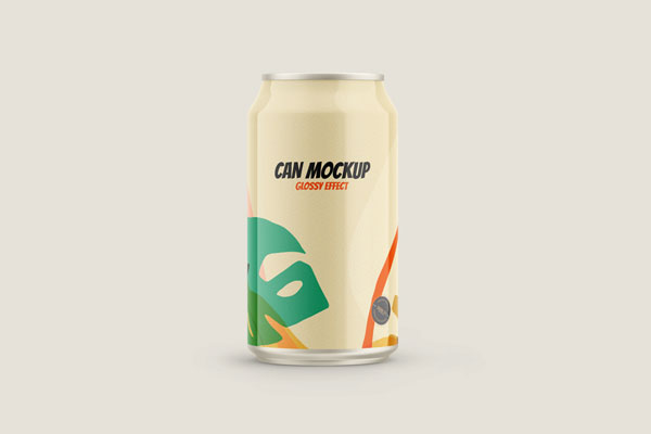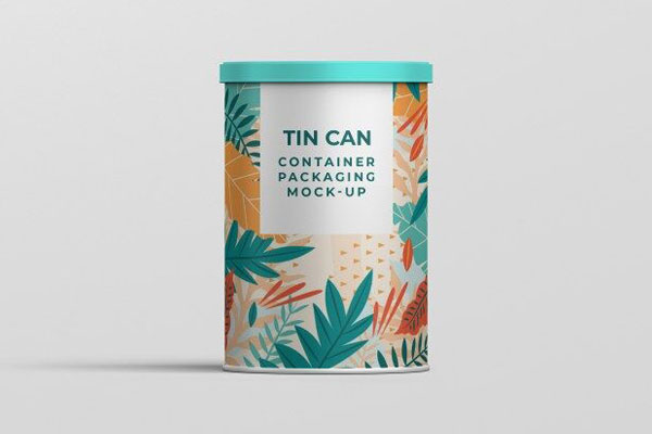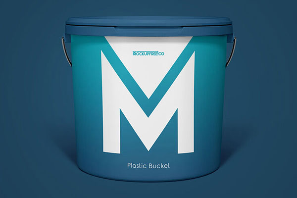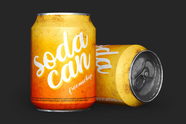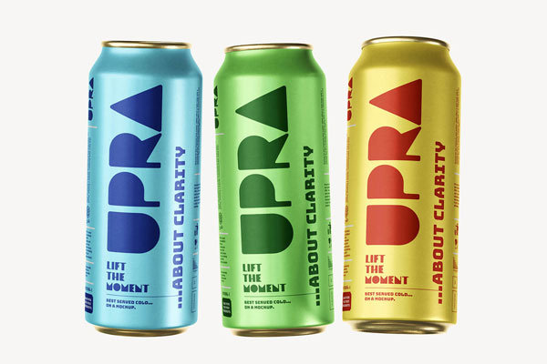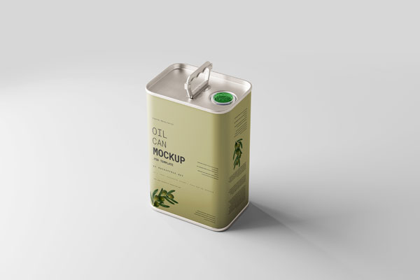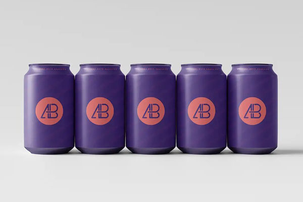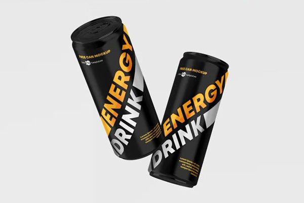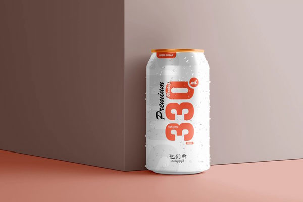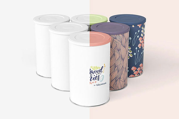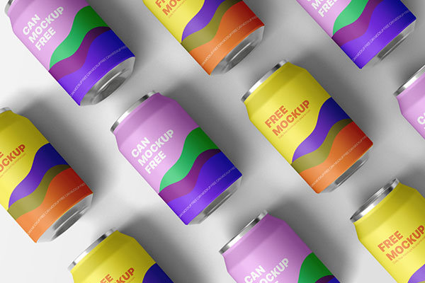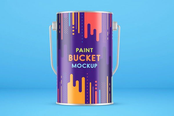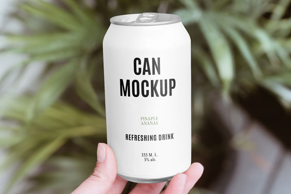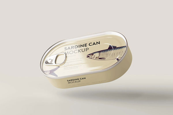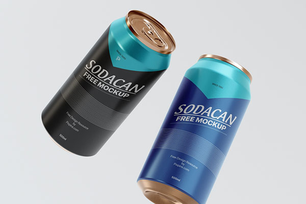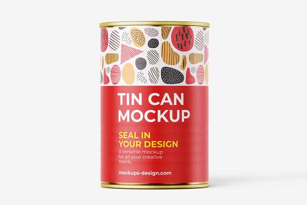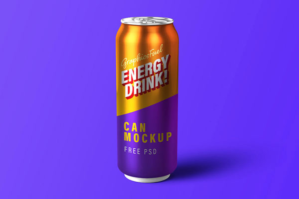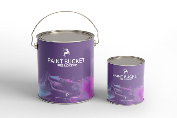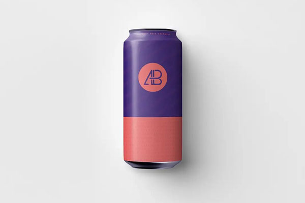
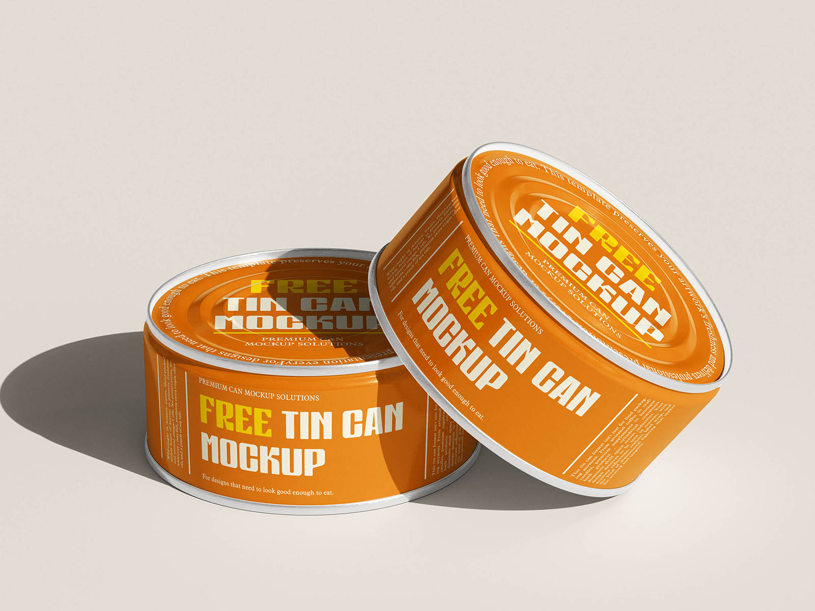


Tin cans have a unique presence because they sit low and wide; they don’t tower; they announce. That broad, flat form demands clarity in every design decision: your logo, type, color fields, and illustrations all have to work together across a wide, uninterrupted surface. That’s exactly why this small flat tin can mockup is such a valuable presentation tool. Instead of imagining your label in abstract, it puts your artwork into a realistic context where lighting, curvature, and material texture all influence perception.
Food brands, specialty goods, home‑grown product lines, gift packaging, and artisanal tins all benefit from that perspective. Sometimes the strength of a design isn’t in how tall it stands; it’s in how confidently it lies in people’s hands and on shelves.