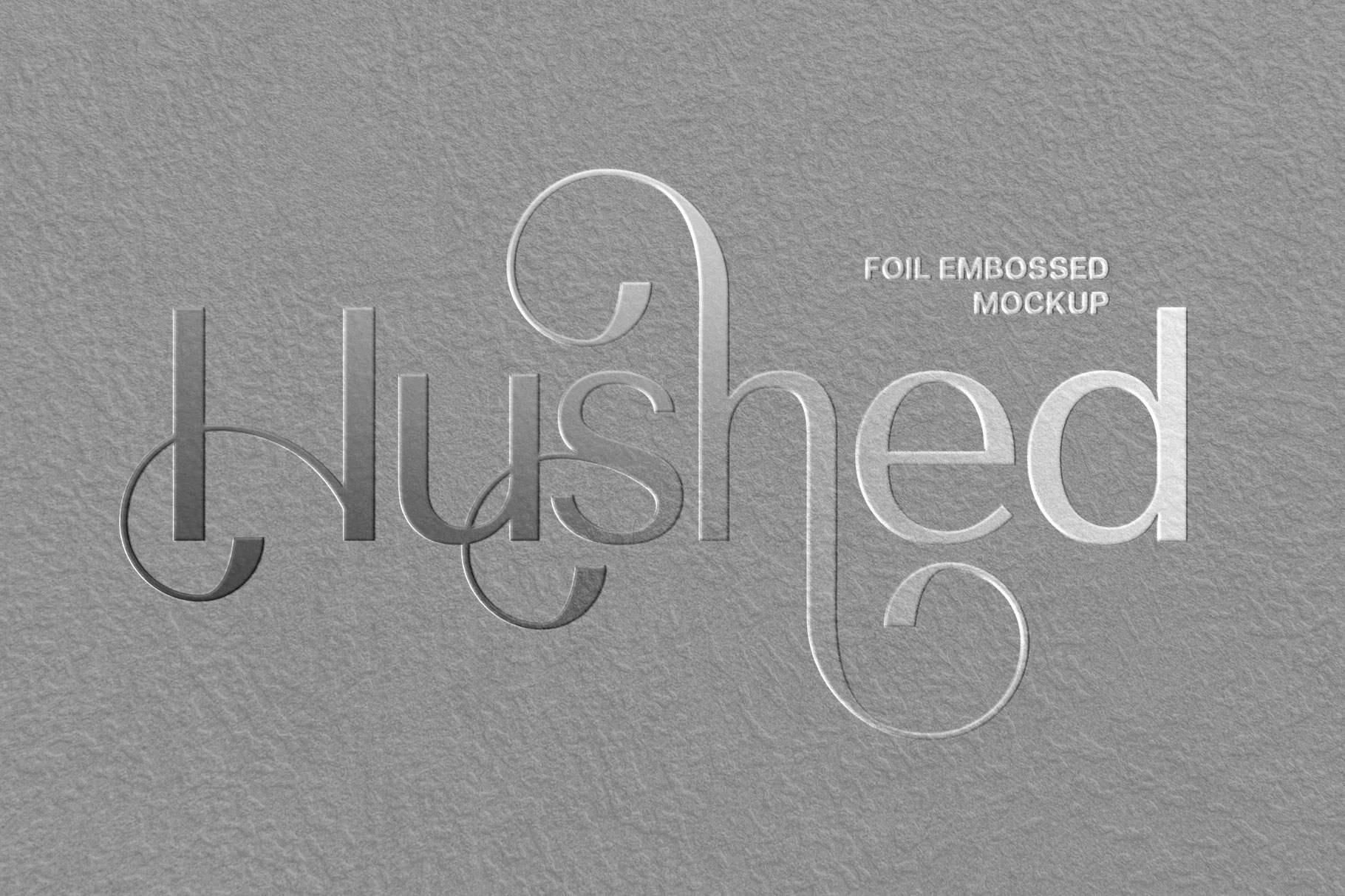
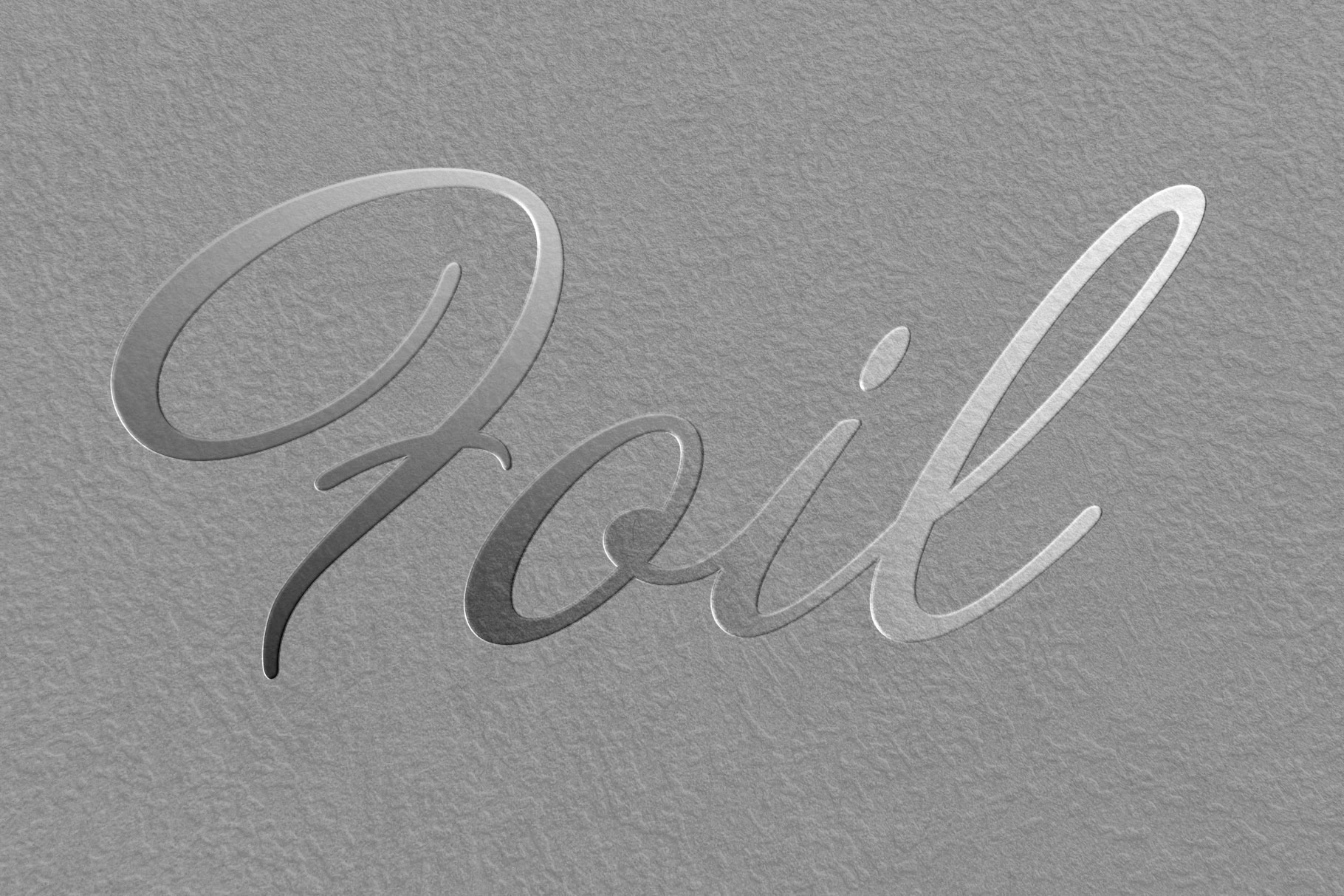
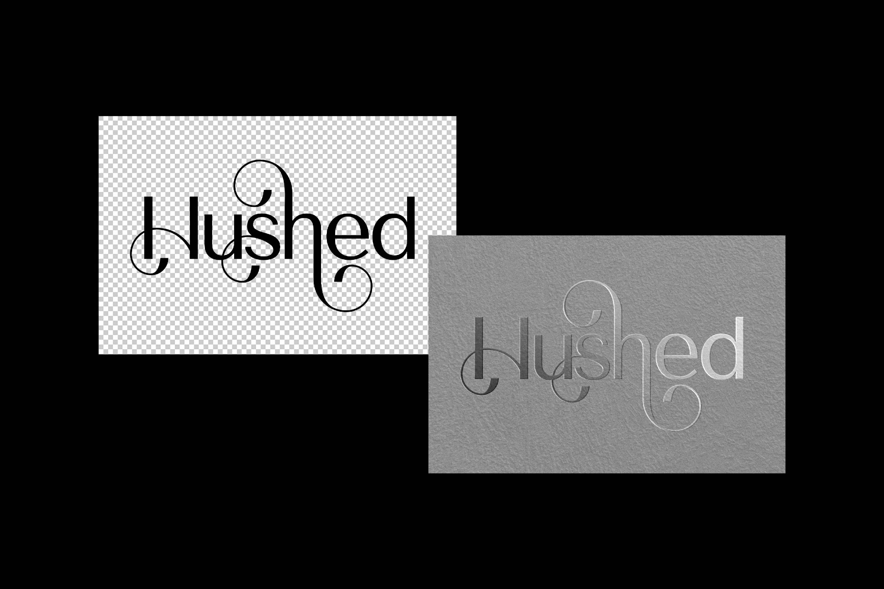
There’s something strangely cinematic about silver foil when it catches light across textured paper, not loud, not ornamental, just surgically precise. This mockup feels built for identities that rely on restraint instead of decoration. The metallic reflections shift naturally with the surface grain, creating a tactile illusion that makes logos and typography appear physically stamped into the material.
We especially like how the shadows stay soft and believable instead of overdramatized. Perfect for luxury branding, editorial marks, fashion packaging, or experimental typography systems that need elegance without falling into predictable “premium” aesthetics. Minimal input, maximum physical presence.