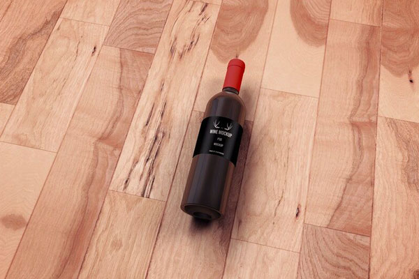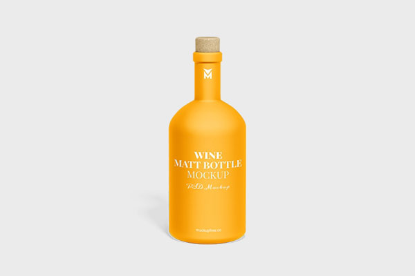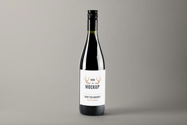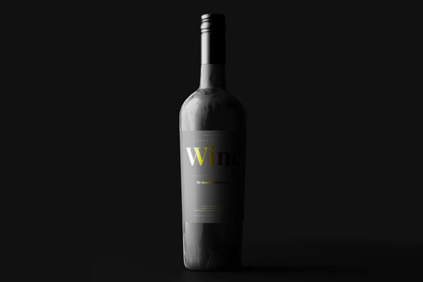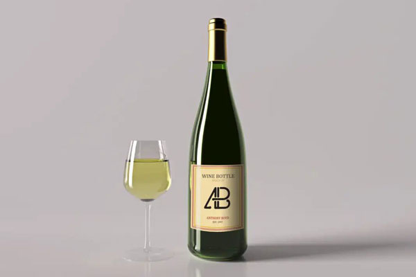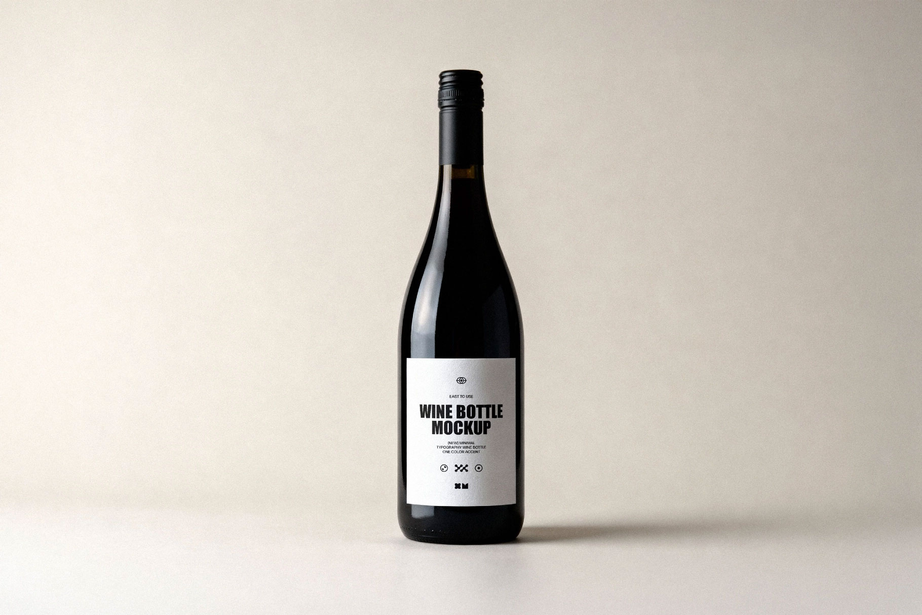
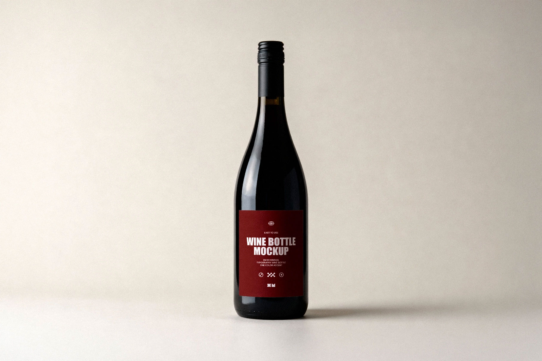
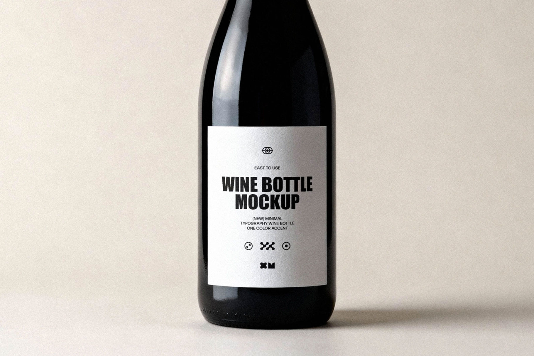
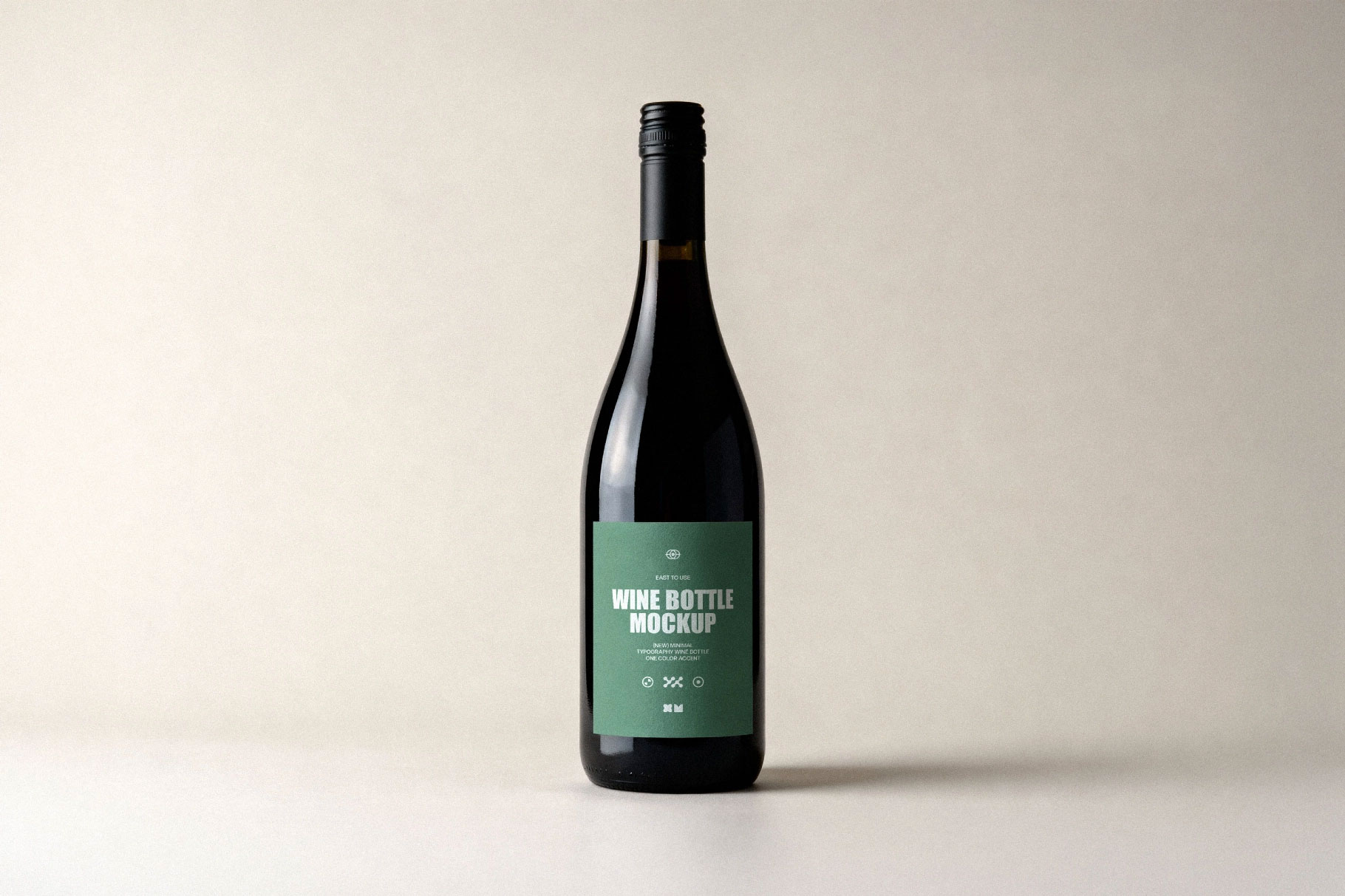
Wine bottle mockups are funny because the expectations are usually higher than the design itself. On the artboard, almost any label can look elegant. Drop it onto a bottle in a realistic setting, and suddenly everything matters: hierarchy, spacing, contrast, and even the smallest typographic choices. That’s exactly why this screw-cap wine bottle scene is so useful.
It gives you a more honest look at how your branding reads in real life, especially from a distance. Vineyard identities, restaurant menus, boutique wine labels, and retail packaging all benefit from that reality check. If the design still holds up here, it’s already doing a lot right.