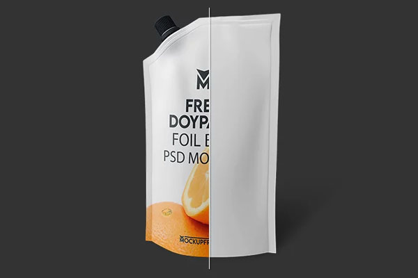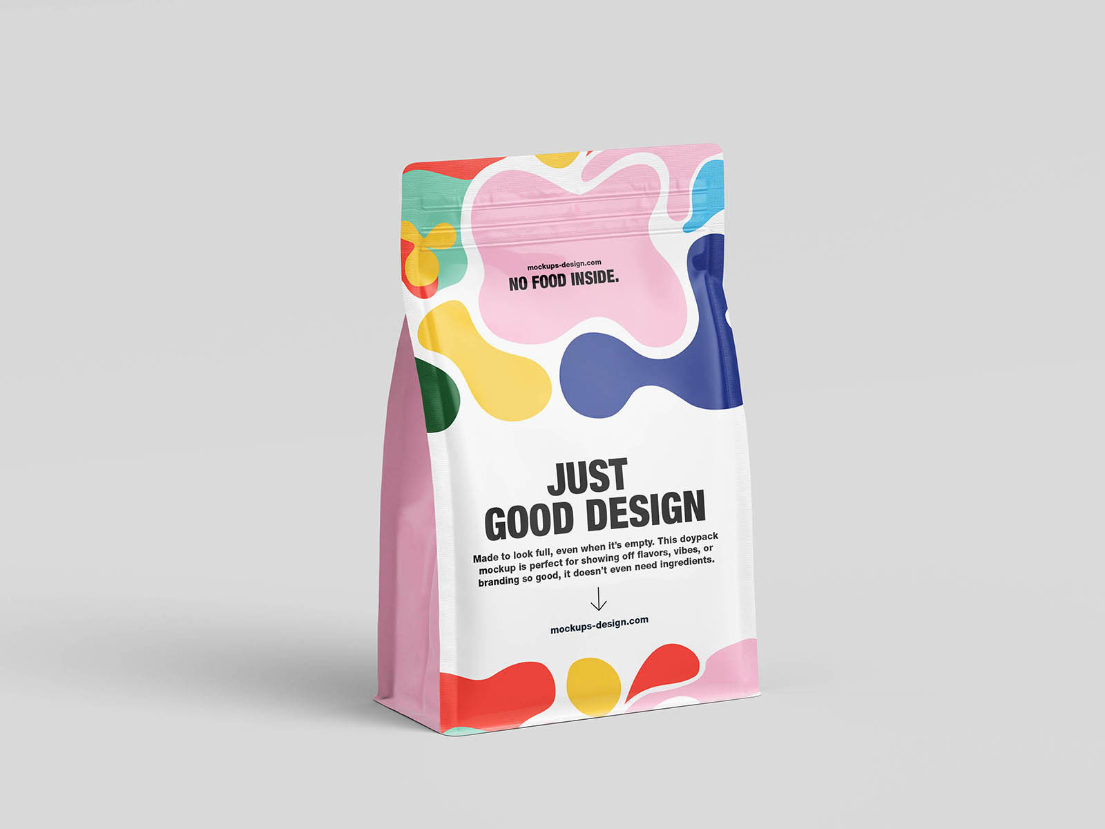
Minimal packaging is a lot less forgiving than people think. When there are no loud graphics, flashy colors, or oversized logos to distract the eye, every tiny design decision becomes visible. Spacing matters more. Typography matters more. Even the placement of a single icon suddenly feels important. That’s exactly why this doypack mockup is useful.
The clean presentation puts all the attention directly on the branding itself, which makes it great for coffee packaging, skincare products, supplements, organic goods, and modern retail concepts. If a design can hold attention on packaging this minimal, chances are it’s doing something right.