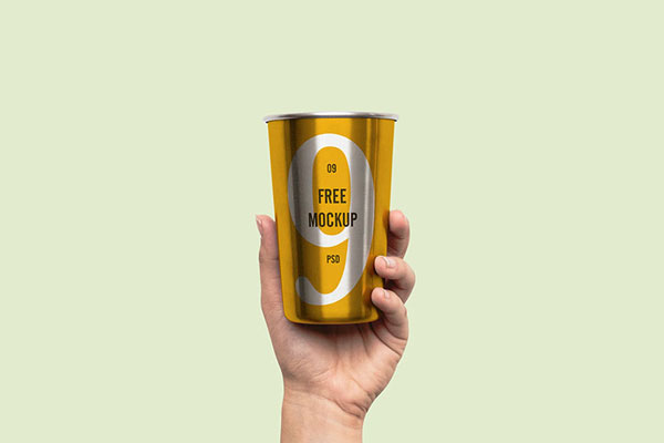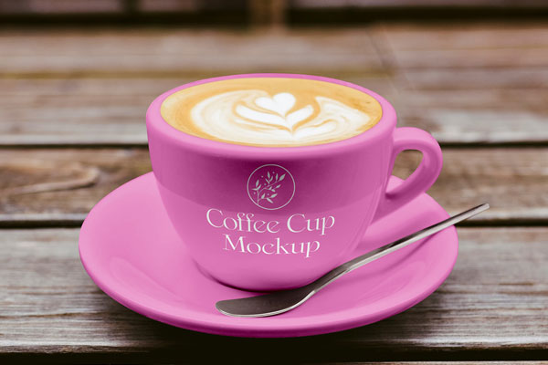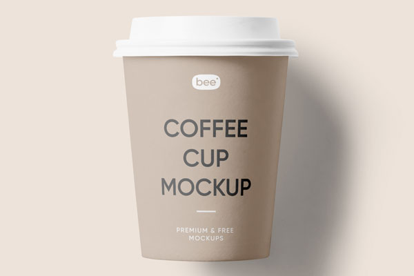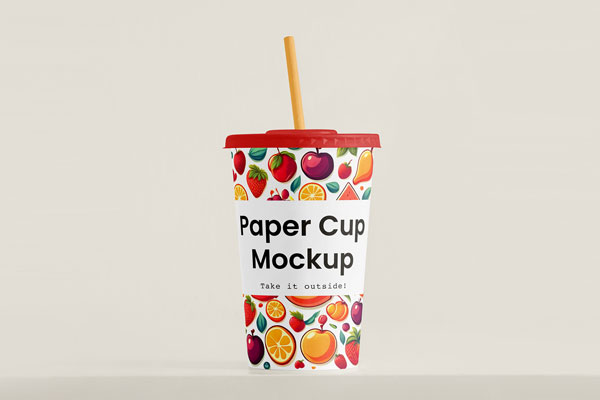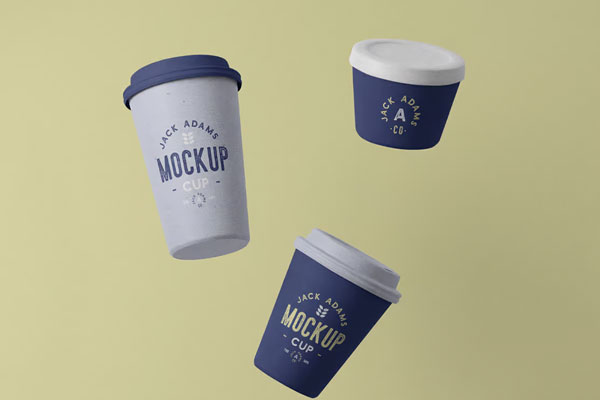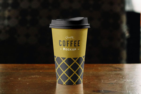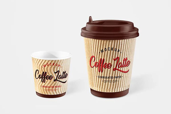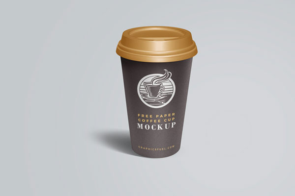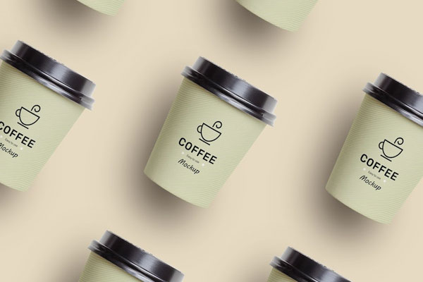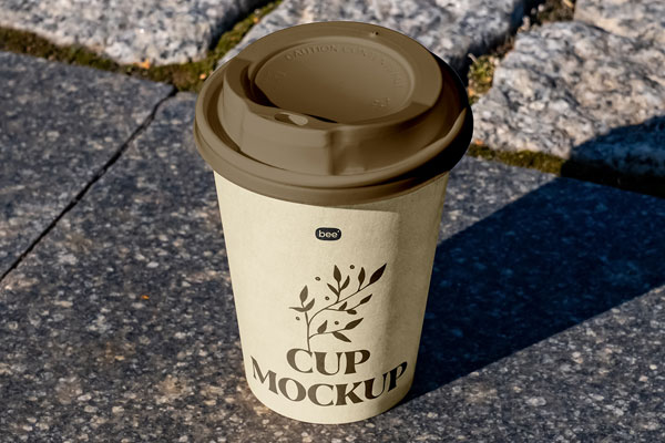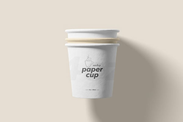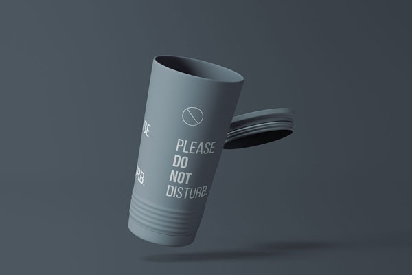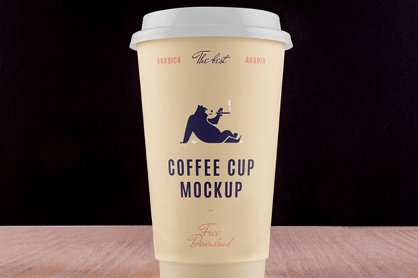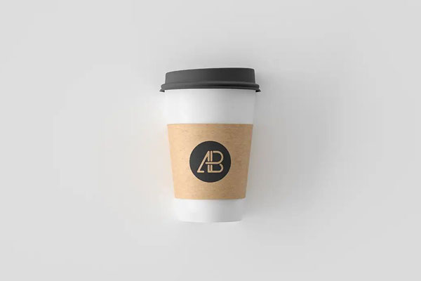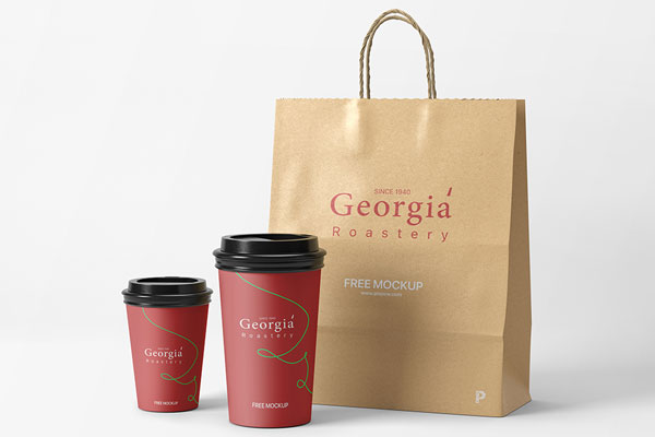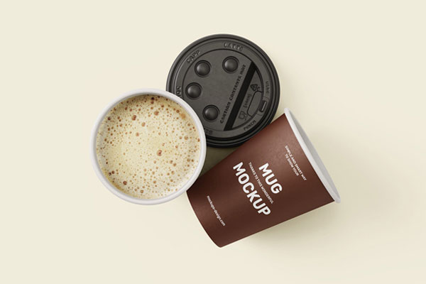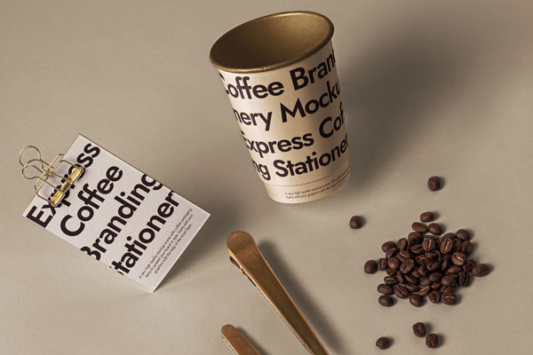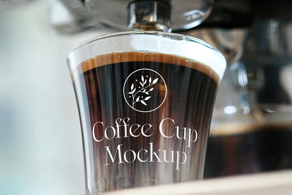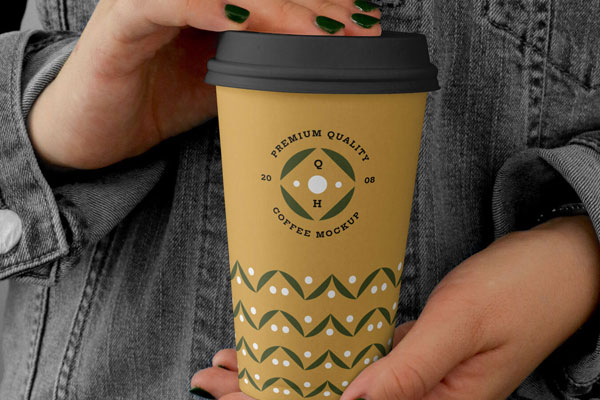
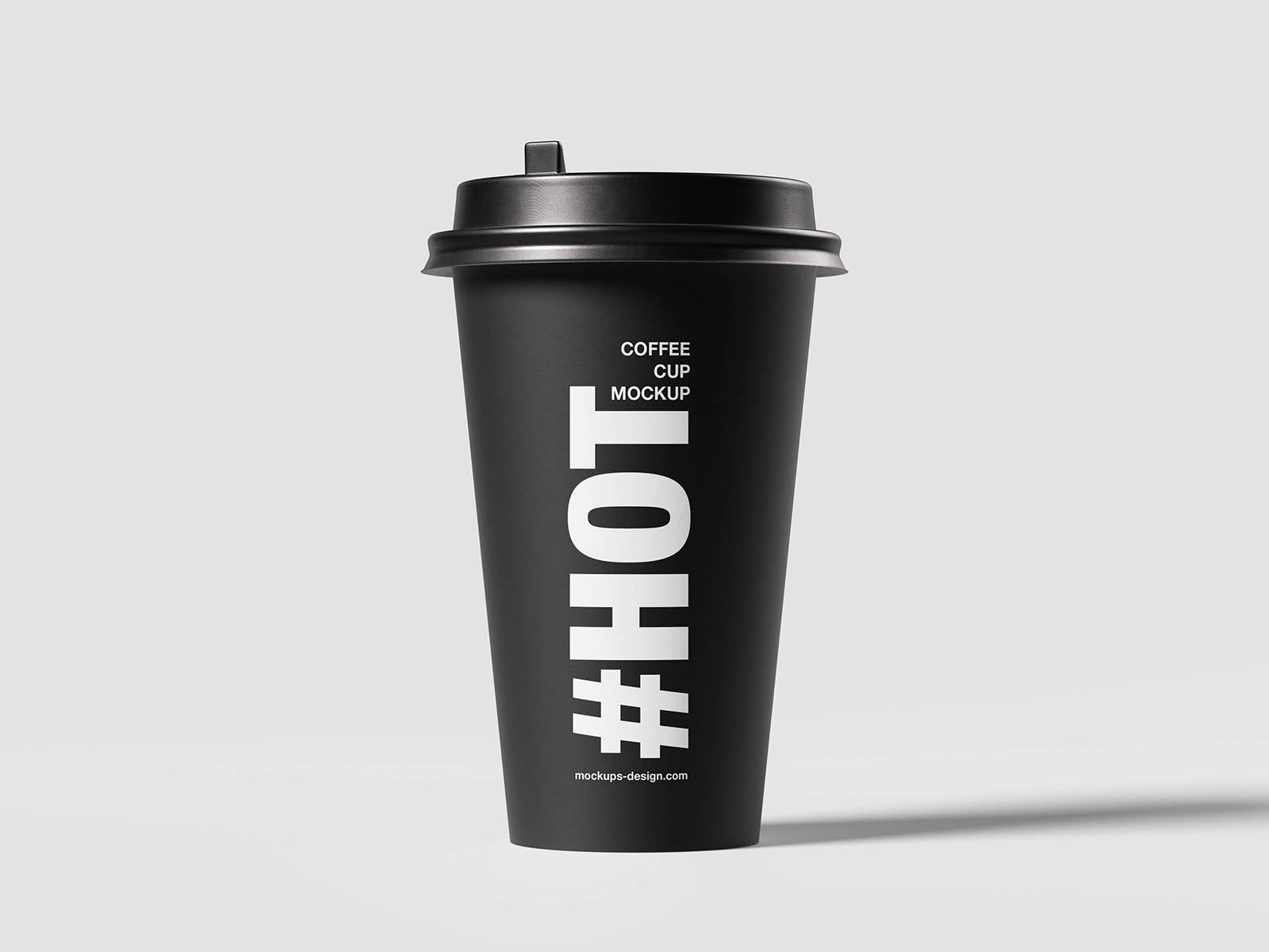
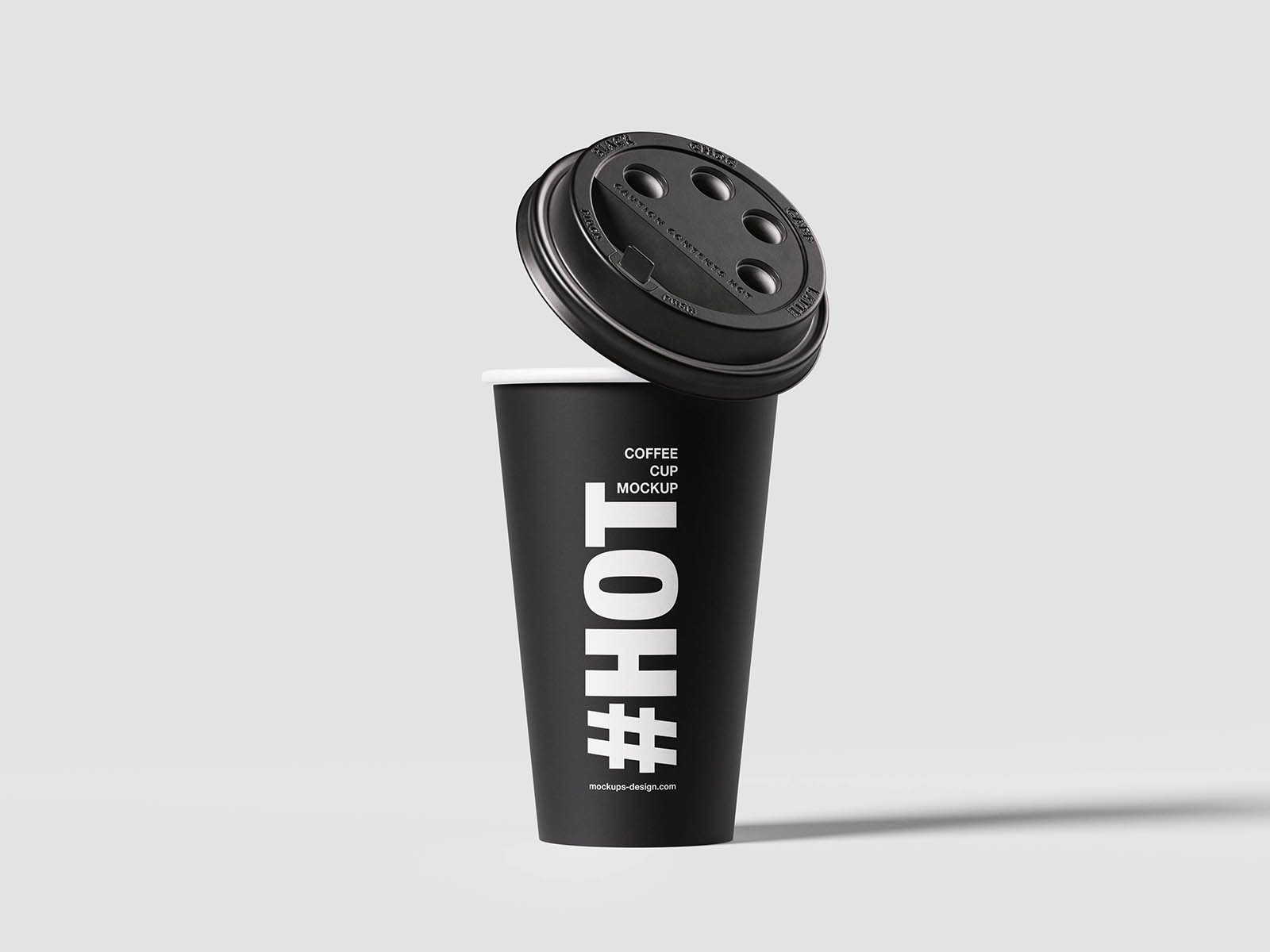
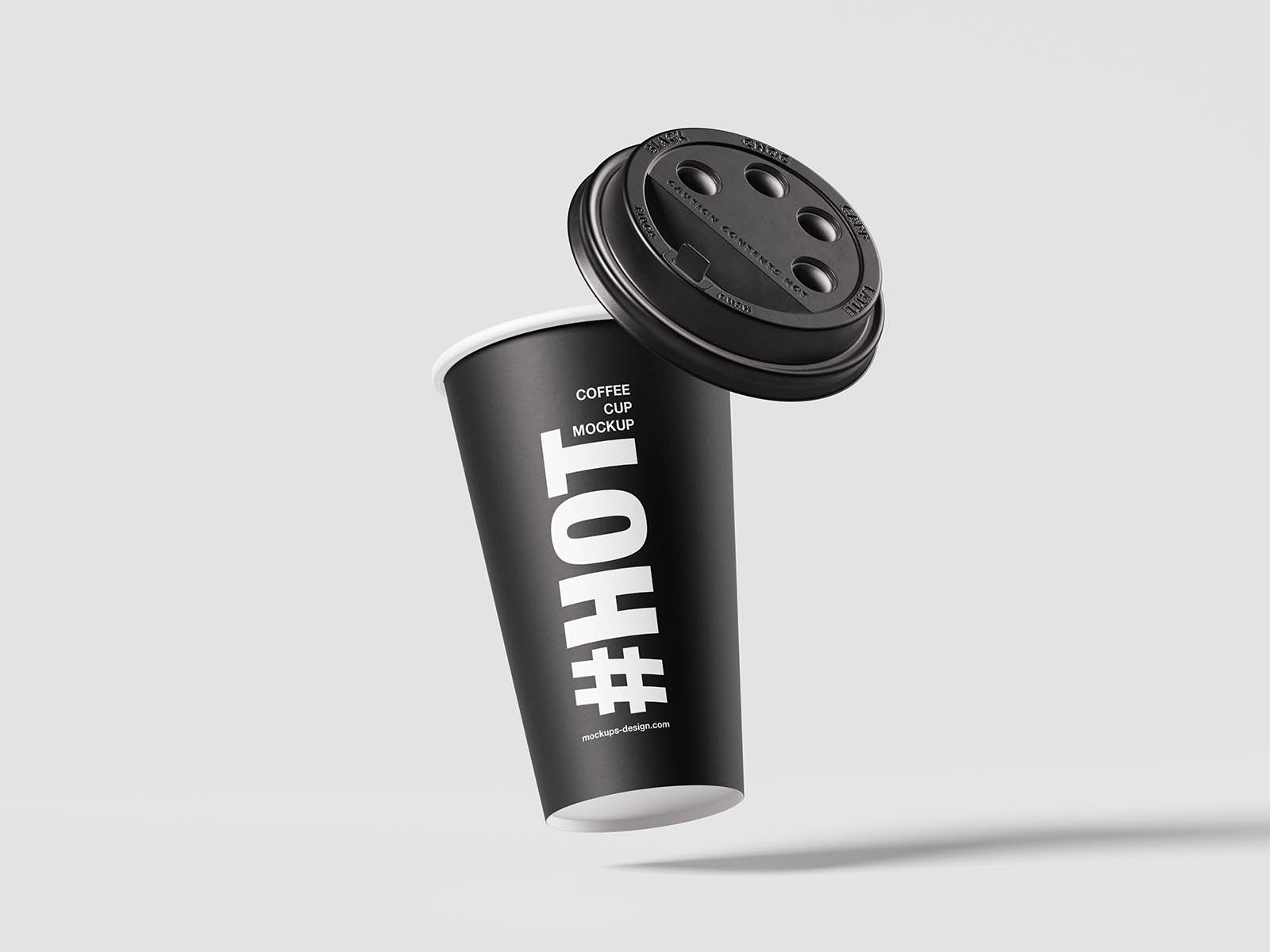
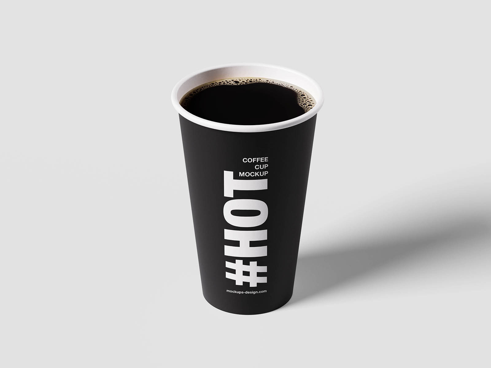
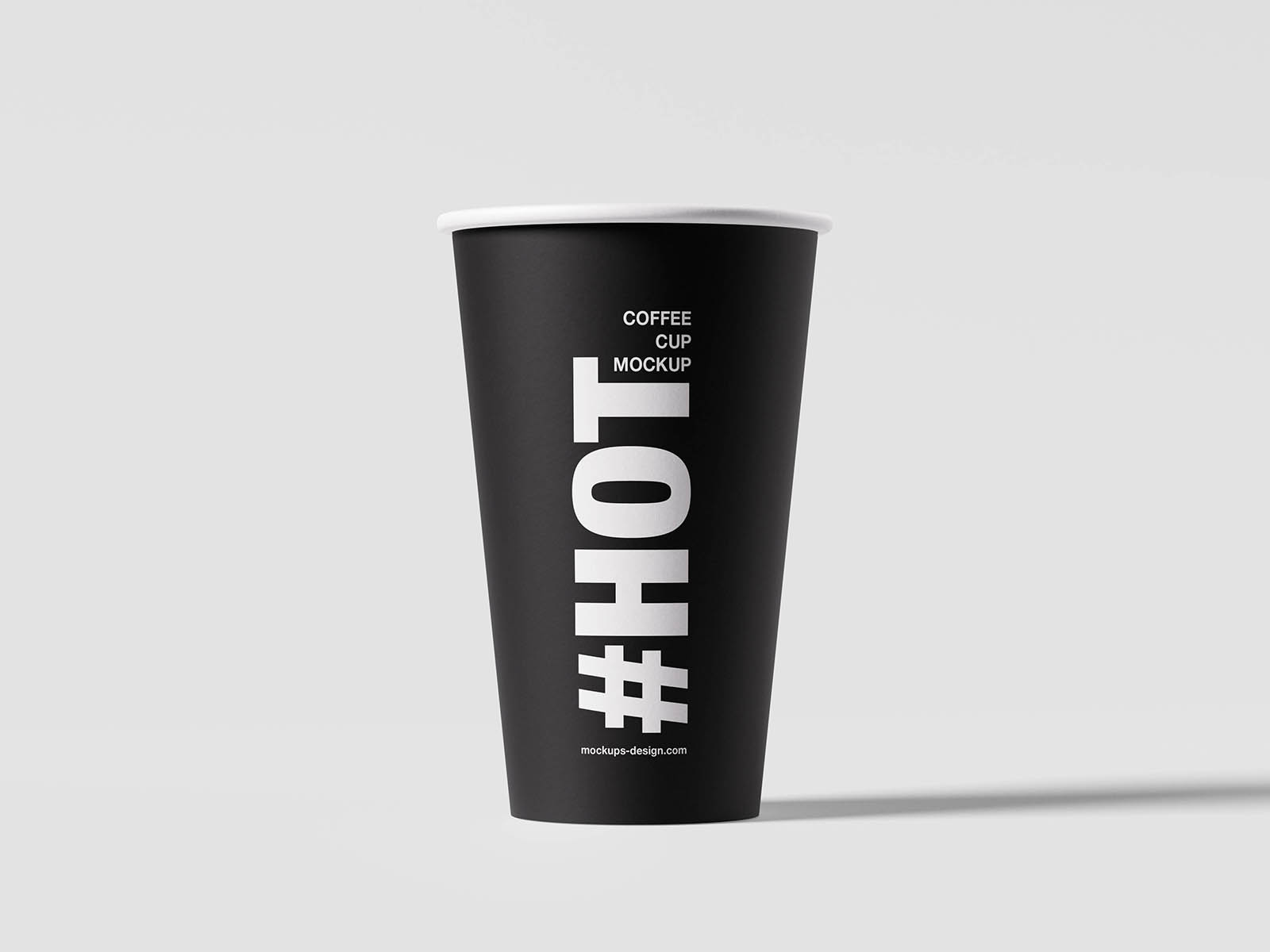
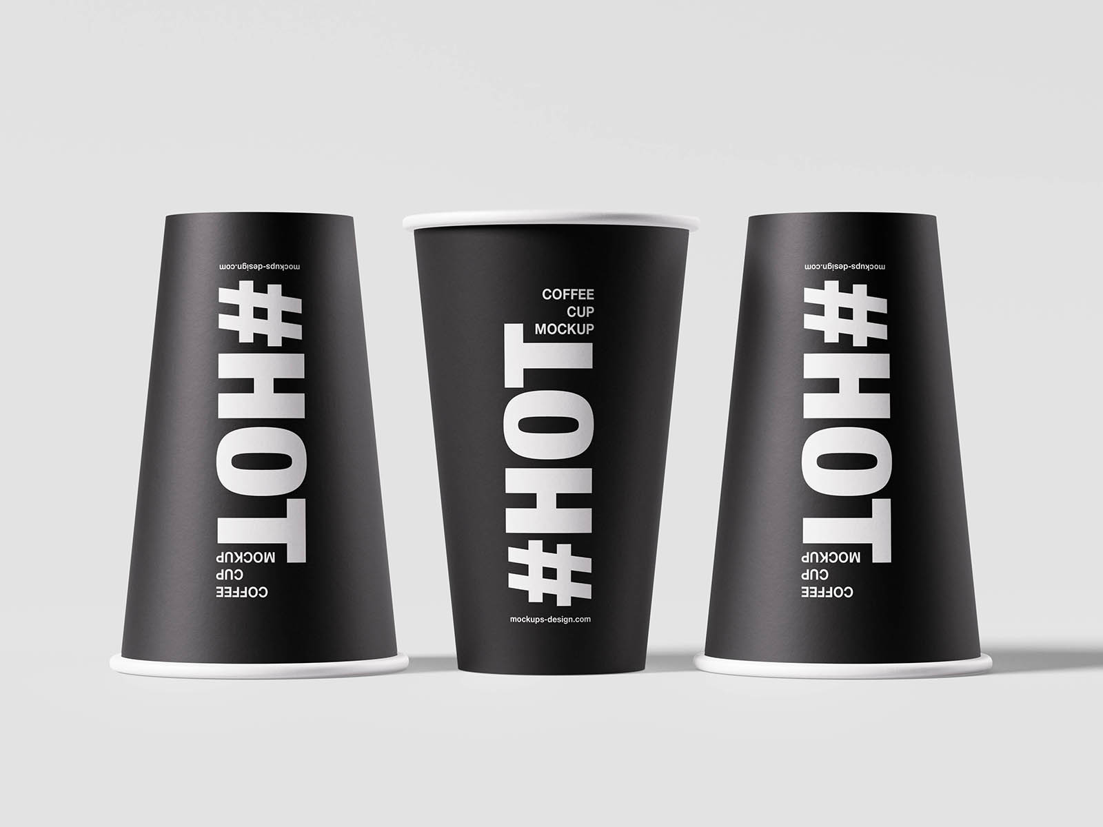
Minimal coffee cup mockups are deceptively difficult. With all the distractions removed, there’s nowhere for a weak logo, awkward typography, or unbalanced composition to hide. That’s exactly what makes this cup mockup so valuable. The clean paper cup, simple lighting, and uncluttered presentation force the branding itself to carry the entire visual experience. Every detail becomes easier to evaluate, from logo scale and placement to contrast and readability.
Cafés, coffee roasters, takeaway brands, beverage startups, and event merchandise all benefit from this kind of honest presentation. Sometimes the strongest branding test isn’t adding more context. It’s removing everything except the essentials and seeing whether the design can still hold attention on its own.